Chapter 5. Sensation and Perception
SP.6: Deep Dive – Colour Vision and Depth Perception
Approximate reading time: 30 minutes
Colour Vision
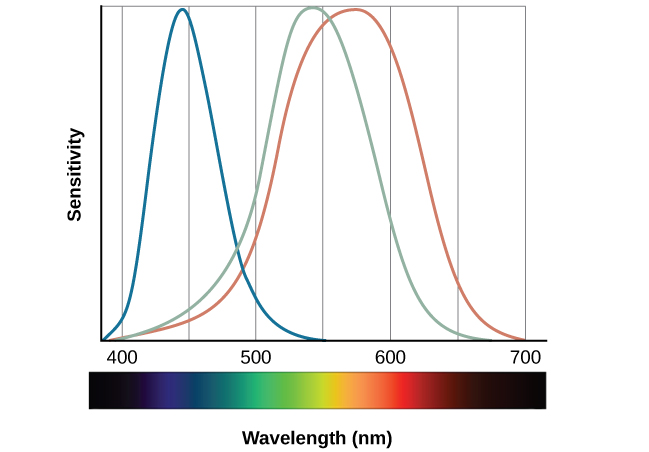
Sighted individuals have three different types of cones that mediate colour vision. Each of these cone types is maximally sensitive to a slightly different wavelength of light. According to the trichromatic theory of colour vision, shown in Figure SUP SP.5, all colours in the spectrum can be produced by combining red, green, and blue. The three types of cones are each receptive to one of the colours.
The trichromatic theory of colour vision is not the only theory — another major theory of colour vision is known as the opponent-process theory. According to this theory, colour is coded in opponent pairs: black-white, yellow-blue, and green-red. The basic idea is that some cells of the visual system are excited by one of the opponent colours and inhibited by the other. So, a cell that was excited by wavelengths associated with green would be inhibited by wavelengths associated with red, and vice versa. One of the implications of opponent processing is that we do not experience greenish-reds or yellowish-blues as colours. Another implication is that this leads to the experience of negative afterimages. An afterimage describes the continuation of a visual sensation after removal of the stimulus. For example, when you stare briefly at the sun and then look away from it, you may still perceive a spot of light although the stimulus (the sun) has been removed. When colour is involved in the stimulus, the colour pairings identified in the opponent-process theory lead to a negative afterimage. You can test this concept using the flag in Figure SUP SP.6.

But these two theories — the trichromatic theory of colour vision and the opponent-process theory — are not mutually exclusive. Research has shown that they apply just to different levels of the nervous system. For visual processing on the retina, trichromatic theory applies: the cones are responsive to three different wavelengths that represent red, blue, and green. But once the signal moves past the retina on its way to the brain, the cells respond in a way consistent with opponent-process theory (Land, 1959; Kaiser, 1997).
Watch this video: Vision: Crash Course Anatomy & Physiology #18 (9.5 minutes)
“Vision: Crash Course Anatomy & Physiology #18” video by CrashCourse is licensed under the Standard YouTube licence.
Depth Perception
Our ability to perceive spatial relationships in three-dimensional (3D) space is known as depth perception. With depth perception, we can describe things as being in front, behind, above, below, or to the side of other things.
Our world is three-dimensional, so it makes sense that our mental representation of the world has three-dimensional properties. We use a variety of cues in a visual scene to establish our sense of depth. Some of these are binocular cues, which means that they rely on the use of both eyes. One example of a binocular depth cue is binocular disparity, the slightly different view of the world that each of our eyes receives. To experience this slightly different view, do this simple exercise: extend your arm fully and extend one of your fingers and focus on that finger. Now, close your left eye without moving your head, then open your left eye and close your right eye without moving your head. You will notice that your finger seems to shift as you alternate between the two eyes because of the slightly different view each eye has of your finger.
A 3D movie works on the same principle: the special glasses you wear allow the two slightly different images projected onto the screen to be seen separately by your left and your right eye. As your brain processes these images, you have the illusion that the leaping animal or running person is coming right toward you.
Although we rely on binocular cues to experience depth in our 3D world, we can also perceive depth in 2D arrays. Think about all the paintings and photographs you have seen. Generally, you pick up on depth in these images even though the visual stimulus is 2D. When we do this, we are relying on a number of monocular cues, or cues that require only one eye. If you think you can’t see depth with one eye, note that you don’t bump into things when using only one eye while walking — and, in fact, we have more monocular cues than binocular cues.
Watch this video: Tricky Topics: Binocular Depth Perception (7 minutes)
“Tricky Topics: Binocular Depth Perception” video by FirstYearPsych Dalhousie is licensed under the Standard YouTube licence.
Monocular Depth Cues That Help Us Judge Depth at a Distance.
In our everyday life, we see the world in 3D, but the images that hit our eyes are actually 2D, like a flat picture. Our brain is pretty smart and uses different tricks to figure out which objects are close and which are far away. Here are some of these tricks:
- Position: If something is higher up in what we see, our brain thinks it’s farther away. Like when you look at a row of fence posts, the ones higher up seem further back.
- Relative Size: When we know objects are usually the same size, the smaller ones look farther away. This is because cars far down the road look tiny compared to the ones close to us.
- Linear Perspective: Lines that we know are parallel, like train tracks, seem to come together in the distance. This helps us think that they are going far away from us.
- Light and Shadow: We get more light bouncing off things that are closer. Since light usually comes from above, objects with shadows look more 3D. For example, bumps and dents can be told apart by how they’re shaded.
- Interposition: If one object blocks part of another, we see the blocking object as closer. Like if a star shape covers part of a bar, the star seems nearer to us.
- Aerial Perspective: Things far away might look fuzzy or covered in smog, which makes them seem further back. Artists use this trick to make distant clouds in paintings look far away.
All these tricks work together to help our brain understand depth and distance, making the world around us look 3D even though the images on our retinas are flat.
| Name | Description | Example | Image |
|---|---|---|---|
| Position | We tend to see objects higher up in our field of vision as farther away. | The fence posts at right appear farther away not only because they become smaller but also because they appear higher up in the picture. |  |
| Relative Size | Assuming that the objects in a scene are the same size, smaller objects are perceived as farther away. | At right, the cars in the distance appear smaller than those nearer to us. | 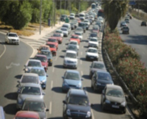 |
| Linear Perspective | Parallel lines appear to converge at a distance. | We know that the tracks at right are parallel. When they appear closer together, we determine they are farther away. |  |
| Light and Shadow | The eye receives more reflected light from objects that are closer to us. Normally, light comes from above, so darker images are in shadow. | We see the images at right as extending and indented according to their shadowing. If we invert the picture, the images will reverse. |  |
| Interposition | When one object overlaps another object, we view it as closer. | At right, because the blue star covers the pink bar, it is seen as closer than the yellow moon. |  |
| Aerial perspective | Objects that appear hazy, or that are covered with smog or dust, appear farther away. | The artist who painted the picture on the right used aerial perspective to make the clouds more hazy and thus appear farther away. |  |
Image Attributions
Figure SUP SP.5. Figure 5.14 as found in Psychology 2e by OpenStax is licensed under a CC BY 4.0 License and contains a modification of a work by Vanessa Ezekowitz which is licensed under a CC BY 3.0 license.
Figure SUP SP.6. Figure 5.16 as found in Psychology 2e by OpenStax is licensed under a CC BY 4.0 License.
All images in Table SUP SP.2 are licensed under a CC BY-NC-SA 3.0 license. The image creator has requested to not receive attribution.
To calculate this time, we used a reading speed of 150 words per minute and then added extra time to account for images and videos. This is just to give you a rough idea of the length of the chapter section. How long it will take you to engage with this chapter will vary greatly depending on all sorts of things (the complexity of the content, your ability to focus, etc).
