3.1 KEY CONCEPT: Readability
All documents have a purpose—to persuade, to inform, to instruct, to entertain—but the first and foremost purpose of any document is to be read. Choosing effective document design enhances the readability or usability of your document so that the target audience is more likely to get the message you want them to receive, and your document is more likely to achieve your intended purpose.
Choose document design elements that make your document “user friendly” for the target audience. Keep in mind that people do not read technical writing for pleasure; they read it because they have to; it’s part of their job. And since “time is money,” the longer it takes to read the document, the higher the “cost.” Your job as the document designer is to make their reading process as easy, clear, useful and efficient as possible by using all the tools at your disposal.
Designing a document is like designing anything else: you must define your purpose (the goals and objectives you hope your document achieves, as well as the constraints — such as word count and format — that you must abide by), understand your audience (who will read this document and why), and choose design features that will best achieve your purpose and best suite the target audience. In essence, you must understand the Rhetorical Situation (see 1.3 Understanding the Rhetorical Situation) in which you find yourself: Who is communicating with whom about what and why? What kind of document design and formatting can help you most effectively convey the desired message to that audience? You want to use the most effective rhetorical strategies at your disposal; document design is one of those strategies.
Genres and Conventions
As you learned in previous writing classes, readers in different contexts expect different textual features, depending on the type of document they are reading and their purpose. A reader of an online editorial can expect strongly worded arguments that may rely on inflammatory emotional language, but not be backed up with much empirical evidence; we do not expect an online editorial to cite reliable sources in a scholarly format. In contrast, an academic reader expects the opposite: neutral, unemotional language, and plenty of empirical evidence to logically and validly support claims, with sources cited and documented in an appropriately academic bibliographical formats. These are some of the conventional expectations of the genres.
It’s not only the content and rhetorical strategies that have differing conventions; documents also differ in how they are designed and formatted. All genres of writing adhere to certain conventions, in terms of content, the style of language used to express that content, and how the content is presented visually. If you look at an online news article (or an article in an actual newspaper), you will often notice consistent formatting features.
Typical Newspaper Formatting Conventions
- Large headlines, often using rhyme, alliteration, exaggeration or some other rhetorical device to grab attention (sometimes called “click bait”)
- Very short paragraphs (generally 1-3 sentences long)
- Pictures related to the article
- A cut out box with a particularly attention-grabbing quotation from the article in larger, bolder print (to get readers interested in the article)
- Advertisements on the side.
It is important for writers to understand the conventions of the genre in which they are writing. Conventions are the “rules” or expectations that readers/viewers have for that particular genre or medium. If you do not follow the target readers’ expectations, you run the risk of confusing them—or worse, damaging your credibility—and therefore not effectively conveying your message and fulfilling your purpose. Think of document design as “visual rhetoric.” Make document design choices that best conform to the expectations of the genre and audience, and that most effectively convey the message you want to send.
Style Guides and Templates
In many writing contexts, style guides and templates will be available. Style guides dictate the general rules and guidelines that should be followed; templates offer specific content and formatting requirements for specific kinds of documents. Academic publishers make style guides available to prospective authors so that they know how to properly write and format documents they submit for publication. Newspapers, academic journals, organizations, and businesses often have their own “in house” style that must be followed by all writers within that organization. A company may have specific templates, for example, a Memo template, that all employees must follow, in order to ensure consistency of messaging.
You likely had a style guide to help you format your written assignments for your Academic Writing class, and in Science classes, you likely had a template to help you organize Lab Reports.
Examine the formatting of academic writing in the H5P interaction below. Reflect on some of the characteristics that adhere to academic writing format requirements that you are familiar with. Do not worry about reading the text, simply examine the formatting. Click on the hotspots (designated by the + signs) for more information.
Now look at the technical writing in the H5P interaction below. What differences do you notice? Reflect on some of the features that differ from the academic writing sample above. Consider why typical readers of technical writing would find these desirable. Which document would you rather read?
EXERCISE 3.1 List some conventions of academic formatting
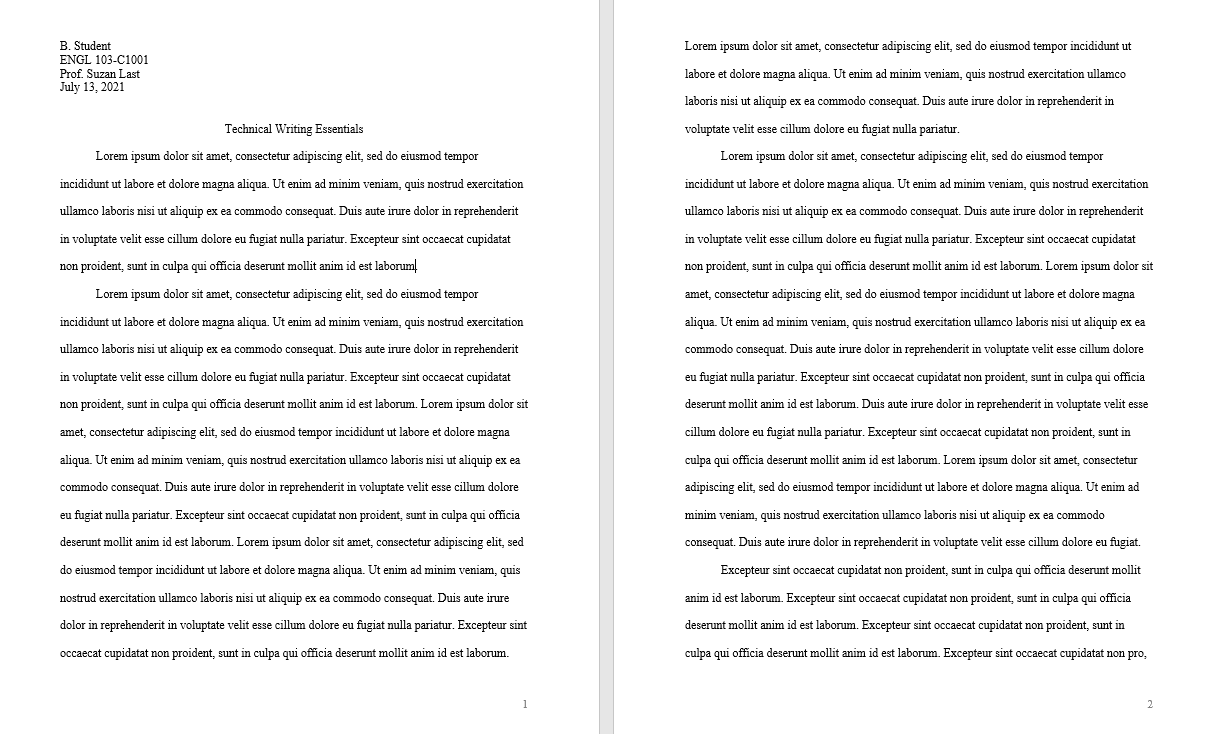
Examine the formatting in Figure 3.1.1 below and list some of characteristics that adhere to academic writing format requirements that you are familiar with. It does not matter if you cannot read the text; simply examine the formatting.
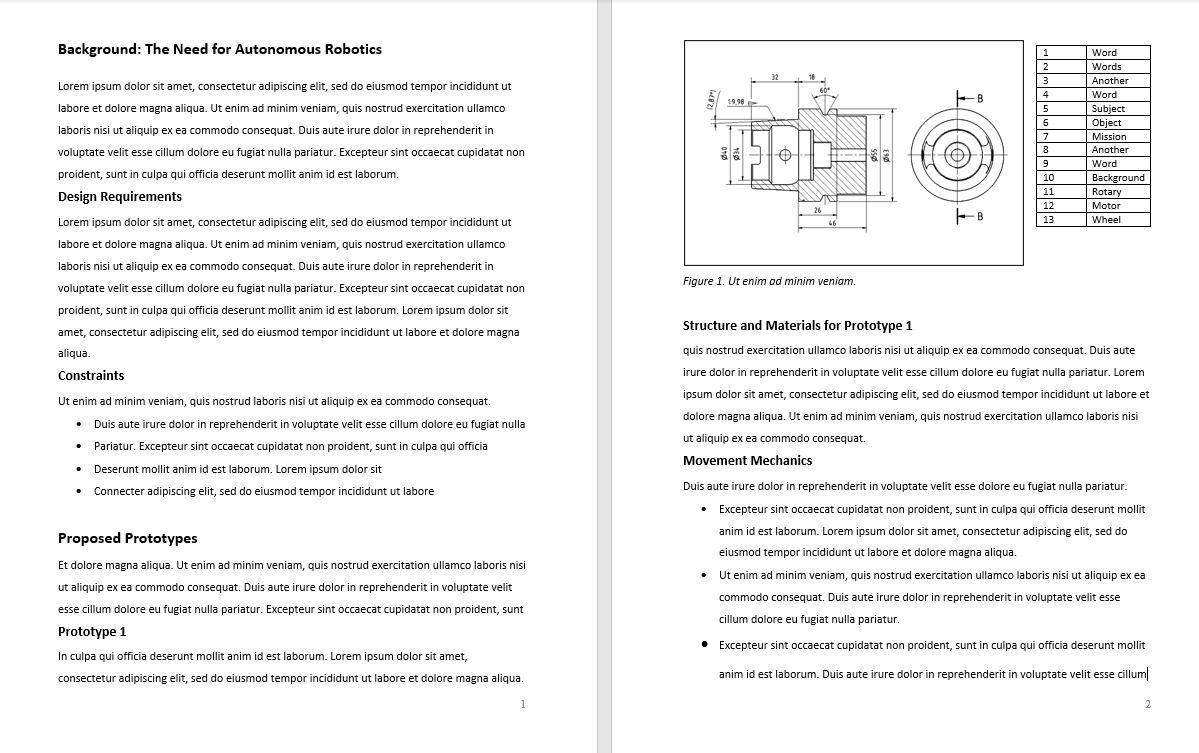
Now examine the document in Figure 3.1.2. What differences do you notice? List some of the features that differ from the academic writing sample above. Consider why typical readers of technical writing would find these features desirable. Which document would you rather read?
Technical writing makes use of several typical design features to organize information efficiently and enhance readability. These include headings, lists, figures, and tables, as well as strategic use of passive space around all of these features and text. Each company, publisher, or organization may have its own style guide to which all writers within that organization, or those wishing to contribute written material, must adhere. All work written for ENGR 120 and 240 should adhere to the ENGR 120/240 style guide. An excerpt from this style guide, listing the main formatting requirements for all assignments, is presented below.
Style Guide For ENGR 120 and 240 Written Assignments
Most workplace documents are created using Microsoft Office products (Word, Excel, and PowerPoint). This is generally industry standard, so it is crucial that you learn how to use these programs effectively to create sophisticated workplace documents.
The general specifications of technical writing documents in WORD are as follows:
| Margins | 1-1.5 inches on all sides If you are binding a hard copy report, leave a 2-inch left margin |
|---|---|
| Body Text Font | A serif font such as Times, Times New Roman, Cambria, etc.** |
| Heading Font | A sans serif font such as Ariel or Calibri |
| Font Size | 11-12 point serif font (12 is preferred) for body text 12-20 point sans serif font for headings |
Generally technical writing is single spaced, the first line of each paragraph is not indented, and an extra space is placed between paragraphs. Letters and memos are always single spaced; reports may be single or 1.5 spaced. Drafts are often double spaced to make room for comments. Paragraphs tend to be no longer than 10 lines long, and each line should avoid having more than 15-20 words.
Justify your left margin only; leave a “ragged right” edge. This is considered much more “reader friendly” than fully justified margins. In some cases, fully justifying your left and right margins results in odd spacing between words that can be disorienting to the reader.
NOTE: For specific document elements such as title page, letter of transmittal, and table of contents, see “Engineering Co-op Work Term Report Guideline” (PDF).
The rest of this chapter offers specific and detailed information on how and why technical writers use the following document design features:
- Headings: headings and subheadings provide a clearly visible organization and structure that allows readers to read selectively and preview information. There are several guidelines for font style, size and colour to help design headings effectively.
- Lists: lists provide a way to concisely and efficiently convey information and emphasize ideas. There are several kinds of lists, each used for specific purposes.
- Figures and Tables: visual representations of data and concepts offer a reader a break from sentence and paragraphs, and provide additional ways to understand information.
- Passive Space: leaving blank spaces strategically on the page (around lists, figures, and headings, and between paragraphs) helps the reader to absorb the information in the “active” space more effectively, and helps create a visually appealing look.
** NOTE: Traditionally, serif fonts have been preferred for body text as they were considered more “readable” in paragraph form, especially in print media. However, recent research has suggested that the serif fonts are less readable for people who have visual impairments or disabilities related to perceiving written text. In addition, sans serif fonts are considered more readable on a screen.[1] This is one reason why Microsoft Word has changed its default body font from Cambria or Times New Roman to Calibri, which is a sans serif font. It is wise to check with the intended audience to see which is preferred.
Media Attributions
- Figure 3.1.1 Page Excerpt from an Academic Essay by Suzan Last is licensed under a CC BY 4.0 licence.
- Figure 3.1.2 Excerpt from a Technical Report by Suzan Last is licensed under a CC BY 4.0 licence.
- AbilityNet, “Producing accessible materials for print and online,” [Online]. Available: https://www.abilitynet.org.uk/quality/documents/StandardofAccessibility.pdf ↵
