Best Practices
3 Organizing Content
Organizing content so it has a logical flow just makes sense. Using chapters, headings, and sub-headings to organize a resource allows students to clearly see how the main concepts are related. In addition, headings are one of the main ways that students using a screen reader navigate through a chapter.
Who are you doing this for?
Everyone benefits from having content that’s clearly organized. Well-organized content supports students who:


Why is this important?
Headings help to identify the hierarchical structure of a document (e.g., sections, sub-sections). They provide a visual cue that helps sighted readers quickly navigate through sections of a document, skimming until they find the section they are looking for. Similarly, headings create logical divisions in the content and allow a non-sighted user to navigate a page or document easily using a screen reader.
When it comes to using visual references to indicate the hierarchy and structure of a document, you might be accustomed to changing the font style, enlarging the type size, or highlighting the text with bold, underline or italics to create the impression of a heading. This approach presents problems when creating material with accessibility in mind because screen readers won’t identify the text as a heading. Instead, the screen reader will just “read” through the text of a heading as if it were regular content, missing your intended cues about structure and organization.
What do you need to do?
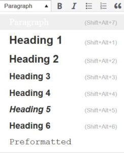
In Pressbooks, use the visual editor to tag sections with Heading 2, sub-sections with Heading 3, sub-sections of sub-sections with Heading 4, and so on.

Although Pressbooks provides up to six heading levels, that many levels might be difficult for your readers to keep track of. If you find yourself getting to four to six heading levels, consider breaking up your chapter into multiple chapters.
Textboxes with titles
If you are creating your textbook with Pressbooks, you might use some of the educational textboxes: Examples, Exercises, Key Takeaways, and Learning Objectives. Here is an example:
Examples
Type your examples here.
- First
- Second
These textboxes have two sections that are different colours. The section on the top is for the textbox title and the section underneath is for the textbox content. For people who can see the textbox, the different colours used in the textbox title communicate that the text is a title. However, this is not communicated to people using screen readers. As such, the textbox title needs to be marked as a heading.
Which heading level you use will depend on where the textbox appears in the chapter. The heading level should be one level below the section heading level it appears under. So in this chapter, “Textboxes with titles” is a heading level 2, so I have assigned the “Examples” textbox title heading level 3.
If changing the heading level of your textbox title changes the appearance, here is some CSS you can add to your “Custom Styles” (under the Appearance tab in Pressbooks) to change it back:
h3.textbox__title {
padding: 0.7em 0.7em 0.7em 0.7em;
margin: -1.1428244907em -1.1428244907em -1em -1.1428244907em;
font-size: 1.3em;
font-weight: normal;
}
Note that this CSS is targeting heading 3s. If your textbox titles are using a different heading level, change h3 to h2, h4, etc.
Media Attributions
- Ann: Original artwork by Hilda Anggraeni (BCcampus). © Creative Commons Attribution 4.0 International Licence.
- Jacob: “WFE003: Jacob” by Rosenfeld Media. © Creative Commons Attribution 2.0 Generic Licence.

