Unit 5: Statistics
Topic E: Histograms
A histogram is a special bar graph that shows how a frequency (the number of times something happens) relates to a class interval (a range of numbers). A histogram is useful when looking at how many times something happens. It is useful to look at monthly or yearly temperatures, at test scores and groups of people based on age.
In the following graph, the height of each bar relates to how many days a temperature was between the listed temperatures in the horizontal axis.
This graph is created by counting how many days the temperatures were:
- between 0°C and −5°C (1 day)
- between −6°C and −10°C (6 days)
- between −11°C and −15°C (8 days)
- between −16°C and −20°C (5 days)
- between −21°C and −25°C (9 days)
- between −26°C and −30°C (2 days)
Then the information is put into graph form.
Graph 1
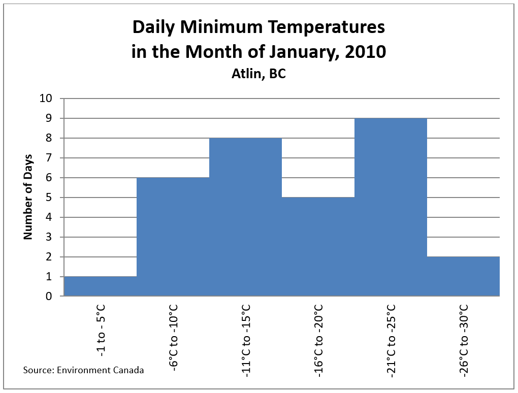
- How many degrees in temperature change is in each bar?
- What is the source of the information?
- Which temperature was the most common in the month of January?
- Which community does this graph represent?
- Which temperature was felt the least in Atlin in January, 2010?
Answers to Graph 1
- Five degrees
- Environment Canada
- −21°C to −25°C
- Atlin, BC
- −1°C to −5°C
Graph 2
In this Fundamentals Math course, students’ marks were collected from the final test. The graph shows the results.
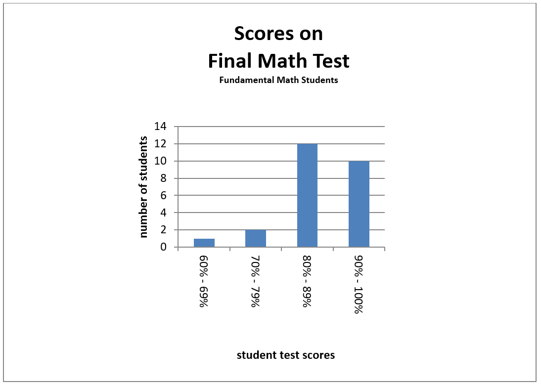
- How many students took the test?
- How many students scored 80% to 89% on the test?
- In order to pass, students must get 80% or over on the test. How many students will have to re-write the test?
- How many more students got 80% to 89% than 90% to 100%?
Answers to Graph 2
- 25
- 12
- 3
- 2
Image Descriptions
Graph 1 (Histogram)
A histogram showing the daily minimum temperatures of Atlin, British Columbia in the month of January, 2010.
- The horizontal axis contains the following temperature ranges, in degrees Celsius: −1°C to −5°C, −6°C to −10°C, −11°C to −15°C, −16°C to −20°C, −21°C to −25°C, and −26°C to −30°C.
- The vertical axis is numbers of days, and has the numbers 0 through 10.
The histogram data is represented in the following table:
| Temperature Range in °C (Horizontal Axis) | Number of Days (Vertical Axis) |
|---|---|
| −1°C to −5°C | 1 |
| −6°C to −10°C | 6 |
| −11°C to −15°C | 8 |
| −16°C to −20°C | 5 |
| −21°C to −25°C | 9 |
| −26°C to −30°C | 2 |
| Source: Environment Canada | |
Graph 2 (Histogram)
A histogram showing the scores on the final math test for Fundamentals Math students.
- The horizontal axis contains the following ranges of test scores, in percentages: 60%–69%. 70%–79%, 80%–89%, and 90%–99%.
- The vertical axis is numbers of students, and has the numbers 0 through 14 in increments of 2.
The histogram data is represented in the following table:
| Test Score Range, in percentages (Horizontal Axis) | Number of Students (Vertical Axis) |
|---|---|
| 60%–69% | 1 |
| 70%–79% | 2 |
| 80%–89% | 12 |
| 90%–99% | 10 |
