Unit 5: Statistics
Topic A: Line Graphs
Line graphs are used to show changes that happen over a period of time. Line graphs easily show trends and patterns.
The most common way to set up a line graph is to put time on the horizontal (\(x\)) axis. Whatever is being measured is then put on the vertical (\(y\)) axis.
Graph 1
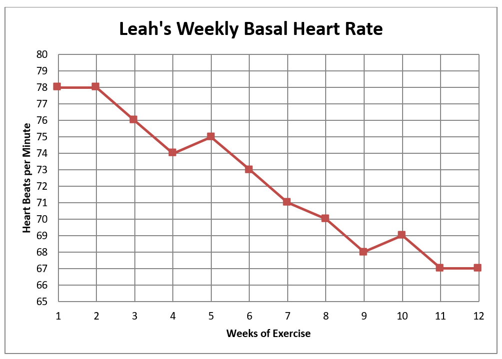
Leah has taken up cycling and jogging to improve her cardiovascular fitness and for weight control. She takes her pulse every Monday morning before she gets out of bed; that is her basal heart rate. Graph 1 records Leah’s heart rate for the first 12 weeks of her exercise program.
- What is the title of the graph?
- What is being measured on the vertical axis?
On this particular graph, the vertical scale is one heartbeat per line. The scale on the horizontal axis is one week per line.
- What was Leah’s basal heart rate on the fourth week of her exercise program?
- Find Week 4 on the horizontal (\(x\)) axis.
- Look straight up from Week 4 until you come to the point in the graphed line.
- Now look at the scale on the vertical (\(y\)) axis. Lay a ruler or straight piece of paper across the graph to help you read the scale at the point for Week 4.
Leah’s basal heart rate was 74 beats/min in Week 4.
- Find her basal heart rate in Week 7.
- What does the graph show us happened between Week 9 and Week 10?
- What trend does this graph show? The graph shows Leah’s basal heart rate is “going down” or decreasing.
Often, you need to estimate the value of the point in the graphed line. Look at Graph 2, which has Leah’s same heart rates recorded.
Answers to Graph 1
- Leah’s Weekly Basal Heart Rate
- Heartbeats per minute
- Given: 74 beats/min
- 71 beats/min
- Leah’s heart rate went up from 68 to 69 beats/min
- Given: Leah's basal heart rate is "going down" or decreasing
Graph 2
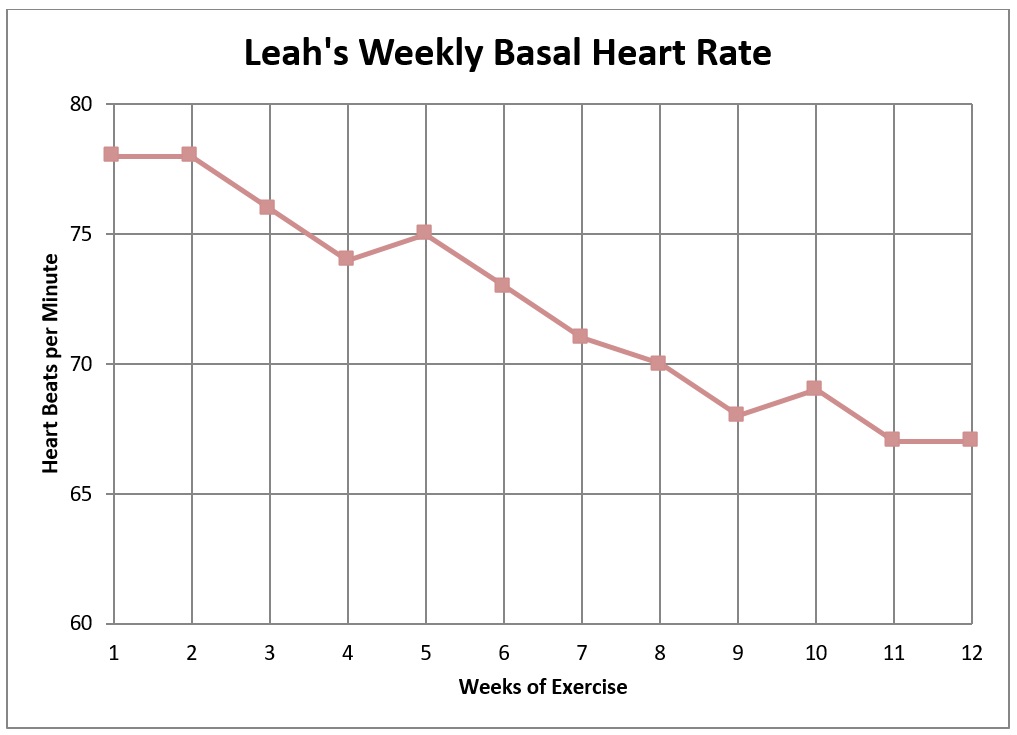
Now the scale on the vertical axis is five heartbeats per line. Use a straightedge (ruler or paper) across the graph to help you read the vertical scale.
- Give Leah’s heart rate in Week 5.
- Give Leah’s heart rate in Week 10.
- What was Leah’s heart rate in Week 12?
- Using the information on the graphs, state how much Leah’s basal heart rate decreased (in beats per minute) from Week 1 to Week 12.
Answers to Graph 2
- 75 beats/min
- 69 beats/min
- 67 beats/min
- Decreased 11 beats/min (78 − 67 = 11)
The person drawing a graph decides how to label it and how to write the scale on the axes, depending on the information to be shown on the graph. The graphs about Leah focus on the range of her heart rate. There is no need to make the heart rate scale lower than 55 or higher than 80 for Leah.
Often, information about several things are illustrated on the same graph. Such graphs are very useful for making comparisons. Look for a legend or key that explains what each graphed line represents. The legend may be printed right by the graphed information or it may be beside or below the graph.
Graph 3
Leah’s husband, John, decided to exercise as well. He had a rapid heart rate at the beginning of the exercise program. Since his heart rate is higher than 85, we must increase the numbers on the vertical scale so we can graph John’s heart rate on the same graph as Leah’s.
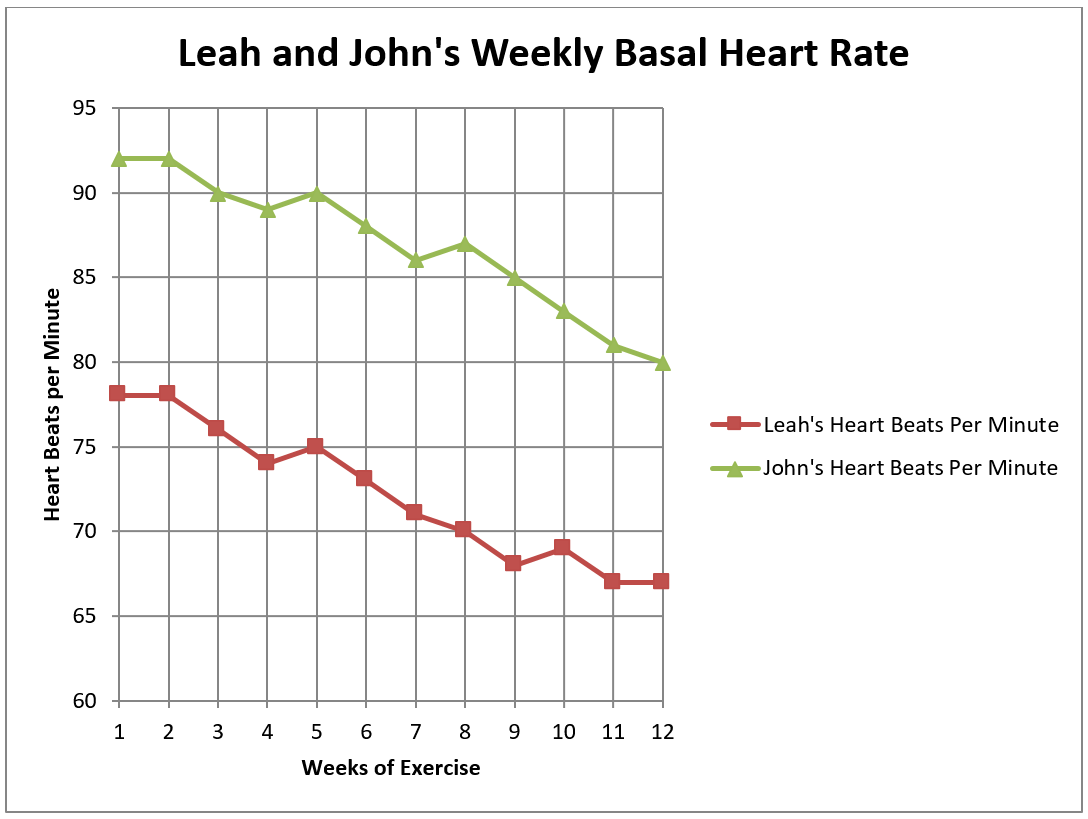
- What was John’s heart rate in Week 6?
- What was John’s heart rate in Week 10?
- How much lower was Leah’s heart rate than John’s in Week 8?
- How much did John’s heart rate drop in the 12-week exercise program?
- What was the amount of change in John’s heart rate between Week 3 and Week 7? Was it an increase (+) or decrease (−)?
- Compare the two graphed lines.
- How is the slant of the lines different?
- How are the lines the same?
- You can tell from looking at this graph that John and Leah had a similar trend in the change in their basal heart rates. Did their heart rates increase or decrease?
Answers to Graph 3
- 88 beats/min
- 83 beats/min
- 17 beats/min
- 12 beats/min
- Decrease 4 beats/min
- Answers:
- John’s goes up at Week 8, Leah’s goes up at Week 10, Leah stays the same from Week 11 to 12 while John’s goes down.
- Similar, because both decrease at a similar slant and both show an increase in two separate weeks.
- Both heart rates decreased.
If the graphed lines have about the same slant, the rate of change is the same for the information being graphed. By looking at graphed lines, you can tell if one has increased or decreased more quickly. You can easily compare changes and tell when the changes occurred.
Steps to Follow When Reading Line Graphs
- Read all the titles so you know what the graph is about.
- Look at the information on the vertical and horizontal scales.
- Decide what the graphed lines represent. Look for a legend and be sure you know which line is which.
- Interpret (read) the information on the graph.
- First, get a general look at what is on the graph.
- Second, look for the detailed information that you need.
Graph 4
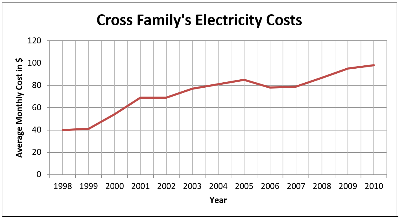
- What is the general trend in the Crosses' average monthly cost for electricity?
- What was the average monthly cost of electricity in 1998?
- How much more did they pay per month in 2003 than in 2000?
- What happened to the average cost between 2005 and 2006?
- By how much did the Crosses' average monthly electricity cost increase between 1998 and 2010?
Answers to Graph 4
- Increased
- $40
- Approximately $23 ($77 – 54)
- Decreased
- $58
Line graphs can also be used to graph two different types of related information on the same chart. For example, we may have wanted to put Leah and John’s weight changes and heart rate changes on the same graph.
When we graph different types of information:
- A subtitle (written in smaller print under the title) usually explains the two types of information.
- The horizontal axis is the same.
- The vertical axis on the right side of the graph has the scale for the second set of information. For example, on the graph for Leah and John, the right vertical axis would be marked in kilograms for weight changes.
Steps to Follow When Reading Line Graphs with Two Types of Information
- Read the titles and subtitles.
- Look at the legend to identify the graphed lines and check where the scale for each line is written (on the left or on the right vertical axis).
- Go up from the horizontal axis in the same way. Read the appropriate scale on the left or right vertical axis for each graphed line.
Graph 5
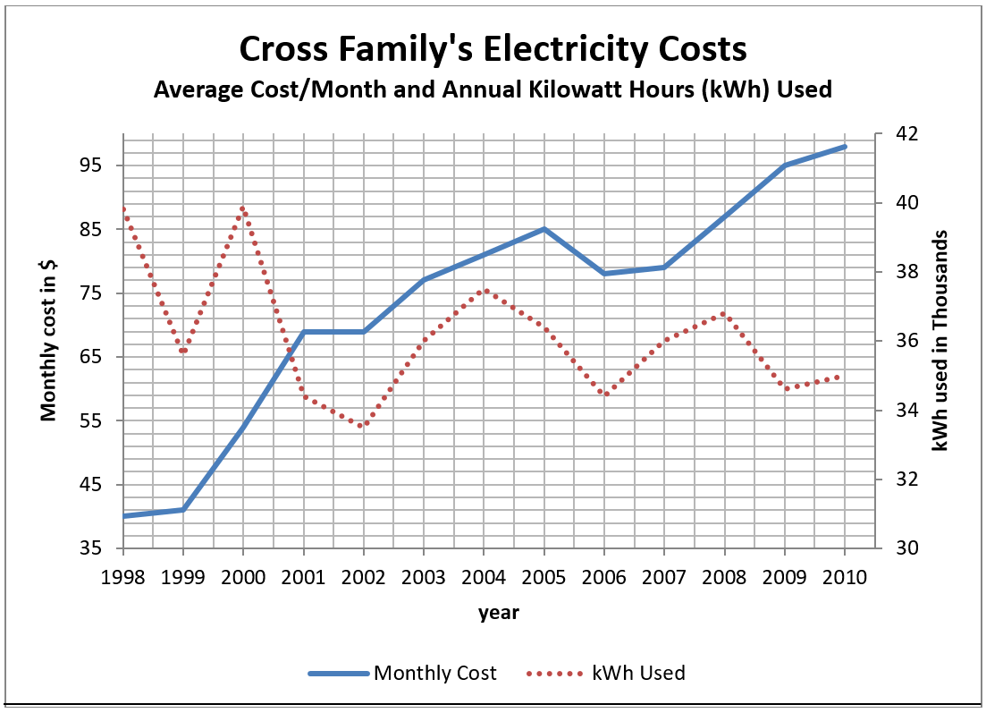
- What is the title of this graph?
- What is the subtitle?
- Look at the legend. What does the graphed line for “Kilowatt Hours Used” look like?
- Where is the scale for kilowatt hours?
- How is the scale for kilowatt hours labelled?
in thousands means that each figure in the scale is to be multiplied by 1,000. For example, "32" represents "32,000."
- In which two years was the use of kWh the greatest?
- In which year was the least kWh used?
- Look at 1999 and 2000.
- Find the amount of kWh used (in thousands) in 1999 and the cost of electricity in 1999.
- Compare to the amount of kWh used in 2000 and the cost of electricity in 2000.
- What can you conclude by comparing the cost and the kWh used in 1999 and 2000?
- Now look at 2001 and 2002.
- Compare the use of kWh.
- Compare the cost.
- What can you conclude?
- Between 2009 and 2010, the use of kWh went up or down? by fill-in-the-blank kWh.The cost of electricity went up or down? by $fill-in-the-blank.
Answers to Graph 5
- Cross Family’s Electricity Costs
- Average Cost/month and Annual Kilowatt Hours Used
- Dotted line
- Right side of graph
- kWh used in thousands
- 1998 + 2000
- 2002
- Answers:
- ~36,000 kWh and $41.
- ~40,000 kWh and $54.
- The price per kWh increased.
- Answers:
- 2001: ~34,500 kWh; 2002: ~33,500 kWh
- 2001: $69; 2002: $69
- You can conclude the price/kWh increased.
- The use of kWh went up by ~500 kWh. Cost went up by $3.
The steepness of the slant of a graphed line gives you an idea of the rate of change. The steeper the slant, the greater the change.
This double graph shows that the average monthly cost of electricity has increased, while the annual use of kilowatt hours has shown an overall decrease.
Image Descriptions
Graph 1 (Line Graph)
A line graph shows the change in Leah's weekly basal heart rate over 12 weeks of exercise.
- The vertical axis is heartbeats per minute and has the numbers 65 to 80 in increments of 1.
- The horizontal axis is weeks of exercise and has the numbers 1 to 12 in increments of 1.
The line graph data is represented in the following table:
| Weeks of Exercise (Horizontal Axis) | Heartbeats per Minute (Vertical Axis) |
|---|---|
| 1 | 78 |
| 2 | 78 |
| 3 | 76 |
| 4 | 74 |
| 5 | 75 |
| 6 | 73 |
| 7 | 71 |
| 8 | 70 |
| 9 | 68 |
| 10 | 69 |
| 11 | 67 |
| 12 | 67 |
Graph 2 (Line Graph)
A line graph showing Leah's weekly basal heart rate.
- The vertical axis is heartbeats per minute and has the numbers 60 to 80 in increments of 5.
- The horizontal axis is weeks of exercise and has the numbers 1 to 12 in increments of 1.
The line graph data is represented in the following table:
| Weeks of Exercise (Horizontal Axis) | Heartbeats per Minute (Vertical Axis) |
|---|---|
| 1 | 78 |
| 2 | 78 |
| 3 | 76 |
| 4 | 74 |
| 5 | 75 |
| 6 | 73 |
| 7 | 71 |
| 8 | 70 |
| 9 | 68 |
| 10 | 69 |
| 11 | 67 |
| 12 | 67 |
Graph 3 (Line Graph)
A line graph showing Leah and John's weekly basal heart rate.
- The vertical axis is heartbeats per minute and has the numbers 60 to 95 in increments of 5.
- The horizontal axis is weeks of exercise and has the numbers 1 to 12 in increments of 1.
- The legend refers to two different graphed lines on the line graph. One refers to Leah's heartbeats per minute, and the other refers to John's heartbeats per minute.
The line graph data is represented in the following table:
| Weeks of Exercise (Horizontal Axis) | Leah's Heartbeats per Minute (Vertical Axis) | John's Heartbeats per Minute (Vertical Axis) |
|---|---|---|
| 1 | 78 | 92 |
| 2 | 78 | 92 |
| 3 | 76 | 90 |
| 4 | 74 | 89 |
| 5 | 75 | 90 |
| 6 | 73 | 88 |
| 7 | 71 | 86 |
| 8 | 70 | 87 |
| 9 | 68 | 85 |
| 10 | 69 | 83 |
| 11 | 67 | 81 |
| 12 | 67 | 80 |
Graph 4 (Line Graph)
A line graph showing the Cross family's electricity costs.
- The vertical axis is the average monthly cost in dollars, and contains the numbers 0 to 120 in increments of 20.
- The horizontal axis is years and contains the years 1998 to 2010 in increments of one year.
The line graph data is represented in the following table:
| Year (Horizontal Axis) | Average Monthly Cost in $ (Vertical Axis) |
|---|---|
| 1998 | 40 |
| 1999 | 41 |
| 2000 | 54 |
| 2001 | 69 |
| 2002 | 69 |
| 2003 | 77 |
| 2004 | 81 |
| 2005 | 85 |
| 2006 | 78 |
| 2007 | 79 |
| 2008 | 87 |
| 2009 | 95 |
| 2010 | 98 |
Graph 5 (Line Graph)
A line graph showing the Cross family's electricity costs, displaying both average cost per month and annual kilowatt hours (kWh) used.
- The left vertical axis is the monthly cost in dollars and contains the numbers 35 to 99 in increments of 2.
- The right vertical axis is the kWh used in the thousands and contains the numbers 30 to 42 in increments of 2.
- The horizontal axis is years and contains the years 1998 to 2010 in increments of one year.
- The legend refers to two different graphed lines on the line graph. One refers to the monthly cost, and the other refers to the kWh used.
The line graph data is represented in the following table:
| Year (Horizontal Axis) | Monthly Cost in $ (Left Vertical Axis) | kWh used in Thousands (Right Vertical Axis) |
|---|---|---|
| 1998 | 40 | ~40 |
| 1999 | 41 | ~36 |
| 2000 | 54 | ~40 |
| 2001 | 69 | ~34.5 |
| 2002 | 69 | ~33.5 |
| 2003 | 77 | ~36 |
| 2004 | 81 | ~37.5 |
| 2005 | 85 | ~36.5 |
| 2006 | 78 | ~34.5 |
| 2007 | 79 | ~36 |
| 2008 | 87 | ~37 |
| 2009 | 95 | ~34.5 |
| 2010 | 98 | ~35 |
