Linear Regression and Correlation – Excel Tools Instruction
Scatter Plot
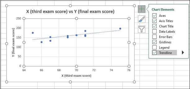
A scatter plot graph presents the data set where it is hypothesized that Y is dependent upon the single independent variable X.
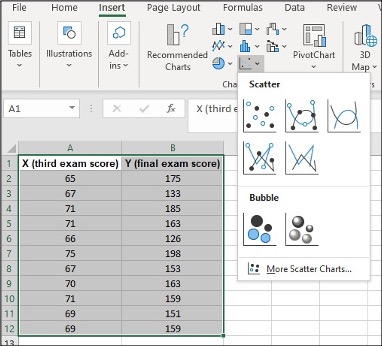
Scatter Plot in Excel
- Highlight columns of cells
- Click Insert, Scatter and the one with only Markers
- Click on the new Scatter plot to change Title, and click icon + to make other changes
| x (third exam score) | y (final exam score) |
|---|---|
| 65 | 175 |
| 67 | 133 |
| 71 | 185 |
| 71 | 163 |
| 66 | 126 |
| 75 | 198 |
| 67 | 153 |
| 70 | 163 |
| 71 | 159 |
| 69 | 151 |
| 69 | 159 |
Media Attributions
- Screenshots of Excel are used with permission from Microsoft.
