Sampling and Data – Excel Tools Instruction
Pie Charts and Bar Graphs
- In a pie chart, categories of data are represented by wedges in a circle and are proportional in size to the percent of individuals in each category.
- In a bar graph, the length of the bar for each category is proportional to the number or percent of individuals in each category. Bars may be vertical or horizontal.
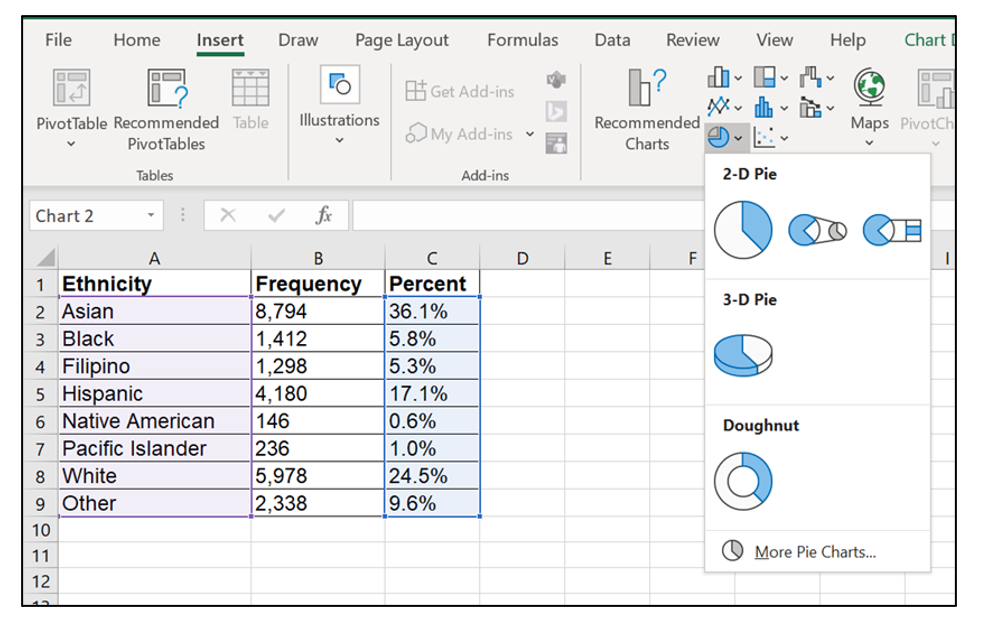
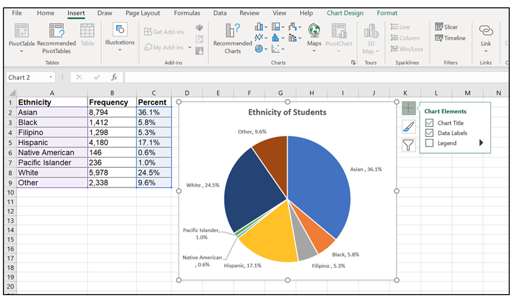
Pie Charts in Excel
- Highlight columns of cells (hold ‘Ctrl‘ button if columns not adjacent)
- Click Insert, Charts and the first 2-D pie
- Click on the new pie chart and icon + to make changes
- Right click on wedge, choose ‘Add Data Labels‘
| Ethnicity | Frequency | Percent |
|---|---|---|
| Asian | 8,794 | 36.1% |
| Black | 1,412 | 5.8% |
| Filipino | 1,298 | 5.3% |
| Hispanic | 4,180 | 17.1% |
| Native American | 146 | 0.6% |
| Pacific Islander | 236 | 1.0% |
| White | 5,978 | 24.5% |
| Other | 2,338 | 9.6% |
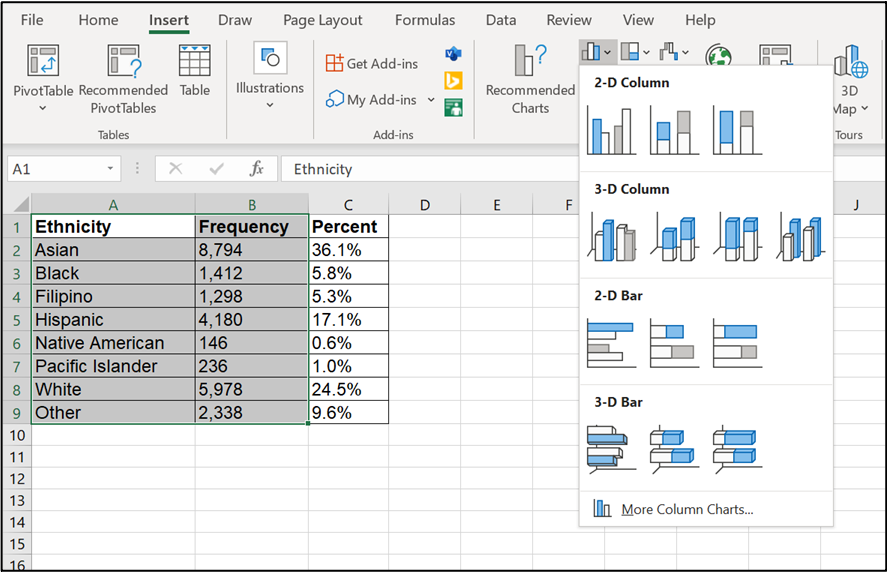
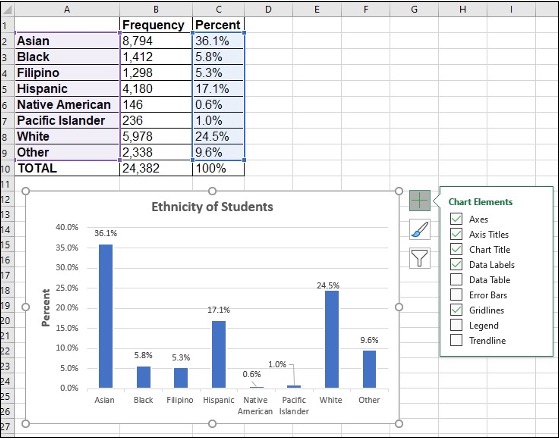
Bar graphs in Excel
- Highlight columns of cells
- Click Insert, Charts and the first 2-D Column
- Click on the new bar graph and icon + to make changes
- Right click on wedge, choose ‘Add Data Labels’
Frequency, Relative Frequency and Cumulative Relative Frequency
- A frequency is the number of times a value of the data occurs.
- A relative frequency is the ratio (fraction or proportion) of the number of times a value of the data occurs in the set of all outcomes to the total number of outcomes. Relative frequencies can be written as fractions, percents, or decimals.
- A cumulative relative frequency is the accumulation of the previous relative frequencies.
Frequency in Excel
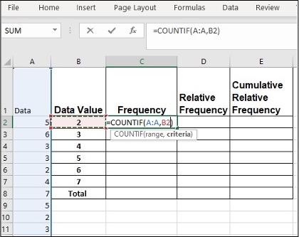
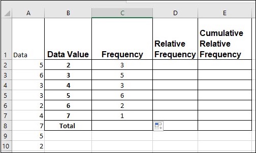
Twenty students were asked how many hours they worked per day. Their responses, in hours, are as follows: 5; 6; 3; 3; 2; 4; 7; 5; 2; 3; 5; 6; 5; 4; 4; 3; 5; 2; 5; 3.
Enter all data in column A. Create a column for data categories (column B).
- Enter =COUNTIF in cell C2, click column A, comma and B2
- Click Enter
- Click C2, move the mouse to the right bottom corner, a little + appears
- Click on the little + and drag down to repeat cell
Relative Frequency in Excel
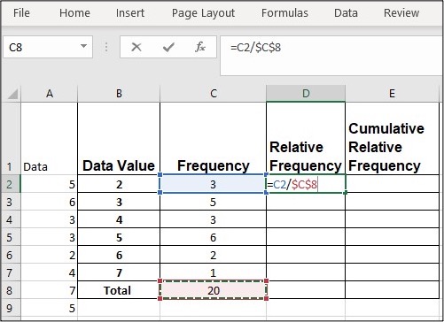
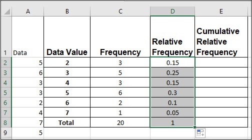
Twenty students were asked how many hours they worked per day. Their responses, in hours, are as follows: 5; 6; 3; 3; 2; 4; 7; 5; 2; 3; 5; 6; 5; 4; 4; 3; 5; 2; 5; 3.
- In cell D2, enter =, click cell C2, enter /, and click C8 F4 (F4 holds a cell constant)
- Click Enter, 0.15 shows in D2
- Click D2, move the mouse to the right bottom corner, a little + shows up
- Click on the little + and drag down to repeat cell
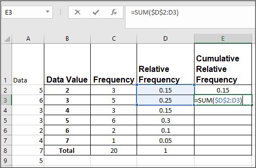
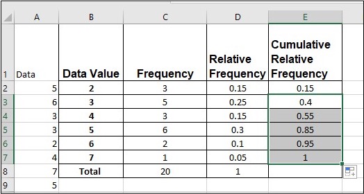
Cumulative Relative Frequency in Excel
Twenty students were asked how many hours they worked per day. Their responses, in hours, are as follows: 5; 6; 3; 3; 2; 4; 7; 5; 2; 3; 5; 6; 5; 4; 4; 3; 5; 2; 5; 3.
- In cell E2, enter =, click D2 and Enter
- In cell E3, enter =SUM($D$2:D3)
- Click Enter, 0.4 shows in E3
- Click E3, move the mouse to the right bottom corner, a little + shows up
- Click on the little + and drag down to repeat cell
Pivot Table
- A Pivot Table helps to arrange and summarize complex data.
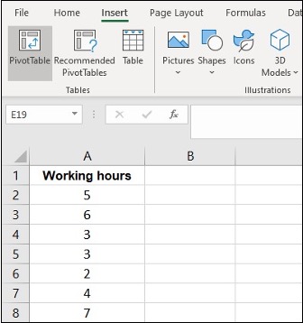
Pivot Table for Frequency in Excel
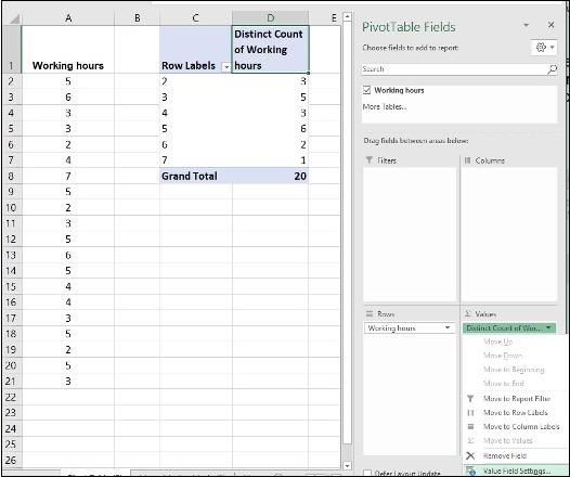
Twenty students were asked how many hours they worked per day. Their responses, in hours, are as follows: 5; 6; 3; 3; 2; 4; 7; 5; 2; 3; 5; 6; 5; 4; 4; 3; 5; 2; 5; 3.
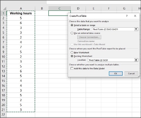
- Enter all data in column A
- Click Insert, Pivot Table
- Click on the area of Table/Range, highlight all data
- Click on the area of Location, click on cell C1 on where the pivot table will display
- Click OK
- Click on Working hours, hold and drag down to Rows area
- Click on Working hours, hold and drag down to Values area
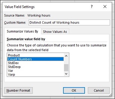
- Click on the drop-down icon, Value Field Setting
- Choose Count Numbers, click OK
Media Attributions
- Screenshots of Excel are used with permission from Microsoft.
