Descriptive Statistics – Excel Tools Instruction
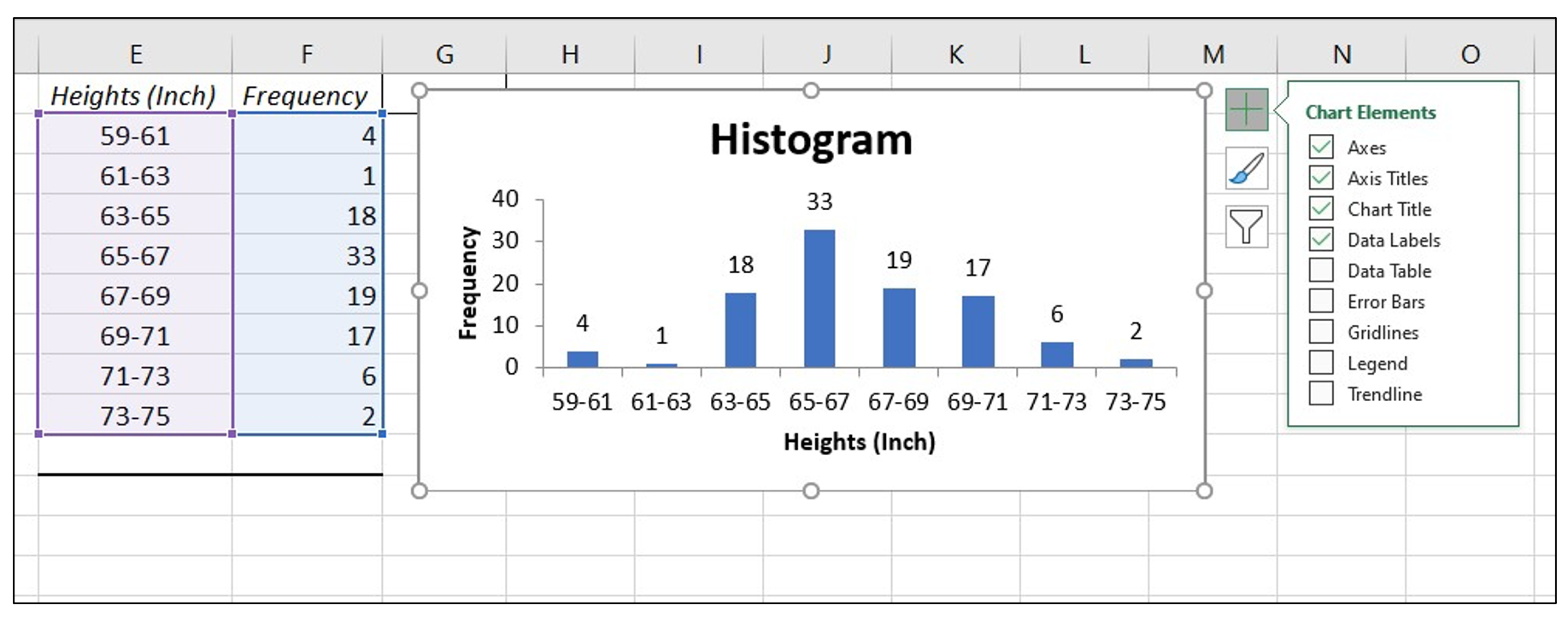
Histogram
- A histogram consists of contiguous (adjoining) boxes. It has both a horizontal axis and a vertical axis. The horizontal axis is labeled with what the data represents (for instance, distance from your home to school). The vertical axis is labeled either frequency or relative frequency (or percent frequency or probability). The graph will have the same shape with either label. The histogram (like the stemplot) can give you the shape of the data, the center, and the spread of the data.
Histogram in Excel
The following data are the heights (in inches to the nearest half inch) of 100 male semiprofessional soccer players. The heights are continuous data, since height is measured.
60; 60.5; 61; 61; 61.5; 63.5; 63.5; 63.5; 64; 64; 64; 64; 64; 64; 64; 64.5; 64.5; 64.5; 64.5; 64.5; 64.5; 64.5; 64.5 66; 66; 66; 66; 66; 66; 66; 66; 66; 66; 66.5; 66.5; 66.5; 66.5; 66.5; 66.5; 66.5; 66.5; 66.5; 66.5; 66.5; 67; 67; 67; 67; 67; 67; 67; 67; 67; 67; 67; 67; 67.5; 67.5; 67.5; 67.5; 67.5; 67.5; 67.5; 68; 68; 69; 69; 69; 69; 69; 69; 69; 69; 69; 69; 69.5; 69.5; 69.5; 69.5; 69.5; 70; 70; 70; 70; 70; 70; 70.5; 70.5; 70.5; 71; 71; 71; 72; 72; 72; 72.5; 72.5; 73; 73.5; 74
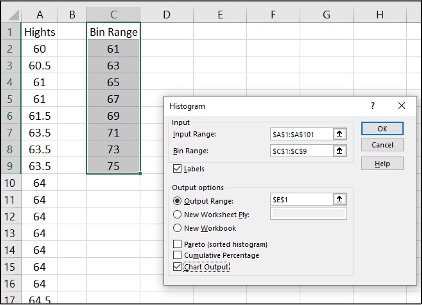
- Enter the data into column A. Create bins Range into column C
- Click Data, Data Analysis, Histogram and OK
- Specify Input Range ($A$1:$A$101), Bin Range ($C$1:$C$9), and Output Range ($E$1)
- Click Labels, Chart Output and OK
- Make changes for the Histogram (i.e. delete Frequency, More on the right side)
- Click on one blue rectangle, right click, click Format Data Series
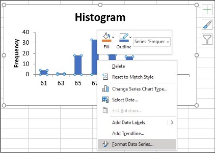
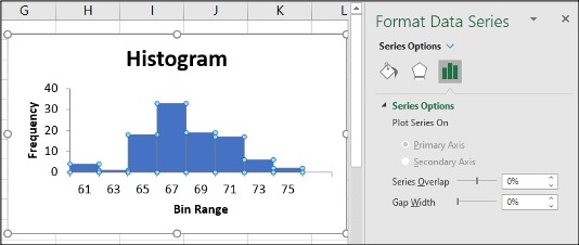
- To change the ‘gap width’, click on symbol ı under Gap Width slide line, hold and slide it to 0%
- Click on the Histogram and icon + to make changes
- Change Axis Titles
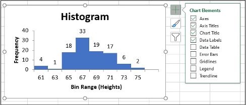
To change the bin range on the histogram table, change the values in the X-Axis data.
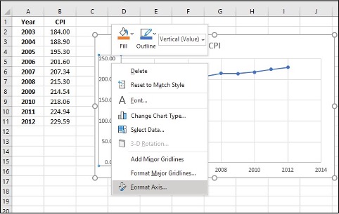
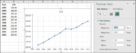
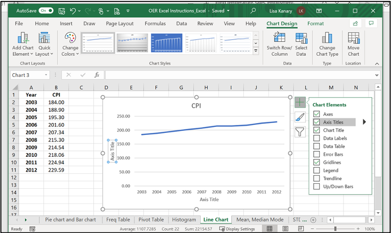
Line Chart
- A line chart is often used to represent a set of data values in which a quantity varies with time. These graphs are useful for finding trends. That is, finding a general pattern in data sets including temperature, sales, employment, company profit or cost over a period of time.
Line chart in Excel
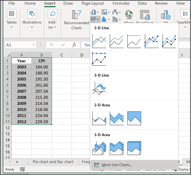
- Enter the data (Year and Annual) into column A, B
- Highlight the columns of data, click Insert, Line Chart
- Click “More Line Charts”
- Choose the graph with a single line.
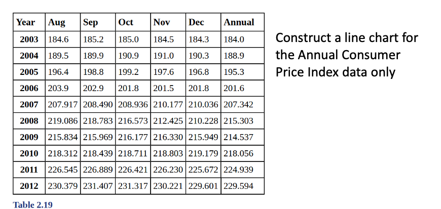
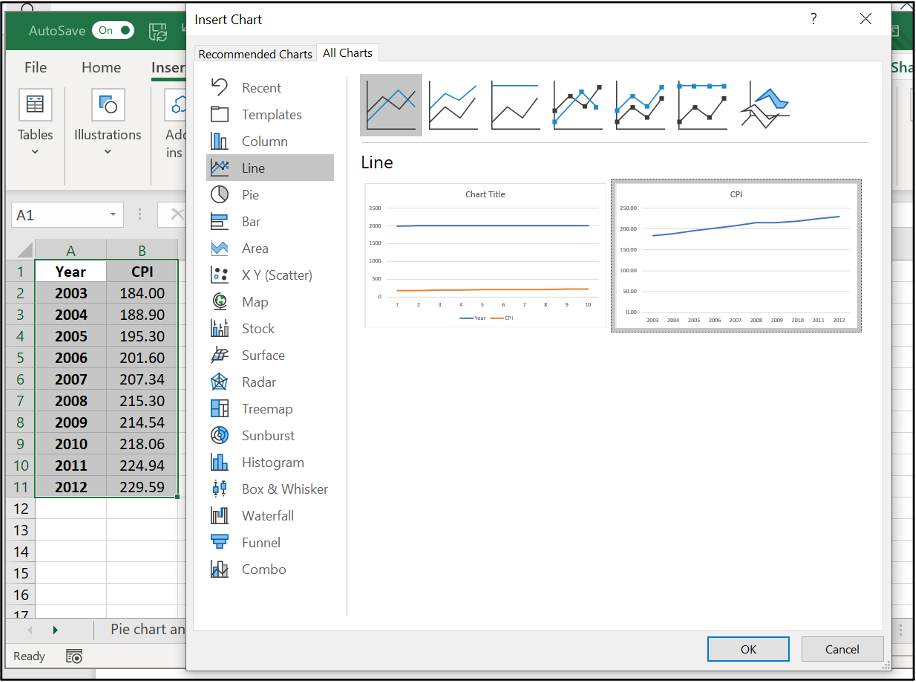
- Click on Y-axis data, right click, Format Axis
- Change Minimum and Maximum values which suit your data best, click Enter
- Click on the new bar graph and icon + to make Axis title changes
Mean, Median & Mode
- Mean: a number that measures the central tendency of the data; a common name for mean is ‘average’.
- Median: a number that separates ordered data into halves; half the values are the same number or smaller than the median and half the values are the same number or larger than the median. The median may or may not be part of the data.
- Mode: the value that appears most frequently in a set of data.
Mean, Median & Mode in Excel (Formula tool)
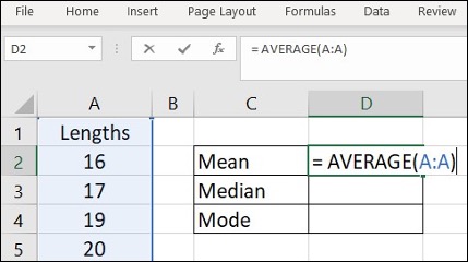
Use the following information to answer the next three exercises: The following data show the lengths of boats moored in a marina. The data are ordered from smallest to largest:
16; 17; 19; 20; 20; 21; 23; 24; 25; 25; 25; 26; 26; 27; 27; 27; 28; 29; 30; 32; 33; 33; 34; 35; 37; 39; 40
- Enter the data into column A
- Create a table for Mean, Median and Mode
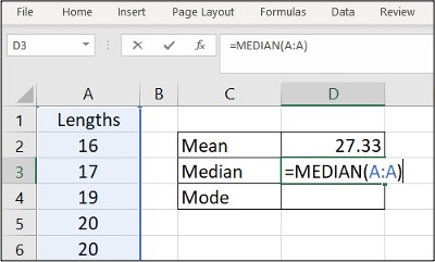
- Enter =AVERAGE(A:A) in cell D2, click Enter
- Enter =MEDIAN(A:A) in cell D3, click Enter
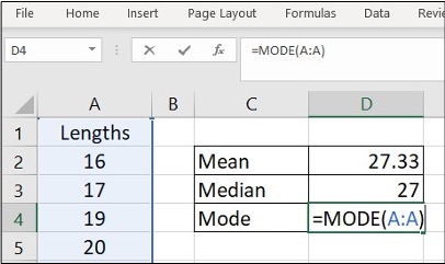
- Enter =MODE(A:A) in cell D4, click Enter
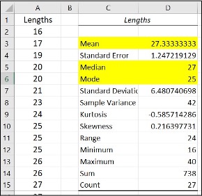
Mean, Median & Mode in Excel (Data Analysis tool)
Use the following information to answer the next three exercises: The following data show the lengths of boats moored in a marina. The data are ordered from smallest to largest:
16; 17; 19; 20; 20; 21; 23; 24; 25; 25; 25; 26; 26; 27; 27; 27; 28; 29; 30; 32; 33; 33; 34; 35; 37; 39; 40
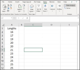
- Enter the data into column A
- Click Data, Data Analysis
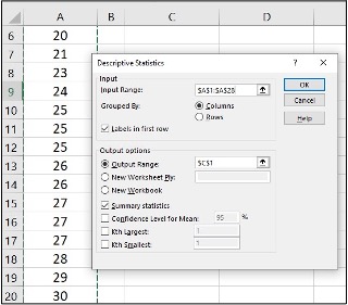
- Click Descriptive Statistics, OK
- Specify Input Range ($A$1:$A$28), Output Range ($C$1)
- Click Labels in first row, Summary statistics and OK
- Find Mean, Median and Mode in the Summary statistics table
Variance & Standard Deviation
- The variance is the average of the squares of the deviations.
- If x is a number, then the difference “x minus the mean” is called its deviation. The standard deviation is a number that is equal to the square root of the variance and measures how far data values are
from their mean. - Notation: s for sample standard deviation and σ for population standard deviation.
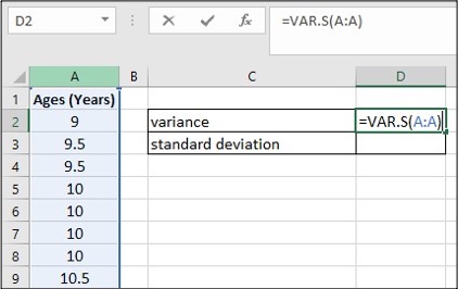
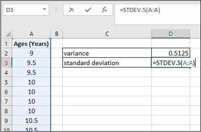
Variance and Standard Deviation in Excel (Formula tool)
In a fifth-grade class, the teacher was interested in the average age and the sample standard deviation of the ages of her students. The following data are the ages for a SAMPLE of n = 20 fifth grade students. The ages are rounded to the nearest half year: 9; 9.5; 9.5; 10; 10; 10; 10; 10.5; 10.5; 10.5; 10.5; 11; 11; 11; 11; 11; 11; 11.5; 11.5; 11.5;
- Enter the data into column A
- Create a table for Variance and Standard deviation
- Enter =VAR.S(A:A) in cell D2, click Enter
- Enter =STDEV.S(A:A) in cell D3, click Enter
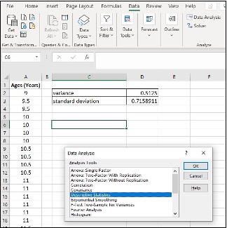
Variance and Standard Deviation in Excel (Data Analysis tool)
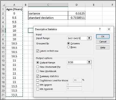
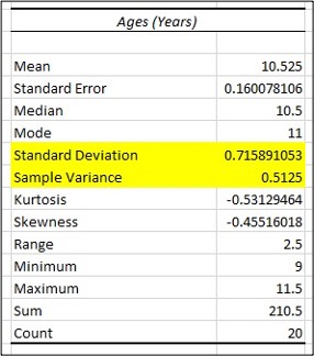
In a fifth-grade class, the teacher was interested in the average age and the sample standard deviation of the ages of her students. The following data are the ages for a SAMPLE of n = 20 fifth grade students. The ages are rounded to the nearest half year: 9; 9.5; 9.5; 10; 10; 10; 10; 10.5; 10.5; 10.5; 10.5; 11; 11; 11; 11; 11; 11; 11.5; 11.5; 11.5;
- Enter the data into column A
- Click Data, Data Analysis
- Click Descriptive Statistics, OK
- Specify Input Range ($A$1:$A$21), Output Range ($C$6)
- Click Labels in first row, Summary statistics and OK
- Find Variance and Standard Deviation in the Summary statistics table
Quartiles
- Quartiles are the numbers that separate the data into quarters; quartiles may or may not be part of the data. The second quartile is the median of the data.
Quartiles in Excel
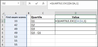
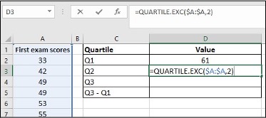
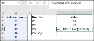
Use the following data (first exam scores) from Susan Dean’s spring pre-calculus class:
33; 42; 49; 49; 53; 55; 55; 61; 63; 67; 68; 68; 69; 69; 72; 73; 74; 78; 80; 83; 88; 88; 88; 90; 92; 94; 94; 94; 94; 96; 100
- Enter the data into column A, and sort them
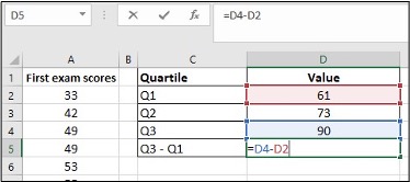
- Create a table for Q1, Q2, Q3 and Q3-Q1
- Enter =QUARTILE.EXC($A:$A,1) in cell D2, click Enter
- Enter =QUARTILE.EXC($A:$A,2) in cell D3, click Enter
- Enter =QUARTILE.EXC($A:$A,3) in cell D4, click Enter
- Enter = in cell D5, click on cell D4, enter –, clike on cell D2, click Enter
Media Attributions
- Screenshots of Excel are used with permission from Microsoft.
