Generating Customer Demand and Nurturing Leads & Prospects
11 Website and Landing Page Optimization
Learning Objectives
By the end of this chapter, you should be able to:
- Conduct a website audit
- Describe the key elements of a successful landing page
Website Optimization
Now that you’ve learned the basic approaches behind SEO, let’s look specifically at website optimization. As with any marketing strategy, the first question to ask is: who is the audience you are optimizing your website for? Website content often needs to support several audiences and each audience has slightly different content requirements. Here is a list of common target audiences for a website:
- Customers
The most common audiences would be potential and existing customers, i.e., those customers represented by your customer personas. When optimizing for these audiences you want to make sure your content is addressing their wants, needs, pain points, goals, and objectives.
- Strategic Partners, Alliances, Vendors
Many organizational websites also include content for strategic partners and vendors. For example, this could be suppliers, funders, investors, etc. The needs and content required for these audiences tends to differ from target customers. Given the distinct needs of these audiences, what specific content or information should be available for them?
- Search Engines
As we discussed in the SEO chapter, preparing your website so that search engines can find, read, and index your content requires yet another approach. If you are wondering which search engines to optimize for, according to the most recent statistics by Statcounter[1], Google represents ~92% of searches and Bing is a distant second with ~3%. This is why most SEO is focused on Google.
- Your Organization / Brand
Your website may also be a source of information for your employees and for customer support. Do you have a self-serve support section? Or do you have a place where employees can discover the latest news to share with their networks? Remember, in our POEM framework, that employees are also considered “owned media” and can promote organizational content, as well.
Based on the above audiences, optimizing your website content will vary depending on which audiences you prioritize. So, identify, define, and rank your target audiences first.
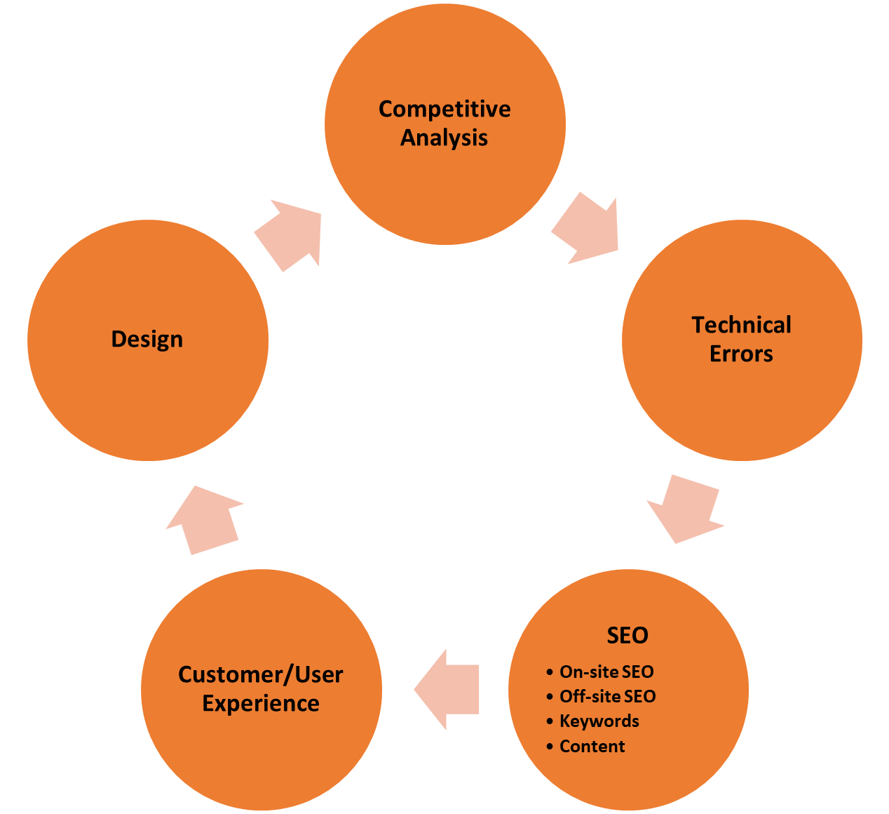
5-Step Website Audit Process

The above image highlights a 5-Step Website Audit process that covers the critical stages in a optimizing your website:
- Competitive Analysis
- Technical Errors
- SEO
- Customer / User Experience
- Design
Step 1: Competitive Analysis
Before optimizing your own website, do take time to review your competitors’ websites. Marketers can glean a great deal of information from this process. For example, it can be beneficial to understand the keywords your competitors are using, how content is organized and presented, who is visiting their website, and provide additional digital marketing ideas to better market your own solutions.
To perform a competitive analysis, there are many free competitor analysis tools. These can give you quick and valuable insights, and many services offer paid, premium versions, as well. The following table presents several competitive analysis tools and lists their features across a variety of areas: search optimization, digital advertising, link authority, social media, traffic, and technology.
| Tool | Rankings | Advertising | Authority | Social Media | Traffic | Technology |
|---|---|---|---|---|---|---|
| Ahrefs | [latex]\checkmark[/latex] | – | [latex]\checkmark[/latex] | – | – | – |
| Alexa | [latex]\checkmark[/latex] | [latex]\checkmark[/latex] | [latex]\checkmark[/latex] | – | [latex]\checkmark[/latex] | – |
| Builtwith | – | – | – | – | – | [latex]\checkmark[/latex] |
| Buzzsumo | – | – | [latex]\checkmark[/latex] | [latex]\checkmark[/latex] | – | – |
| FollowerWonk | – | – | – | [latex]\checkmark[/latex] | – | – |
| iSpionage | [latex]\checkmark[/latex] | [latex]\checkmark[/latex] | – | – | – | – |
| Majestic | [latex]\checkmark[/latex] | [latex]\checkmark[/latex] | [latex]\checkmark[/latex] | – | – | – |
| Moat | – | [latex]\checkmark[/latex] | – | – | – | – |
| MOZ / Link Explorer | – | – | [latex]\checkmark[/latex] | – | – | – |
| Quantcast | – | – | – | – | [latex]\checkmark[/latex] | – |
| SimilarWeb | [latex]\checkmark[/latex] | – | – | [latex]\checkmark[/latex] | [latex]\checkmark[/latex] | – |
| Searchmetrics | [latex]\checkmark[/latex] | [latex]\checkmark[/latex] | [latex]\checkmark[/latex] | – | – | – |
| SEMrush | [latex]\checkmark[/latex] | [latex]\checkmark[/latex] | [latex]\checkmark[/latex] | [latex]\checkmark[/latex] | – | – |
| Serpstat | [latex]\checkmark[/latex] | [latex]\checkmark[/latex] | [latex]\checkmark[/latex] | [latex]\checkmark[/latex] | – | – |
| SpyFu | [latex]\checkmark[/latex] | [latex]\checkmark[/latex] | [latex]\checkmark[/latex] | – | – | – |
Each tool evaluates different aspects of digital marketing and website criteria. So, let’s look at each one of these in more detail:
Keyphrases and Search Engine Rankings
What do they rank for?
Seeing what your competitors rank for and how high will immediately provide ideas for content and keyphrases. Without using a tool, the only way to find this information would be to search for every conceivable keyphrase.
Pay Per Click and Digital Advertising
What phrases are they bidding on? Where are they investing their ad budgets? What do their ads look like?
Like organic rankings, understanding a competitor’s ad spending will provide insights into what might be a good investment for you. Assuming they have well-managed, well-optimized ad campaigns, you can see which words and phrases are getting traction with your target audiences.
Authority and Link Popularity
Do they have higher quality and more authoritative links than us?
As discussed in the SEO chapter, links can signal a website’s value. Sites with many links from other relevant and related websites will likely have higher authority, especially if the links are from sites that have high authority themselves.
Beyond the number, you can also use these reports to find marketing opportunities. For example, if a media site or blog has mentioned and linked to a competitor, it may be a good site to promote or write about your solutions.
There are many tools that track links and provide authority metrics. Each service has a distinct name for the number, but essentially, they all measure the same thing: the likelihood of ranking on a scale from 1 – 100.
-
- MOZ: Domain Authority
- SEMrush: Domain Score
- Alexa: Competitive Power
- Ahrefs: Domain Rating
- Searchmetrics: Page Strength
Social Media
Which of their articles is getting shared the most? Who is sharing their content?
Social media accounts are easy to follow, but hard to analyze. You may be able to see which specific posts are getting engagement, but the bigger picture is difficulty to see without tools. So, using these tools can be very useful and spark ideas for what to write about, where to be active, and who to collaborate with.
Traffic
Are they getting more traffic?
There are no tools that will provide an accurate look into your competitor’s analytics. But there are ways to get website traffic estimates. Some of the above tools can provide an overview into who is getting more visitors, when they visit, demographics and behaviour data. This data can be quite helpful in completing your customer personas.
Technology
What technology is their site built on and what tools are they using?
Website technology is surprisingly visible, and there are services that can find out exactly what is powering your competitor’s website, as well as what additional tools and plugins are being used. This can potentially provide information about what tactics your competitors are using and what might work well for you.
Step 2: Technical Errors
Now that you have reviewed your competitors’ websites and possibly have ideas about how to improve your website, let’s take a look at the most common technical errors that might exist on your own website:
- HTTPs Status
Make sure that your website has a TLS/SSL certificate. Websites secured with a TLS/SSL certificate will display HTTPS and the small padlock icon in the browser address bar. An HTTPS connection indicates that your website is secure and that communications between your web browser and the web application are encrypted. Having a secured website impacts your search engine ranking because websites with TLS/SSL certificates rank higher. - Page Speed Test
According to recent research, if your site takes more than 3 seconds to load, you lose 75% of your potential readers. Therefore, it is crucial to make sure your webpages load quickly. A recommended tool to test for webpage load speeds is Google PageSpeed Insights[2]. - Broken Images and Links
Links are quite important to your SEO. However, broken links undermine these efforts and decrease your site’s search engine ranking and user-friendliness. So, removing any broken images and links, i.e., links that no longer resolve to a valid webpage, is an easy way to improve your search engine ranking. - Mobile Optimization
Is your website optimized for a mobile experience? Being mobile friendly improves the user experience and increases your site’s ranking.
Since these technical errors are easy to detect, using a site auditor tool is highly recommended. Once again, here is a list of website audit tools that can be useful:
| Name | Price | Features |
|---|---|---|
| Hubspot Website Grader[3] | Free |
|
| Hotjar[4] | 15-Day Free Trial $99+ per month |
|
| Google Search Console[5] | Free |
|
| Serpstat[6] | $69 – $499 per month |
|
| RAVEN Site Auditor[7] |
$39 – $399 per month |
|
| SEMrush Site Auditor[8] |
$99.95 – $399.95 per month |
|
| WebCEO Site Auditor[9] |
14-Day Free Trial $99 – $299 per month |
|
Step 3: On-Site & Off-Site SEO
On-site and off-site SEO represent the next step in the framework. Summarizing the details covered in the SEO chapter, you will want to improve your on-site and off-site SEO by addressing the following key areas:
- Keywords, Phrases, & Questions
Identify and build a comprehensive list of appropriate keywords, phrases, and questions that your target audiences might use. Many of the previous steps in this 5-Step Website Audit process should assist in compiling this list.
- Structural Elements of Webpages
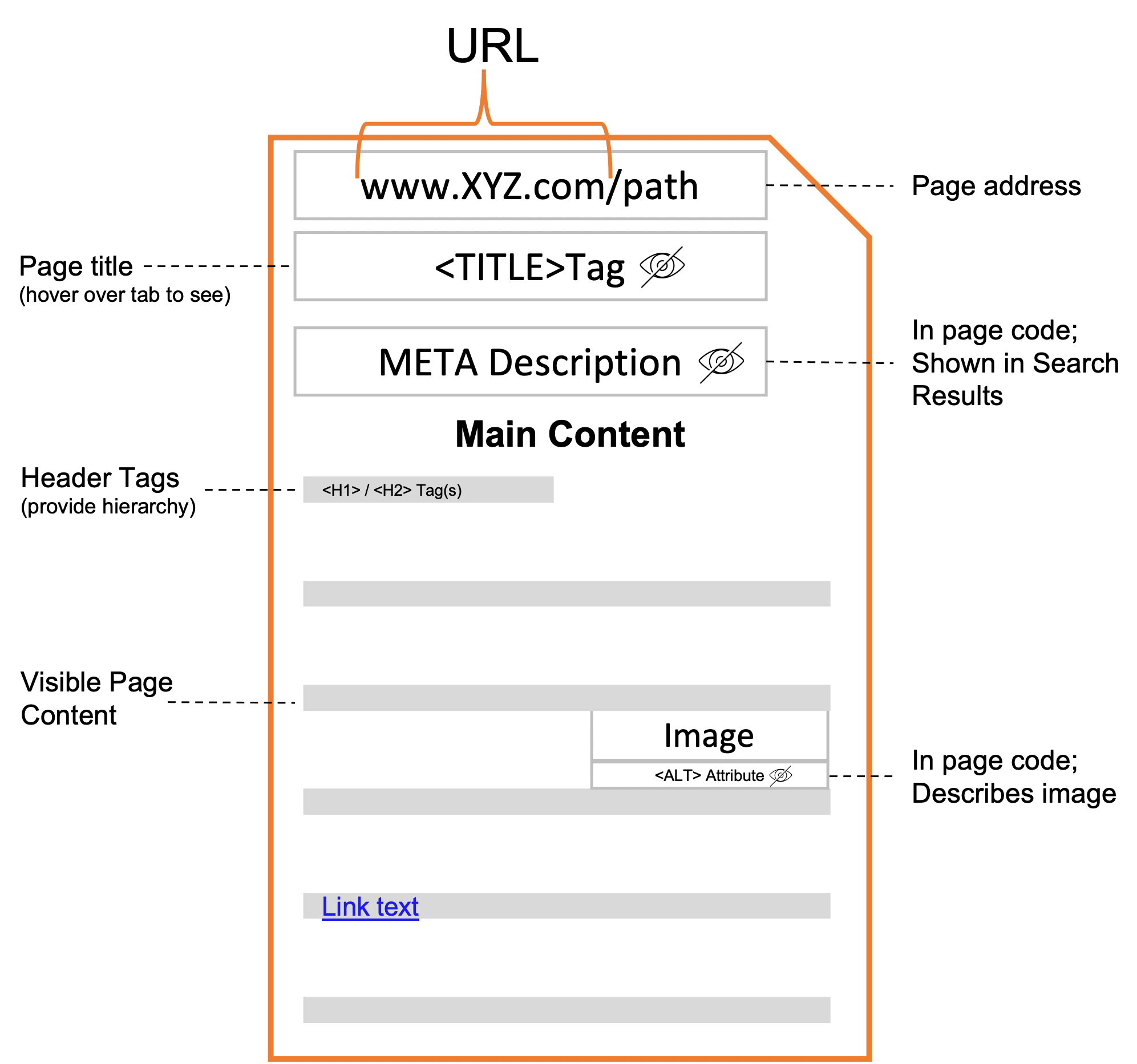
Make sure to update and include your keywords into the structural elements of your webpages.
(click on the pluses below for details)
- Link Building
Implement a comprehensive content marketing and link building strategy to increase your link network and ultimately, improve your link authority. Especially for newer websites, developing content using keywords will usually provide more SEO benefits that simply trying to get backlinks. So, think about getting backlinks based your content, not just links on their own.
Step 4: Customer & User Experience (CX / UX)
Now that you have identified your audiences and the appropriate content, let’s look at the experience of accessing and discovering that content. According to Wikipedia:
The user experience is how a user interacts with and experiences a product, system, or service. It includes a person's perceptions of utility, ease of use, and efficiency.
Given the above definition, let’s look at how your website contributes to your customer experience and what areas you should evaluate:
- Simple / easy-to-use navigation
This may seem obvious, but many websites are so complicated and have so much content that it can be difficult to find the content you want. When reviewing your website, think about the following questions:- How many clicks / scrolls does it take to get to the relevant information?
Be careful about assuming what visitors see. This is particularly important when thinking about the mobile vs. desktop experience.
- Is the navigation “intuitive”, i.e., does it follow “standard” navigation practices?
When we go to a new website, there are standard navigation expectations and does your website follow them? For example, is the account login link in the top, right-hand corner of the webpage or is there a navigation menu at the top?
- Is there are search bar?
There are generally two types of visitors: browsers and searchers. Browsers will browse their way through a website, clicking on links to discover and explore what the website offers. In contrast, searchers know exactly what they want to find and are looking for specific information or answers. Having a search bar allows searchers to more easily find what they want without have to unnecessarily click around the website.
- How many clicks / scrolls does it take to get to the relevant information?
- “Unnecessary” obstacles / hurdles
Marketers often want to convert visitors as quickly as possible when on their website. This can result in “interruptions” like pop-ups, which marketers may use to get visitors to sign-up for something or to promote an offer. When launching this strategy, think about your goals and objectives and ask: will these tactics attract our target customers and how valuable or long-lasting are these conversions? Also, look at your bounce or exit analytics because you may see that these tactics are more disruptive than helpful, i.e., you are pushing leads away. Use the following tactics carefully and not too frequently:- Pop-ups (can be especially problematic on mobile)
- Automatic Live Chat pop-ups
- Relevant and credible content
Based on the previous steps, prioritize your content. Make sure the content you are presenting is relevant and credible to your target audiences. It should answer and provide solutions to target customers' questions, pain points, and challenges. Make sure your content is organized and addresses the following:- Hierarchy
Content hierarchy refers to the location of content on your website and webpages. For example, the most important content should be available on initial entry pages and preferably, at the top of those pages. When visitors come to your website or webpage, the most important information should be easily visible and available without significant scrolling or clicking required.
- Social proof
Be sure to include testimonials, customer logos, certifications, etc. to highlight your credibility, industry leadership, and expertise.
- Hierarchy
- Clear calls-to-action (CTAs)
And, finally, for an optimal customer experience, make sure that all links, buttons, and any other calls-to-action are clear, consistent, and stand out.
A poor customer experience negatively impacts your entire customer journey. So, review and optimize all audience experiences to make them as easy and seamless as possible. For a nice overview on navigation, hierarchy, and colour (which we will discuss in the next step), you can watch the following video:
Watch: Key Web Design Principles: Navigation, Hierarchy & Color (11:30 mins)
Step 5: Design
In this next step, we will briefly discuss a few website design areas that can help optimize your website experiences. Having a well-designed, well-laid out website can positively impact your visitors’ perceptions of your content and brand. Here are a few design areas you may want to review as part of your website audit:
- Design Consistency
Since websites are literally living documents, consistency of design elements makes it easier for visitors to understand and navigate them. Inconsistencies are usually a result of design standards or preferences changing over time and/or a variety of people creating content using different standards. As a result, it is important to audit your website and review the following design elements to make sure they are consistent:- Fonts
Make sure that your fonts and font sizes are consistent. Especially look for any fonts that might be too small, keeping in mind the mobile experience. Often what looks fine on a desktop, may not work well on a mobile device.
- Imagery
Try to stick to similar types of imagery. For example, mixing animated images or clip art with real-world photos can create an inconsistent website design. Pick a style of images and/or icons and stick to them.
- Colours
Make sure that your website colours are on brand. If possible, work from a defined colour palette or brand guidelines so that there is consistency around which colours are used and for which purposes.
- Layouts
Using website templates can ensure that your layouts are consistent. However, if your website has sub-sections, e.g., a customer support portal, do make sure that it has consistent navigation and allows for easy navigation between sections.
- Calls-to-Action (CTAs)
As mentioned above, make sure that your calls-to-action are designed in the same way so that they are recognizable as calls-to-action, e.g., colour, size, font, shading, borders, etc.
- Brand voice
Is the voice of your brand consistent throughout your website? Again, if multiple people have been maintaining the website content, there may be areas that need rewriting or updating.
- Fonts
- Whitespace
An area often overlooked in website design is whitespace. Whitespace is the “empty” or blank space between content on a webpage. Having ample whitespace makes the content easily scannable and can significantly improve comprehension.
Please note that website design is a complex, detailed discipline. The above design considerations are simply a few high-level areas that can have a significant impact on your website optimization.
Landing Pages
Now that you know the key areas to consider as part of a website audit, let’s take a look at a very specific type of webpage called a landing page. In digital marketing, a landing page is typically a standalone webpage, created specifically for a marketing or advertising campaign. A landing page is where a visitor “lands” after clicking on an ad or a link. Landing pages can be existing pages on your website, but when planning a marketing campaign, marketers usually prefer to have a landing page with specific messaging, imagery, and often, a unique call-to-action, e.g., book an XYZ demo, etc.
Landing pages are designed to maximize conversion. As a result, they often minimize the number of links and other website navigation options. This is referred as the attention ratio. The attention ratio is the number of things a visitor can do on a page relative to the number of things they should be doing. In an optimized marketing campaign, the attention ratio of a landing page should be 1:1. Since every campaign has one conversion goal, every corresponding landing page should only have one call to action, i.e., one place to click. In comparison, a typical home page, may have 10 – 15 calls-to-action. But, as the attention ratio goes up, i.e., more links to click on, conversions go down. So, for an optimal conversion experience, marketers will want to limit the number of click options on their landing pages.
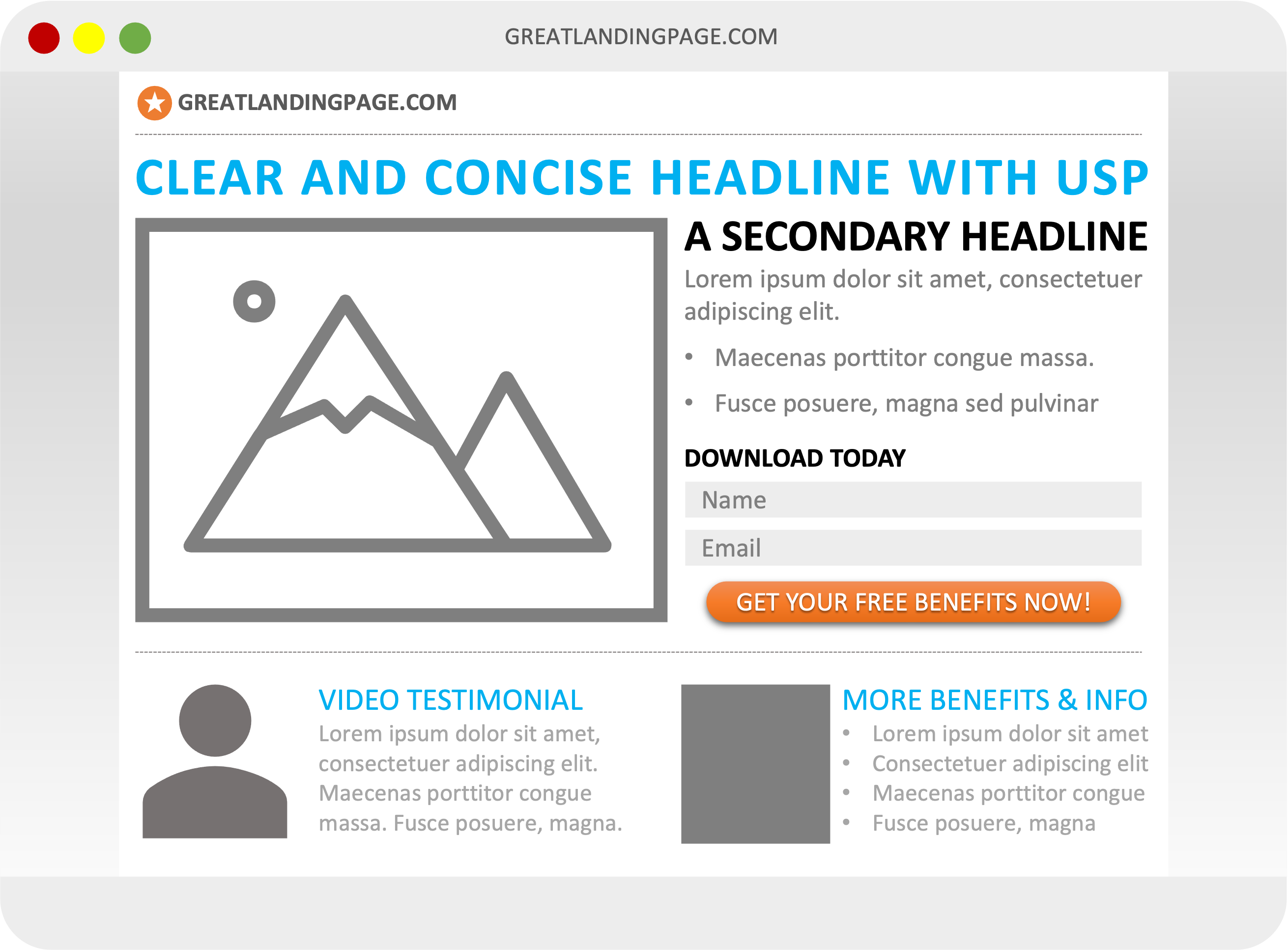
Building on this optimization strategy, let’s look at which elements should be included in an optimized landing page. Generally speaking, there are five key elements to any successful landing page. The following image presents these elements on a generic landing page:
(click on the pluses below for details)

- Clear unique selling proposition (USP)
Your unique selling proposition differentiates your offer from the competition’s and should highlight what is compelling about your offer. To ensure your target audience understands your USP, be sure to include it in your main headline, any supporting headlines (if present), and in a closing argument before asking for the conversion / call-to-action.
- Engaging hero shot
A hero shot is a visual element that represents your offer and helps your target audience better understand what you are offering or what it looks like. It could be an image, video, or any other visual media type.
- Compelling benefits
Often marketers will list the features of their offer. Try to rework your features and present them as benefits your target audience will receive. A feature is what something is, and a benefit is what users can do or accomplish with it. On your landing page, answer how your target audience will benefit from your product or service. Let’s walk through a quick feature-benefit example:
Product: mobile phone
Feature: a battery pack with 2000 mAh capacity
Advantage: a powerful, long-lasting battery
Customer benefit: Increase your phone’s battery life by up to 50% so you can enjoy 3D gaming on your long commute without worrying about the battery running out.
- Inspirational social proof
As discussed, social proof highlights other people or organizations that have bought, consumed, read, participated in, and ideally, succeeded using what you are offering. Common social proof examples include testimonials, customer logos, industry certifications, awards, etc.
- Strong call-to-action (CTA)
The goal of every landing page is to convert; always ask for the conversion with a strong call-to-action that highlights the benefits the visitor will receive.
For more details and examples, please review this Unbounce article, The 5 Essential Elements of a Winning Landing Page.
Key Takeaways
Website and landing page optimizations are critical to successfully convert prospective customers. By performing a 5-Step website audit and optimizing your landing pages, you can significantly improve your customer experiences, as well as increase campaign conversions.
- The five key stages of a website audit are:
- Conduct a competitive analysis
- Identify any technical errors
- Implement an SEO strategy
- Evaluate the customer / user experience
- Review the website design
- The five elements of a successful landing page include:
- Clear unique selling proposition (USP)
- Engaging hero shot
- Compelling benefits
- Inspirational social proof
- Strong call-to-action (CTA)
Website & Landing Page Optimization - Additional Resources
In addition to the resources listed in the chapter, here are a few more articles and courses that provide additional details:
-
15 Step Website Audit Checklist (& PDF Template)
- 10 User Testing Tools to Try
- Unbounce Landing Page course (Free - 3 hrs.)
Media Attributions
- 5-step website audit process by Rochelle Grayson is licensed under a CC BY 4.0 licence.
- KEY Web Design Principles: Navigation, Hierarchy & Color by Flux Academy is licensed under a Standard YouTube License.

