Lab 06: Climate Analysis with Virtual Globes
Andrew Perkins
How have scientists come to the conclusion that global climate is rapidly changing? It’s based on the scientific method and repeated hypothesis testing. Specifically, by observing global temperature and precipitation records over the long term and looking for significant change. While atmospheric conditions have been subtly changing for decades, we’ve only been consistently and directly measuring key climate indicators like atmospheric carbon dioxide levels since the 1960’s. However, the widespread existence of weather stations around the world, with regular, reliable weather observations, allows us to go further back in time to see the pattern of changing climate over the last century and beyond.
In this lab, you will explore the underlying causes of changing climate, human contributions to this, and analyze actual temperature records from some of the longest running weather stations in Canada to determine if they demonstrate a trend in changing climate over time. At the end of this lab, you will have a good sense of one line of evidence for contemporary climate change.
Learning Objectives
After completion of this lab, you will be able to
- Read and graph monthly average temperatures by decade from historical data sources.
- Analyze trend lines in graphed data for change over time.
- Interpret histograms.
- Understand the basis in data for modern climate change.
Pre-Readings
What Causes Earth’s Climate to Change Over Time?
Atmospheric gases play a significant role in maintaining a global energy balance. Through transmission, reflection, absorption, and refraction they affect radiation emitted by the sun as it travels to and from Earth’s surface. Energy from the Sun comes as shortwave energy at the UV and visible end of the electromagnetic spectrum. Energy re-emitted from Earth is much lower in temperature and has a longer wavelength. Some of the re-emitted longwave radiation from Earth is temporarily trapped within the atmosphere before it escapes back into space, resulting in heat retention. This is known as the greenhouse effect (Figure 6.1).
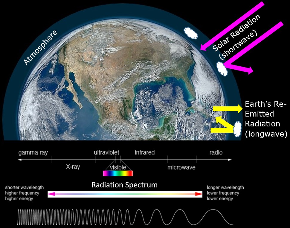
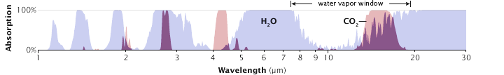
The differing wavelengths (commonly measured in micrometres, μm) between incoming solar radiation and outgoing radiation re-emitted by Earth allow atmospheric gases to play specific roles in controlling the transmission of these wavelengths. For example, water vapour (H2O), absorbs mostly energy in the longwave end of the spectrum, blocking energy re-emitted from Earth (Figure 6.2). In contrast, oxygen (O2) and ozone (O3), absorb mostly energy in the shortwave end of the spectrum (high-energy incoming solar radiation). This difference – where high-energy radiation is passed through the atmosphere, but lower energy radiation is prevented from escaping – permits the greenhouse effect, which is what creates the conditions (climate) that allow life as we know it to exist on Earth.
So, the greenhouse effect is the basic process that underpins the global climate. Changes to the climate system do occur as a result of natural and anthropogenic (manmade) changes that affect how much energy enters or leaves Earth’s system, in other words, activities that affect Earth’s energy budget. These changes are known as climate forcings, and are outlined in Climate Forcings and Global Warming.
Carbon dioxide (CO2) is a gas that is very effective at absorbing long-wave radiation. Figure 6.2 shows that CO2 absorbs thermal radiation at a wavelength that water vapour does not. This is known as closing the atmospheric window, and is a reason that CO2 concentrations in the atmosphere play a large role in forcing the climate. One of the first scientific stations to measure CO2 concentrations over long periods is still operational at Mauna Loa in Hawai’i. To check it out, go to Keeling Curve of Carbon Dioxide Concentration at Mauna Loa Observatory. The data recorded here have allowed us to track detailed changes in carbon dioxide concentrations over time. These concentrations are usually measured in parts per million (ppm) where 1 ppm CO2 represents one CO2 particle per million atmospheric particles.
Since initial measurements at Mauna Loa began, we have augmented our understanding of global CO2 concentrations with more measuring stations and satellite measurements. This has allowed us to see a spatial distribution in CO2 emissions across the globe, and also better understand the global energy budget.
For an interesting way to visualize the pathway of escaping longwave (infrared) radiation, check out the Infrared Escape Game. See how the difficulty of this game changes between atmospheric concentrations of CO2 in the 1900s to expected concentrations in 2025.
Measuring Spatial Variation in Earth’s Energy Budget
When Earth’s energy budget is out of balance, global temperatures start to rise or fall. When this happens, ecosystems need to adjust which, depending on the rate of change, can be difficult to accomplish.
One way to analyze change in countries around the world is by using temperature records that extend into the historic past. Canada has several sites for which daily temperature records cover at least a 100-year period. These data are archived by Environment and Climate Change Canada. Others have organized this data into virtual globes to make it easier to explore.
The data collected from these locations is incredibly valuable for reconstructing changes in temperature over time, and analyzing how changes might be different at separate locations around the globe. This reinforces the importance of keeping consistent long term scientific datasets for the good of society in general, so we can better understand the systems we inhabit.
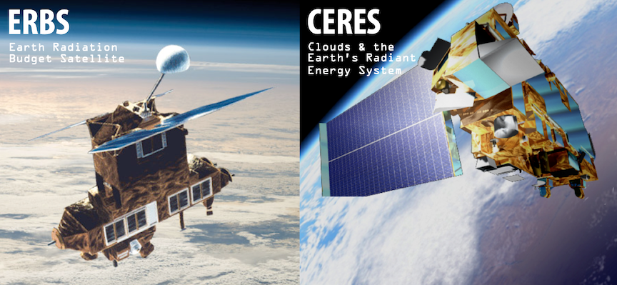
Since the 1970’s, space-based measurements have been possible from satellites that are measuring atmospheric and surface conditions on Earth. ERBS (Earth Radiation Budget Satellite) launched in 1984 and collected data on Earth’s radiation budget. One of the modern satellite systems to take over this role is CERES (Clouds and Earth’s Radiant Energy System) (Figure 6.3).
Lab Exercises
In these exercises you will
- Review the greenhouse effect and the basis for contemporary climate change.
- Analyze the pattern of carbon dioxide concentration in the atmosphere over recent decades.
- Observe and graph temperature trends from several Canadian weather stations over at least a century of time using this virtual globe (historical temperature data).
- Determine how the long term patterns of your analyzed weather stations fits in to the broader pattern of Canadian weather station observations by comparing values to long-term Climate Normals.
EX1: Solar Radiation and the Atmospheric Window
Figure 6.4 shows a detailed view of the atmospheric window. Part 1 shows spectral intensity of the radiation. Part 2 is a two-part graphic with the complete picture of absorption/scattering (gray) and transmission (white) at the top, and the absorption/scattering and transmission separated into individual atmospheric components at the bottom.
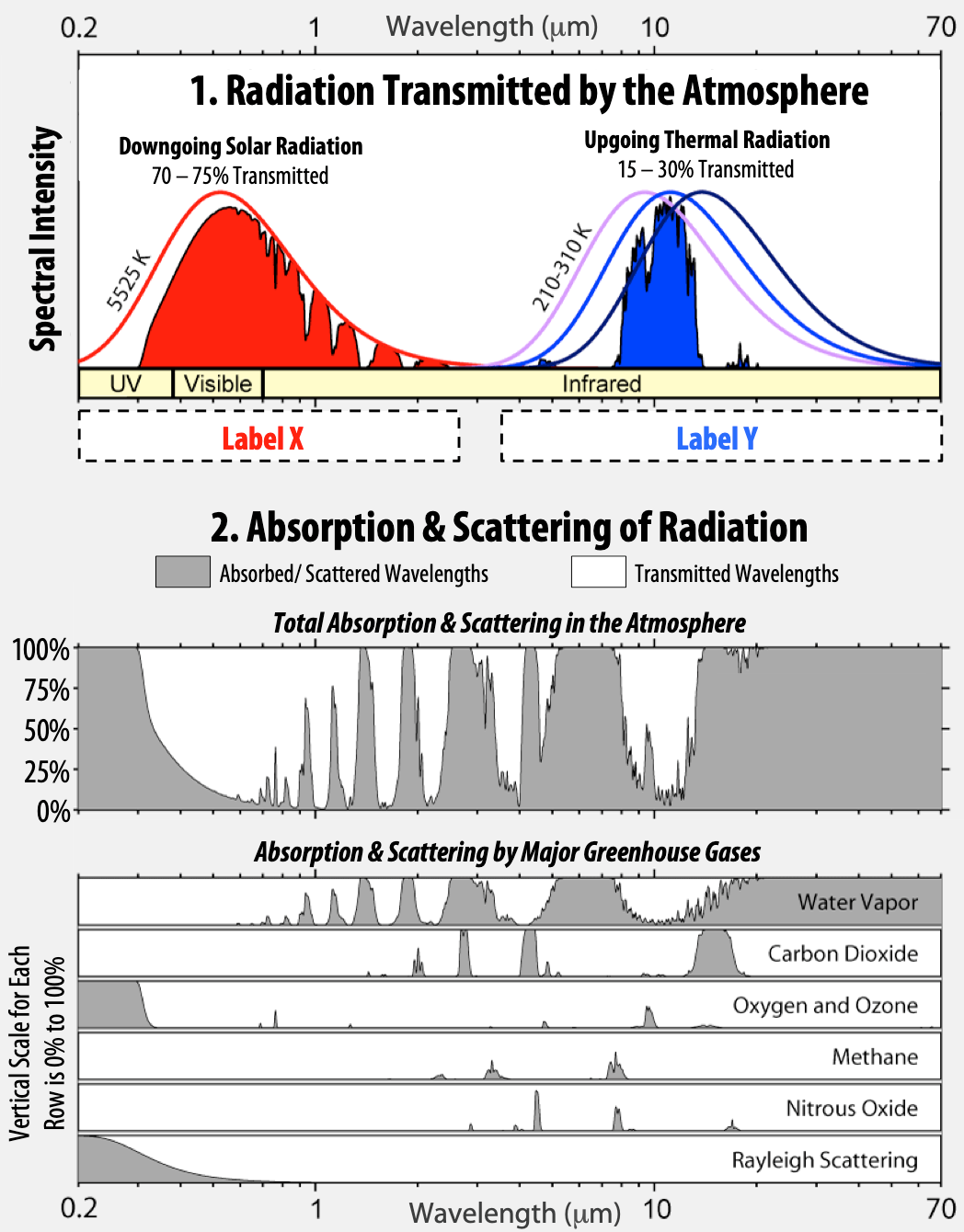
- There are spaces for two labels, Label X and Label Y under the first graph. Which of these labels should be shortwave and which should be longwave?
- What is the range of transmitted wavelengths for downgoing radiation coming from the Sun (indicated by the solid red shading)? Give your answer in micrometers (μm).
- What is the range of transmitted wavelengths for upgoing radiation released from Earth’s surface (indicated by solid blue shading)? Give your answer in micrometers (μm).
- Does a greenhouse gas like carbon dioxide (CO2) absorb mostly longwave or mostly shortwave radiation?
- Water vapor also acts as a greenhouse gas, yet it is not often talked about in the media with respect to climate change. Why are scientists more concerned about the impact of CO2 in the atmosphere than water vapor? Provide two reasons.
- Look at the monthly averages for atmospheric CO2 measured at Mauna Loa, Hawai’i.
- What was the maximum CO2 concentration measured in 1960?
- What was the maximum CO2 concentration measured in 2017?
- Based on the information in the previous questions, how much has CO2 concentration increased on average per year?
- Look at the graph demonstrating the growth rate of CO2 in our atmosphere as measured at Mauna Loa, Hawai’i. 10-year averages are indicated by the black horizontal lines on the graph:
- What was the average yearly increase in carbon dioxide at Mauna Loa over the decade of the 1960s?
- What was the average yearly increase in carbon dioxide at Mauna Loa over the decade of the 2000s?
- According to this graph have humans been successful in reducing the rate of carbon dioxide accumulation in the atmosphere?
EX2: Human Contributions of CO2 to the Atmospheric Reservoir
We know that there are many natural sources of CO2 emissions that contribute to the atmospheric CO2 reservoir. To better visualize the human contribution, we need to separate the human-generated component from the natural sources.
Imagine a world where the only contributions to CO2 in the atmosphere are from people (in this scenario, natural/non-human sources of CO2 do not exist). How much CO2 would build up in the atmosphere every year, simply from human activities like burning fossil fuels? This is exactly what the animation CO2 from Fossil Fuel Combustion (below) shows us, for the years 2011 and 2012. Watch the animation and pay special attention to the geography of the emissions. In particular, notice where the main sources of fossil fuel emissions are located, and how that relates to population distribution. A map of population density is available at Our World in Data – Population Density.
- Which hemisphere has a higher buildup of carbon dioxide? Why do you think this is the case?
- List three significant source regions for carbon dioxide release.
- Describe one impact that global circulation patterns have on distributing atmospheric carbon dioxide around the globe.
EX3: Changing Temperatures in Canada Over the Last Century
Your instructor will assign you one of the four weather stations in Table 6.1 for analysis between 1880 and 2010.
Step 1: Open the virtual globe. Explore the data available and how to use the time slider at the bottom of the globe. Some brief instructions:
- Runs best with Google Chrome.
- 60 MB of temperature data is used so the initial download may be slow.
- Click and drag to rotate the globe.
- Scroll to zoom in and out.
- The timeline is animated with the spacebar or play button.
- Clicking the timeline slider also allows you to move through time.
- Shift-click-drag on the globe to select a region on the map and generate temperatures for the histogram.
- Use the Search tool (magnifying glass in top-right corner) to find individual weather stations.
Step 2: Enter your station name into the Search tool and confirm the station ID once you zoom to the station (indicated by a filled circle). Note that the Moosonee, ON station is the only one that existed in 1880. If you have been assigned one of the other stations, they will not appear on your map until they were set up.
Step 3: Open an Excel spreadsheet. Set up a table in which you can enter the data you collect. Your table will have three columns: Year, January Temperature (°C) and July Temperature (°C).
Step 4: Return the Virtual Globe to 1880 using the timeline slider. You can check the month and year in the circle control in the bottom-left of the screen.
Step 5: Read the temperature from the information box in the top-right of the screen, and record in your table. Move to the next timestep (July 1880) using the play button or the timeline slider. Record the temperature value in your table. Repeat until you have collected all your data.
- Record the January and July temperatures for your station every 10 years, starting in January 1880 and continuing until July 2010. If there is no data, leave the cell blank.
- Graph the results of your table using a line graph with markers.
- Place the year on the x-axis.
- Use the left y-axis for the January temperature range and right y-axis for the July temperature range. In Excel, right click on the July data series, select Format Data Series then select Plot Series On > Secondary Axis.
- Make sure that you can distinguish between the lines for January and July temperatures, and that a legend is included to guide other viewers.
- Add axis labels with units and a descriptive title.
- Check that the scale of each axis allows you to see the detail you need in the graph.
- Analyze the data:
- Draw a best fit trendline through each series. To do this in Excel, right click on the data series one at a time and select Add Trendline. Leave the trendline as a linear trendline.
- Determine the slope of the trendlines for January and July.
- Is the temperature at your station undergoing a warming or cooling trend, or does it appear neutral?
| Daily Average Temperature | Jan | Feb | Mar | Apr | May | Jun | Jul | Aug | Sep | Oct | Nov | Dec |
|---|---|---|---|---|---|---|---|---|---|---|---|---|
| Churchill, Manitoba | -26 | -24.5 | -18.9 | -9.8 | -1 | 7 | 12.7 | 12.3 | 6.4 | -1.2 | -12.7 | -21.9 |
| Prince Albert, Saskatchewan | -17.3 | -13.8 | -6.8 | 3.3 | 10.4 | 15.3 | 18 | 16.7 | 10.5 | 3.1 | -7.2 | -14.8 |
| Sable Island, Nova Scotia | -4.1 | -3.6 | -0.2 | 4.9 | 10.1 | 15.2 | 18.8 | 19.1 | 15.5 | 9.9 | 4.8 | -0.8 |
| Moosonee, Ontario (James Bay) | -20 | -17.5 | -11.1 | -1.8 | 6.8 | 12.2 | 15.8 | 14.9 | 10.5 | 3.8 | -4.3 | -14.5 |
- Obtain the Climate Normals for January and July for your station from Table 6.2. Add lines representing these values to your graph of temperatures.
One way to add the lines to your graph in Excel is to add two columns to your data table, one for each month of interest, and enter the Climate Normal value for all years. Right click on your graph and select Select Data. Click Add, and fill the three cell ranges. Ensure that the July Climate Normal plots on the right y-axis.
- What is the difference between the average temperature from your first three temperature readings, and the 1981-2010 Climate Normal? Show your work for
- January
- July
Reflection Questions
- Measurements of temperature at weather stations around the globe are some of the best long-term indicators of climate conditions at a specific location.
- What factors do you think could impact the reliability of the measurements from an individual weather station?
- How does considering the temperature records across many weather stations over a long period of time help increase confidence that the trends in a climate record reliably reflect actual conditions?
- How do you think the climate trends you observed at your weather station are affecting the biogeography and ecosystem health of that location?
- The recent collapse of a diesel storage tank in northern Russia released approximately 20,000 litres of diesel fuel into a sensitive Arctic river system. The resource company that owned the storage tank has blamed melting permafrost for destabilizing the foundation of the tank, leading to its failure.
- Are climate-change related hazards something we should be more aware of (and private corporations should be responsible for monitoring) as we observe accelerating changes in some areas of the globe, like the Arctic?
- Is it reasonable that a company focused on resoiurce extraction is blaming an oil tank failure on melting permafrost and suggesting the company itself is not to blame for the failure? Explain.
Media Attributions
- Figure 6.1: Images by NASA are in the public domain. Modified by A. Perkins and S. MacKinnon and licensed under a CC BY-NC-SA 4.0 licence.
- Figure 6.2: Image adapted from R. Rohdes and shared by NASA Earth Observatory. Used with permission.
- Figure 6.3: Image by K. Panchuk (2020) is licensed under a CC BY-NC-SA 4.0 licence. Based on ERBS and CERES images by NASA, which are in the public domain.
- Figure 6.4: Image by R. Rohdes, Atmospheric_Transmission and adapted by K. Panchuk (2020) is licensed under a CC BY-SA 4.0 licence
Image Descriptions
Figure 6.1. Overview of the greenhouse effect
There is a satellite image of the Earth showing incoming shortwave radiation from the Sun, represented as pink arrows. Some of this radiation bounces off the atmosphere, and some makes it to the Earth’s surface. At the Earth’s surface yellow arrows show longwave radiation re-emitted back out to space, a small amount of which is bounced off of Earth’s atmosphere and back to the surface. Below this, the electromagnetic spectrum is shown, demonstrating different wavelengths of light and their associated energy. Shorter wavelength light including X-rays are on the left side of the diagram, visible light is in the middle and long wavelength light, including infrared is on the right side of the diagram.
Figure 6.4 Atmospheric window.
The diagram is made of two graphs. On the upper graph, the x-axis shows wavelength of energy and the y-axis shows the energy intensity measured in the atmosphere. Two peaks are shown, a red one centred around shorter wavelengths and a blue one centred around longer wavelengths. The lower graph shows different atmospheric gases and their ability to absorb or transmit radiation of different wavelengths. Percent transmission through the atmosphere is shown on the y-axis and wavelength is shown on the x-axis. Areas of white on the graph show transmission of specific wavelengths and areas of gray on the graphs show absorption and blocking of wavelengths by specific gases. Graphs are shown for Water Vapour, Carbon Dioxide, Oxygen and Ozone, Methane, Nitrous Oxide, and Rayleigh Scattering. A cumulative graph of all of these gases and their transmission of radiation is shown above the individual graphs.
- Source: Environment and Climate Change Canada - Accessed May 2018 ↵
