Understanding Statistics
19 Descriptive Statistics
Lesson
Learning Outcomes
By the end of this chapter, learners will be able to:
- differentiate between types of data,
- define mode, median and mean,
- describe range, standard deviation, and a 5 number summary, and
- explain how histograms, density curves, stemplots, and boxplots are used.
Introduction to Descriptive Statistics
As described in the previous chapter, Introduction to Statistics, descriptive statistics is the branch of statistics which helps to describe and summarize data. You might use descriptive statistics in situations such as presenting information from a patient satisfaction survey at a staff meeting or summarizing the reasons that people visit different health care providers in a town, such as a primary health care center, walk in clinic, traditional Chinese medicine clinic, and emergency room.
The first section of this chapter describes various types of data. Being able to differentiate between types of data is helpful when you are using statistics because different statistical methods are used to describe and analyze different types of data.
The second section of this chapter explains ways to describe the middle, or commonly occurring values in a data set. These are categorized as measurements of center and specific measurements explained include mode, median, and mean.
The third section of this chapter explains ways to describe the amount of variation between values in a data set. Examples of measurements of variation described in this text are range, standard deviation, and a 5 number summary.
The last section of this chapter describes some common ways in which health care data is displayed with images. The types of images and graphs described are histograms, density curves, stemplots, and boxplots.
There are several terms which may be helpful for you to review before continuing in this chapter. Refer to Table 19.1: Examples of Basic Terms for Statistics to learn about the terms individual, variable, range, outlier, parameter, and statistic.
| Term | Description | Examples |
|---|---|---|
| Individual | The thing being studied, not necessarily a person | Community acquired pneumonia |
| Variable | A characteristic of the "individual" | Temperature |
| Range | The difference between the lowest and highest values | 3.5 (if highest temp 40°C and lowest 36.5°C) |
| Outlier | A value which is widely outside of the range of values | 34.2°C |
| Parameter | A number describing a particular characteristic of a population | The median age of all of the people living in Canada |
| Statistic | A number describing a particular characteristic of a sample of a population | The average call time of a random sample of people phoning the Talk Suicide Canada crisis line. |
Types of Data
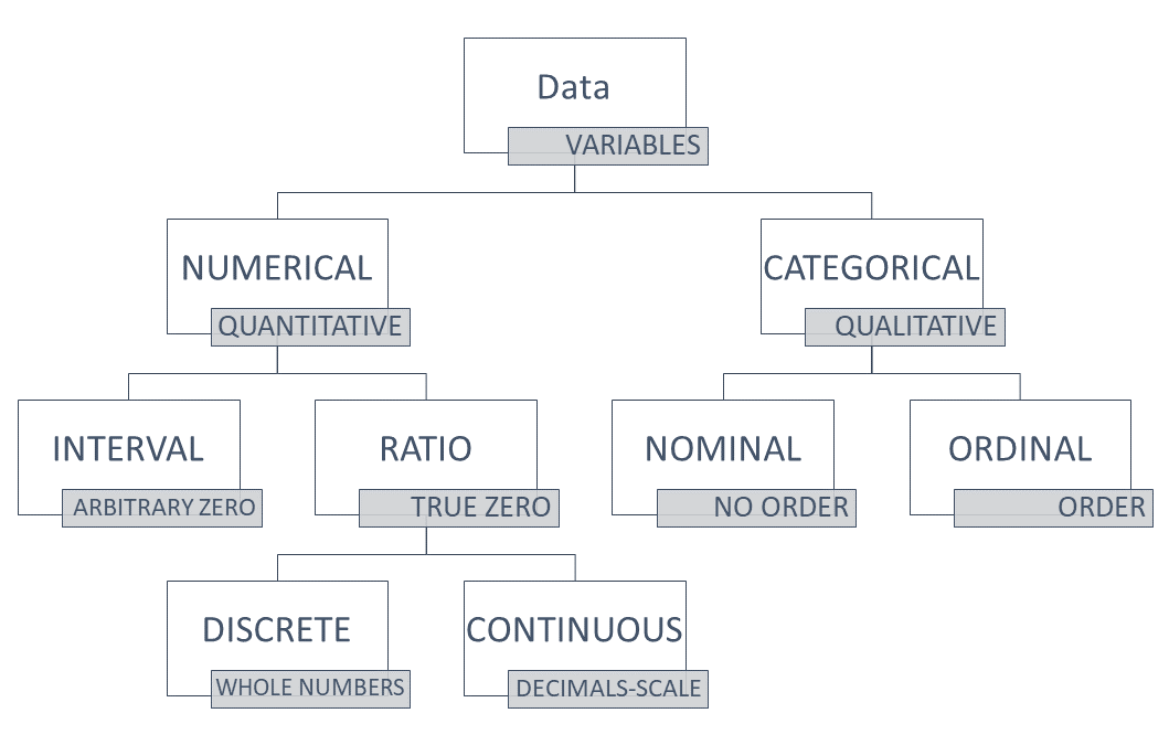
When data is measured and recorded, it can be described with numbers or words. The types of data are referred to as numerical (with numbers) or categorical (with words). You will likely come across alternate terms like variable (for data), quantitative (for numerical) and qualitative (for categorical) as you begin to use research data to inform your nursing practice. Refer to Chart 19.1: Data Types for a summary of types of data.
Numerical Data
Numerical data, which is data that has a numerical value, is subdivided into two types, ratio and interval measurements.
- Ratio Measurements are used for counting items, starting with the number 0. The number zero refers to an absence of the thing being measured in ratio measurements. There will never be any negative numbers because you cannot count negative items. For instance, it is possible for you can have 0, 1, or 2 alcohol swabs in your pocket, but you could not have -1. When ratio measurements are used, they are measured on a numerical scale where there is the same amount of difference between the levels on the scale. For instance, think of a ruler which measures centimeters. There is exactly one centimeter between each number marking on the ruler.
There are two ways ratio measurements are recorded, and these are by discrete and continuous types of data. Discrete data counts numbers of things, and is represented by whole numbers. For instance, the number of people accessing a particular clinic for sexual and reproductive health. There are no portions of people entering the clinic! Continuous data relates to data with values on a scale measuring a numerical value, and can be represented by numbers with decimals. For instance, the birthweight of infants born in Saskatchewan or the length of various catheter sizes. - Interval Measurements are measured with scales created by people to compare amounts. The space between each unit on the scale is equal. This probably sounds a lot like ratio measurements, but with interval scales the number zero does not mean there is nothing to measure. Therefore, this is why we say interval scales do not have an absolute zero. The measurement of temperature is a very popular example to describe an interval scale because it is a scale that most people are familiar with. The scale is based on the temperature which water freezes at. A measurement of 0 degrees does not mean there is no temperature, it is the temperature water freezes at and it is cold. We can compare it to a negative temperature, which is a temperature below the freezing point of water, or a positive temperature, which is warmer. We can also calculate the difference between temperatures because the space between each degree on the scale is equal. For instance, if we are measuring the temperature of a child before and after we give them acetaminophen, we might note that their temperature dropped 2.5 degrees if their temperature was measured at 39.5 degrees prior to the acetaminophen and 37 degrees one hour after administration. Refer to Table 19.2: Examples of Categorical Data to compare these classifications of data.
Clear as mud? Another way to check if something is an interval measurement is to consider the way you would compare values you are measuring. If using a ratio doesn't make sense, but noting the difference (by using subtraction) does, then the measurements are from an interval scale. Refer to the example below.
What if I'm not sure if the zero is arbitrary?
If using a ratio to compare values does not make sense, but using the difference does, the measurements are from an interval scale. See the following example to learn how this works.
Nursing instructor B.D. graduated nursing school in 1994.
Nursing instructor C.R. graduated nursing school in 2002.
First, try to calculate a ratio from the values.
[latex]\dfrac{2002}{1994}=1.004[/latex] or [latex]\dfrac{1994}{2002}=0.996[/latex]
These numbers do not have any meaning when relating the values of years to each other.
Next, try to calculate the difference.
[latex]{2002}-{1994}=8[/latex]
This gives a meaningful answer. CR and BD graduated 8 years apart. It describes something specific about the relationship between the values.
Therefore, the measurement of years is on an interval scale.
| Data Type | Examples |
|---|---|
| Ratio: Discrete |
|
| Ratio: Continuous |
|
| Interval |
|
Categorical Data
Categorical data is subdivided into nominal and ordinal types of data. Nominal data refers to categories of data which are distinct from one another. Meaning, they do not have a particular order or sequence between them. An example of nominal data is the name of brands of stethoscopes used by nursing students. Nominal data might just have two categories, like yes/no, positive/negative, vaccinated/unvaccinated. Ordinal data refers to categories of data which do have a particular order or relationship between them. An example of ordinal data could be the types of nurses working in an acute care medical floor at a rural hospital, using the categories from Patricia Benner's From Novice to Expert Theory: novice, advanced beginner, competent, proficient, expert. These categories are ordinal as they have a particular ranking in relation to each other. Ordinal data also refers to categories that organize a state into levels, like stages of pressure ulcers (I, II, III, IV). Although you can read a number in the stage, it doesn't refer to a numerical value. It does help someone conceptualize that stages progress in levels of severity, so there is a ranking between the stages. Refer to Table 19.3: Examples of Categorical data to compare nominal and ordinal data types.
| Data Type | Examples |
|---|---|
| Nominal |
|
| Ordinal |
|
1.4.3: Scales of Measurement is shared under a CC BY-SA 4.0 license and was authored, remixed, and/or curated by Michelle Oja.
Measurements of Center
Measurements of center tell us about the middle, or commonly occurring values, of a data set. It is sometimes helpful to understand measures of center when using information in your nursing work. In a very simple example, one could use knowledge of the average size of brief worn by adults in order to stock a personal care cart with the briefs which are used most often. Now, this does not mean that on any given day a nurse would actually use this size most often, but it would be helpful in creating a standard stock list for the cart with the expectation nurses would add to the cart if the situation on the ward on a given day required more briefs of a rarely used size.
There are several ways to describe the center of data, and they are each calculated in a specific way. The measures described in this text are mode, median, and mean. Which measure to use depends on the type of data being measured and what and how the data is used for.
These measures will be described in detail in the following three sections and are summarized in Table 19.4: Definitions of Mode, Median and Mean. An example using the same fictional data set is used to portray the differences between these measures in each of the sections.
| Statistic | Measurement of Data Set |
|---|---|
| Mode | Value occurring most often |
| Median | Value in the physical middle |
| Mean | Average of all values |
Mode
The mode is the statistic which describes the value that occurs most often in a data set. In a small data set, one can simply count the value occurring most often. In a large data set, it can be helpful to use spreadsheets and graphs to sort and count values to find the mode.
Determining the Mode
To find the mode, count the number of times each specific value in a data set occurs. The one which occurs most often is the mode.
Sample Data Set: Ages of Nursing Students in a First Year Nursing Class
19, 20, 20, 21, 21, 22, 22, 23, 23, 23, 24, 24, 24, 24, 25, 25, 26, 26, 27, 28, 28, 29, 29, 30, 32, 32, 34, 35, 36, 38, 40, 42
The mode is 24, it occurs most often in this data set. No other value occurs 4 or more times.
Sample Exercise 19.1
Determine the mode of the following data set.
Sample Data Set: Number of Siblings of Nursing Students in a Particular Cohort
0 0 0 0 0 1 1 1 1 1 1 1 1 2 2 2 2 2 2 2 2 2 2 2 3 3 3 3 4 5 8
Answer:
The mode is 2. The value 2 occurs more times than any other value in this data set.
Median
The median is the middle point in a data set, once the values have been listed in numerical order. If there are an odd number of values in the data set, the value of the median is exactly the same as the number in the physical middle of the data set. If there are an even number of values, the middle is considered to be the value that would fall between the two numbers in the middle. The examples following illustrate the difference in physical location of the median in data sets with odd and even numbers of values.
Odd Number of Values
[latex]\begin{array}{ccccc} &&\text{median}&& \\ &&\downarrow&& \\ 2&6&8&10&15\end{array}[/latex]
Even Number of Values
[latex]\begin{array}{ccccc} &&\text{median}&& \\ &&\downarrow&& \\ 2&6&\text{ }&8&15 \\ &&=7&&\end{array}[/latex]
It is easy to identify where the middle is in the examples above because the middle point is visually easy to identify. In larger data sets, a formula can be used to identify the location of the middle.
[latex]\dfrac{n+1}{2}=\text{location of median}[/latex]
For a data set with an odd number of values the formula gives the location of where the value would be in a numbered list of values. In the example above, the median is the third number in the list and so the formula for finding the median in this set gives the number 3. You can see that the location, 3, and the median, 8, are different numbers. This can be confusing for some people. The formula just gives the location, or place of the number, in the list of values. Once the formula gives the location, you need to figure out which value is at that particular place in the list. The process for using the formula is summarized in the box below.
Determining the Median of a Data Set with an Odd Number of Values
Sample Data Set: 2 6 8 10 15
First, find out the location of the middle of the data set.
[latex]\begin{equation}\begin{split} \text{location of median} &= \dfrac{n+1}{2} \\ \\ &= \dfrac{5+1}{2} \\ \\ &=3\end{split}\end{equation}[/latex]
Next, identify the third value in the list of values from the data set.
[latex]\begin{array}{ccccc} 1&2&3&& \\ &&\downarrow && \\ 2&6&8&10&15\end{array}[/latex]
8 is the median of this data set. It is the value in the physical center of the data set.
In a data set with an even number of values the formula will give a number with a decimal place of 0.5 because the location is always between two numbers. The actual value of the median is found by calculating the average of these two numbers. The formula below can be used to calculate the average of two values. The variable [latex]a[/latex] and the variable [latex]b[/latex] refer to the values of the numbers of either side of the middle point in the data set.
[latex]\dfrac{{a}+{b}}{2}=\text{value of median}[/latex]
Determining the Median of a Data Set with an Even Number of Values
First, find out the location of the middle of the data set.
[latex]\begin{equation}\begin{split} \text{location of median} &= \dfrac{n+1}{2} \\ \\ &= \dfrac{32+1}{2} \\ \\ &=16.5\end{split}\end{equation}[/latex]
In this case, there is an even number of values in the data set so the median will fall between two values. The median value will between the 16th and 17th values of the ordered data set. Remember that the data must be in numerical order, otherwise the values will not relate to the middle values of the data set.
Next, count to find the 16th and 17th value. In this sample set, the 16th and 17th values are 25 and 26.
Sample Data Set: Ages of Nursing Students in a First Year Nursing Class
19, 20, 20, 21, 21, 22, 22, 23, 23, 23, 24, 24, 24, 24, 25, 25,
26, 26, 27, 28, 28, 29, 29, 30, 32, 32, 34, 35, 36, 38, 40, 42
Now you can find the mean of these two values.
[latex]\begin{equation}\begin{split} \text{value of median} &= \dfrac{{a}+{b}}{2} \\ \\ &= \dfrac{25+26}{2} \\ \\ &=25.5\end{split}\end{equation}[/latex]
25.5 is the median of this data set. It is the number that relates to the exact center of this data set.
Sample Exercise 19.2
Find the median of the sample data set.
Sample Data Set: Number of Siblings of Nursing Students in a Particular Cohort
0 0 0 0 0 1 1 1 1 1 1 1 1 2 2 2 2 2 2 2 2 2 2 2 3 3 3 3 4 5 8
Answer:
2 is the median of this data set. It is the value in the physical center of the data set.
[latex]\begin{equation}\begin{split} \text{location of median} &= \dfrac{n+1}{2} \\ \\ &= \dfrac{31+1}{2} \\ \\ &=16\end{split}\end{equation}[/latex]
Now count to the sixteenth value in the list of values from the data set.
0 0 0 0 0 1 1 1 1 1 1 1 1 2 2 2 2 2 2 2 2 2 2 2 3 3 3 3 4 5 8
Mean
The mean is the average of all of the values in a data set. To calculate the average, add up all of the values in the data set and divide by the total number of values. For small data sets a calculator can easily be used. For large data sets it is easy to make mistakes with a calculator so it is common to record all of the values in a spreadsheet and use a function of the software to complete this task. The following formula is used to calculate the mean.
[latex]\text{mean}=\dfrac{\sum({{x_1}+{x_2}+...+{x_x}})}{n}[/latex]
Formula Symbol Legend
[latex]{x}[/latex] refers to a number in the data set, and the use of different subscript numbers means that each variation of [latex]{x}[/latex] is referring to an individual value in the data set.
… refers to the variables continuing in the same pattern shown by the variables to the left of the …
[latex]{n}[/latex] refers to the total number of values in the data set.
[latex]\sum[/latex] is the symbol (the Greek uppercase letter sigma) that means to take a sum (or add) everything in a specified sequence. In this formula, it shows the sequence inside the brackets. The pattern of variables indicates to keep adding each different number, all the way to the last, identified as [latex]{x_x}[/latex].
Determining the Mean
Sample Data Set: Ages of Nursing Students in a First Year Nursing Class
19, 20, 20, 21, 21, 22, 22, 23, 23, 23, 24, 24, 24, 24, 25, 25, 26, 26, 27, 28, 28, 29, 29, 30, 32, 32, 34, 35, 36, 38, 40, 42
[latex]\text{mean}=\dfrac{\sum({{x_1}+{x_2}+...+{x_x}})}{n}[/latex]
First, add up all of the values in the data set. Then divide this value by the number of values in the data set.
[latex]\begin{equation}\begin{split} \text{mean} &= \dfrac{843}{32} \\ \\ &=26.3\end{split}\end{equation}[/latex]
Sample Exercise 19.3
Find the mean of the sample data set.
Sample Data Set: Number of Siblings of Nursing Students in a Particular Cohort
0 0 0 0 0 1 1 1 1 1 1 1 1 2 2 2 2 2 2 2 2 2 2 2 3 3 3 3 4 5 8
Answer:
[latex]\begin{equation}\begin{split} \text{mean} &= \dfrac{\sum({{x_1}+{x_2}+...+{x_x}})}{n} \\ \\ &= \dfrac{59}{31} \\ \\ &=1.9\end{split}\end{equation}[/latex]
Critical Thinking Questions
- How do you decide what measures of center to use to describe data?
- Are there situations when one measure is better than another?
Data Variability
Another approach to describe values in a data set is to give information about how different the values are from each other. For instance, are all the values very close to the same, or are they all very different from each other? Picture a researcher conducting a study about the effectiveness of a new medication on blood glucose levels. One value being measured might be the blood glucose level of a person after taking the medication. It would be important to know if the response to the medication gave a change in values of blood glucose which were similar between different people in the study, or if the values were very different.
In the following subsections, three ways to describe variability in data will be explained: range, standard deviation and a 5 number summary.
Range
The range of a data set refers to the difference between the minimum and maximum values. This can also be referred to as the spread.
[latex]\text{range}=\text{maximum value}-\text{minimum value}[/latex]
Thus, the range is found when you subtract the minimum value from the maximum value.
Determining the Range
Sample Data Set: Ages of Nursing Students in a First Year Nursing Class
19, 20, 20, 21, 21, 22, 22, 23, 23, 23, 24, 24, 24, 24, 25, 25,
26, 26, 27, 28, 28, 29, 29, 30, 32, 32, 34, 35, 36, 38, 40, 42
Identify the maximum and minimum values in the data set.
42 and 19
[latex]\begin{equation}\begin{split} \text{range}=\text{maximum value}-\text{minimum value} \\ \\ &=42-19 \\ \\ &=23\end{split}\end{equation}[/latex]
The range is 23 years. This means there are 23 years between the youngest and oldest students in this particular class.
Sample Exercise 19.4
Find the range of the sample data set.
Sample Data Set: Number of Siblings of Nursing Students in a Particular Cohort
0 0 0 0 0 1 1 1 1 1 1 1 1 2 2 2 2 2 2 2 2 2 2 2 3 3 3 3 4 5 8
Answer:
[latex]\begin{equation}\begin{split} \text{range}=\text{maximum value}-\text{minimum value} \\ \\ &=8-0 \\ \\ &=8\end{split}\end{equation}[/latex]
Standard Deviation
Defining Standard Deviation
The standard deviation provides a measure of the overall variation in a data set as it measures how far individual values are from their mean. In some data sets, the values are more widely spread out from the mean.
The standard deviation is always positive or zero. The standard deviation is small when the individual values are all concentrated close to the mean, exhibiting little variation or spread. The standard deviation is larger when individual values are more spread out from the mean, exhibiting more variation.
A value that is two standard deviations from the average is just on the borderline for what many statisticians would consider to be far from the average. Considering data to be far from the mean if it is more than two standard deviations away is more of an approximate “rule of thumb” than a rigid rule. In general, the shape of the distribution of the data affects how much of the data is further away than two standard deviations. (You will learn more about this in later sections).
Suppose that we are studying the amount of time patients wait in line for vaccinations at a public health clinic. The average wait time is calculated to be five minutes and the standard deviation for the wait time is two minutes. We can use the standard deviation to determine whether a particular value is close to or far from the mean.
Suppose that Daniella and Harjit both visit the public health clinic. Daniella waits to see the nurse for seven minutes and Harjit waits for one minute. We know the standard deviation was calculated to be two minutes and the average wait time is five minutes. What does this tell us about the wait times of Daniella and Harjit?
Daniella waits for seven minutes:
Daniella’s wait time of seven minutes is two minutes longer than the average of five minutes.
Two minutes is equal to one standard deviation.
Daniella’s wait time of seven minutes is one standard deviation above the average of five minutes.
Harjit waits for one minute:
Harjit’s wait time of one minute is four minutes less than the average of five minutes.
Four minutes is equal to two standard deviations.
Harjit’s wait time of one minute is two standard deviations below the average of five minutes.
Knowing that Harjit's wait time is two standard deviations below the mean and Daniella's in one standard deviation above tells us Harjit's wait time was further from the average. Now, with this simple example, it is possible you would have been able to look at the numbers given and come to the same conclusion without knowing anything about standard deviation. Statistics like standard deviation become really useful when analyzing larger data sets when it is not easy to see how individual values differ from the average.
Standard deviations are also helpful in comparing data from similar studies. For instance, we could repeat the study at a different public health clinic and determine the average wait time and standard deviation at this alternate clinic. If the average wait time at this clinic was also five minutes, but the standard deviation was 2.75, what does this tell you about the wait times at this clinic?
Answer:
The standard deviation at clinic A was 2 minutes. The standard deviation at clinic B was 2.75 minutes. This tells us there is more variation from the mean at clinic B, meaning wait times fluctuate more at clinic B. It's important to note this does not tell us anything about why there is variation. This measure just describes what the variation in data is like.
Sample Exercise 19.5
You are reading the results of a study comparing two non-pharmacological nursing interventions to reduce pain. In this study, pain has been measured using a pain scale of 0-10. You can assume that the characteristics of participants in each intervention group are similar.
| Intervention | Mean Reduction of Pain | Standard Deviation |
|---|---|---|
| Intervention A | 2.5 | 0.75 |
| Intervention B | 2.5 | 2.0 |
- Explain what the mean reduction of pain is referring to.
- Based on the information provided above, which intervention has the most consistent reduction in pain?
Answers:
- The mean reduction of pain is referring to the average pain reduction measured in units of pain (from the pain scale). The mean reduction of pain is calculated separately with data from participants receiving intervention A and intervention B.
- Intervention A has the most consistent reduction in pain because the standard deviation is smaller than the standard deviation of Intervention B. A smaller standard deviation means that the data values are more closely centered around the average (mean) value.
Calculating the Standard Deviation
It is important to note there are two different formulas for calculating the standard deviation (SD). The formulas are chosen based on if we are looking at data from a sample or the data of a population.
When we calculate measures from population data, it means we know all of the data points for an entire population and use this information to calculate different measures. These types of numbers describing the population can also be referred to as parameters. When we know all of the data related to a population, then we can be certain our findings represent the actual values related to the population.
A sample refers to data collected from a portion of the population. If we are using data from a sample it is unlikely we will find the actual values of the population, but we might get very close, depending on how we chose the sample and how big the sample is. Therefore, a sample estimates the values of the population. In most cases in health care, we are collecting data from a sample of a population because it is too difficult to collect data from an entire population. The numbers calculated from a sample can also be referred to as statistics.
Standard Deviation of a Population (μ)
[latex]σ=\sqrt{\dfrac{\sum|X-\bar{μ}|^2}{N}}[/latex]
Formula Breakdown
[latex]{N}[/latex] refers to the number of values in the population.
[latex]\sum[/latex] is the symbol (the Greek uppercase letter sigma) that means to take a sum (or add) everything in a specified pattern, as noted with the bracketed part of the formula to the right.
[latex]X[/latex] refers to each value found in the population.
[latex]\bar{μ}[/latex] refers to the population mean, or the average.
Standard Deviation of a Sample ([latex]s[/latex])
[latex]s=\sqrt{\dfrac{\sum|X-\bar{x}|^2}{n-1}}[/latex]
Formula Breakdown Here
[latex]\sum[/latex] is the symbol (the Greek uppercase letter sigma) that means to take a sum (or add) everything in a specified pattern, as noted with the bracketed part of the formula to the right.
[latex]{X}[/latex] refers to each value of the sample.
[latex]\bar{x}[/latex] refers to the sample mean, or the average.
Click here for further detail about this formula.
If x is a number, then the difference “x – mean” is called its deviation. In a data set, there are as many deviations as there are items in the data set. The deviations are used to calculate the standard deviation. You can think of the standard deviation as a special average of the deviations.
To calculate the standard deviation, we need to calculate the variance in deviations first. The variance is calculated by taking the average of the squares of the deviations related to each value in the data set.
If the numbers come from a census of the entire population and not a sample, when we calculate the average of the squared deviations to find the variance, we divide by N, the number of items in the population. If the data are from a sample rather than a population, when we calculate the average of the squared deviations, we divide by n – 1, one less than the number of items in the sample.
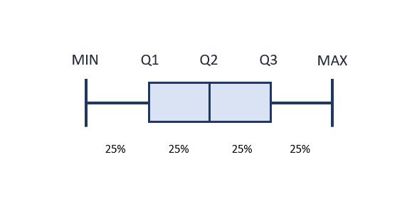
5 Number Summary
Distribution may be described in text as a summary of five statistics: the minimum value, first quartile (Q1), median value, third quartile (Q3), and maximum value. These numbers separate the values of a data set into quarters. This summary is often presented in a graphic called a boxplot.
You should already be familiar with the minimum, median and maximum values. Refer back to the glossary if you need a refresher on these terms. You can also think about the median as the point where 50% of the values are above and below the median.
The first quartile is the number whereby 25 % of values are below Q1, and 75 % are above. The formulas to find the locations of Q1 and Q3 are very similar to the formulas for determining the median. Sometimes, you might see the median labelled as Q2. Here is the formula to find the location of Q1:
[latex]\text{location of Q1}= \dfrac{1}{4}\times{(n+1)}[/latex]
If the number calculated is a decimal number, you will need to take the mean of the actual values to the right and the left of this number to determine the value of Q1.
The third quartile is the number whereby 25 % of the values are above Q3 and 75% are below. Here is the formula to find the location of Q3:
[latex]\text{location of Q3}= \dfrac{3}{4}\times{(n+1)}[/latex]
If the number calculated is a decimal number, you will need to take the mean of the actual values to the right and the left of this number to determine the value of Q3.
Can you see the pattern in the formulas for the 1st quartile, the median, and the third quartile?
Determining the 1st and 3rd Quartiles of the 5 Number Summary
Sample Data Set: Ages of Nursing Students in a First Year Nursing Class
19, 20, 20, 21, 21, 22, 22, 23, 23, 23, 24, 24, 24, 24, 25, 25, 26, 26, 27, 28, 28, 29, 29, 30, 32, 32, 34, 35, 36, 38, 40, 42
Minimum = 19
Median = 25.5 (as calculated in the example here)
Maximum= 42
Use the formula to find the location of Q1.
[latex]\begin{equation}\begin{split} \text{location of Q1} &= \dfrac{1}{4}\times{(n+1)} \\ \\ &= \dfrac{32+1}{4} \\ \\ &=8.25\end{split}\end{equation}[/latex]
Now we have found the location, between the 8th and 9th value, we can determine the mean of these values. Since the 8th and 9th values are both 23, the mean will be the same as these values, 23.
The first quartile is 23.
Use the formula to find the location of Q3.
[latex]\begin{equation}\begin{split} \text{location of Q3} &= \dfrac{3}{4}\times{(n+1)} \\ \\ &= \dfrac{3}{4}\times{(32+1)} \\ \\ &= \dfrac{3}{4}\times{33} \\ \\ &= \dfrac{99}{4} \\ \\ &=24.75\end{split}\end{equation}[/latex]
Identify the values on either side of the location of this median and calculate the mean. In this example, the values are 30 and 32.
[latex]\begin{equation}\begin{split} \text{value of median} &= \dfrac{{a}+{b}}{2} \\ \\ &= \dfrac{30+32}{2} \\ \\ &=31\end{split}\end{equation}[/latex]
The third quartile is 31.
Now you have determined all of the individual numbers in the 5 Number Summary, write them all in a list, separated with commas.
Five Number Summary: 19, 23, 25.5, 31, 42
Describing Data with Imagery
There are a variety of ways large data sets can be summarized in tables, graphs, and charts in order to make the data easy to understand quickly. How graphs and tables are presented can make a significant difference in how easy it is to understand what is being presented. A graph that is labelled well with an appropriate scale make it easier to understand what is being presented. Likewise, a table with too many rows and columns can make it hard to see relationships in the data. When using graphs and tables in your own work, consider what the purpose for displaying the information is and then check to see if the table or graph you created helps others appreciate the purpose of the image. Following are some examples of graphs you might be unfamiliar with.
Graphs for Describing Numerical Information
Histogram
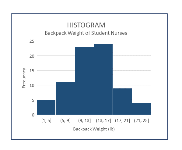
A histogram is very similar to a column chart, but is used for presentation of continuous data. A histogram uses a numerical range for each column of the graph. The bars touch together, versus being separate, which indicates the numerical amount can include any numerical value up to, but not including, the beginning value of the column to the right. To plot the data on a histogram, the researcher needs to decide what the range will be for each column. Most of the time, you will want the range to be large enough so the number of columns is not too high and so it clearly gives a visual representation of the information being collected. If you are using software to create a histogram, the width of the column is referred to as bin size.
Look at the image of the sample histogram below. It summarizes the results of a fictitious survey which asked nursing students at a particular college how much their backpack weighed on the day of the survey. In this graph, the numbers on the x axis (horizontal) are associated with the weight of backpacks, in pounds. The y axis (vertical) represents the number of students nurses who had backpacks with a weight in a specific range. Therefore, in the first column the possible values of backpack weight include any backpacks weighing 1.0 lb up to, but not including, 5 lb and there were 5 students with backpacks weighing that much. Overall, this graph tells us about the frequency of particular findings. It is easily seen most of the backpacks weighed between 9-17 pounds.
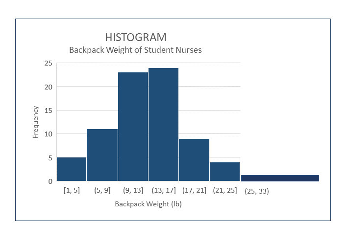
You may come across some slight variations in formatting of histograms. For instance, it is possible to create a histogram with unequal ranges on columns, which can be helpful when there are few occurrences over a large spread of values. The image below shows a wide column with a larger range. When you are interpreting the data in a histogram with unequal ranges, you need to be aware that the vertical height will not equal the actual frequency of the occurrences in unequal columns. The frequency is actually based on the area of the column, the column height times the width. When all of the columns are equal, you can infer the frequency directly from the graph, but not when they are unequal. Since it is a bit of a tricky concept to understand how to interpret the frequency in columns with varying widths you will not see graphs of this type very often.
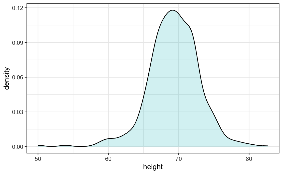
Density Curves
While a histogram plots the actual frequency of values occurring in a data set, a density curve plots the estimation of the distribution of values occurring in a larger sample. Sometimes they are referred to as smooth density curves, as it is like the individual column heights of a corresponding histogram have been smoothed out as the line of the graph follows the tops of the histogram columns. It is important to note the y axis is no longer representing an actual count of a particular value. It is now labelled as density. Below are two graphs created from the same sample data set related to height. You can see how the overall shapes are similar in each of the graphs. These graphs can vary in shape, depending on how the data values of a particular sample are distributed.

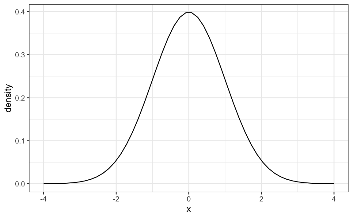
Normal Distribution
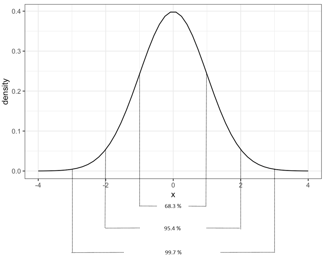
It is likely you have already been introduced to the normal distribution curve at some point in your academic studies. Perhaps you have heard the term bell curve? These terms are referring to the same thing, which refers to the distribution of data values being equally centered around the mean. You might see this represented graphically like the sample graph below. In the graph below, the mean occurs at 0. The area under the line represents where data values can be on either side of the mean. Each side of this curve is symmetrical. The x-axis in this graph is labelled to show standard deviations and the y-axis is labelled to show density.
When data is analyzed which has a normal distribution, we can infer that most of the values will be within three standard deviations above or below the mean. When you are just beginning to learn about statistics, a basic understanding of what this graph represents is sufficient. Picture all of the area under the curve as equal to 100% of where the data values being measured are. If we break up the area under the curve into sections, we can convert that area into a percentage of the data. The graph below shows a summary of how much of the data falls within one, two, and three standard deviations away from the mean. 68.3 % of values fall within the area under the curve and one standard deviation above and below the mean. If this area is increased to two standard deviations away from the mean 95.4 % of values fall within this area. If the area is increased to three standard deviations away, 99.7 % of values are captured. This is why we can infer that most of data with a normal distribution will be within three standard deviations from the mean.
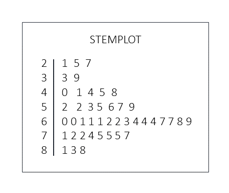
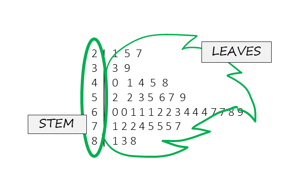
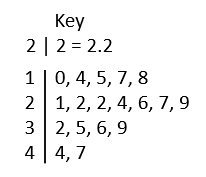
Stemplot
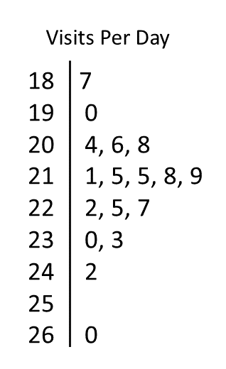
A stemplot is another type of graph you may come across in your studies. Rather than writing a long list of numbers from a data set into a report, the stemplot summarizes all the data values so the distribution is easier to interpret at a glance. The "stem" refers to all but the last number in each numerical value and is listed to the left of a vertical bar. The last number in each value is placed to the right of the vertical bar and are referred to as "leaves". When one leaf is joined with the stem you are able to determine individual values from the data set. If duplicate values are included in the data set, then there will be duplicate leaves in the stemplot. If you find a stem with no leaves, then no values were found with this stem in the dataset. Stemplots are used for relatively small data set, as a data set with thousands of values would be better expressed in an alternate type of graph. Following this paragraph is a fictitious data set. Refer to figure 19.1 below to see a sample stemplot of this data and figure x.x to see a visual representation of the stem and leaves overlaid on the sample stemplot. Can you see how the distribution of values is represented in the stemplot?
Data set for figure x.x: 21, 25, 27, 33, 39, 40, 41, 44, 45, 48, 52, 52, 53, 55, 56, 57, 59, 60, 60, 61, 61, 61, 62, 62, 63 64, 64, 64, 67, 67, 68, 69, 71, 72, 72, 74, 75, 75, 75, 77, 81, 83, 88
Decimal Numbers and Stemplots
Stemplots can be used with whole number or with decimal numbers. Stemplots may have a key noted beside them to show the reader how to interpret the stemplot values into numbers. If there is no key, you can assume the stemplot values convert to whole numbers. When stemplots use decimal numbers they should always include a key to show the stemplot is referring to decimal numbers.
Stemplot Key Examples
Whole Numbers
5|2 = 52
Decimal Numbers
2|9 = 2.9
Back to Back Stemplots
You might come across two stemplots which are created back to back, using the same stem. This is a helpful visual for comparing values related to two groups. Refer to table 19.4 for a sample back to back stemplot comparing ages of students in two college classes. What can you infer about the distribution of ages in these two courses from looking at this stemplot?
| Stemplot Comparing Age of Students in Two College Classes | ||
|---|---|---|
| Introductory Statistics | Life Drawing | |
| 0 0 0 0 0 0 0 1 1 1 1 2 2 2 3 4 5 6 7 7 7 8 9 | 2 | 2 2 3 4 5 5 6 7 8 9 |
| 0 0 1 1 2 2 2 3 5 7 7 8 | 3 | 0 1 1 2 3 3 4 4 5 6 6 6 7 9 |
| 2 6 7 | 4 | 0 1 1 2 4 7 8 8 |
| 2 4 | 5 | 0 1 4 5 7 9 |
| 6 | 1 3 4 8 | |
Boxplot
A 5 number summary can be displayed as a visual graphic which helps to show how data is centered around the mean. Looking at boxplots can quickly help you infer if data values occur evenly above and below the mean, and essentially how they are spread around the center. Boxplots are most often used when data is skewed as it helps to easily show where more of the values occur. This type of graphic is sometimes referred to as a box and whisker diagram, with the box in the center and the "whiskers" on either side.
The image below shows the location of each of the five values in the 5 number summary. The spaces in between each of these values encompass 25% of the values from the data set. The two center sections are usually depicted with a rectangle, and together these boxes represent where 50% of the values occur. The widths of each of these elements are related to the spread, or range, of the values depicted by them. Boxplots representing actual data will also include the actual values of the 5 number summary on the graphic.
A sample boxplot is included below which uses the values from the five number summary sample to create the elements of this graphic.
5 Number Summary of Ages of Nursing Students in a Fictitious Class
19, 23, 25.5, 31, 42
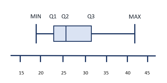
The shaded box between Q1 and Q2 represents the values occurring between the 1st quartile and the median. The shaded box between Q2 and Q3 represents the values occurring between the median and the 3rd quartile. Since the box on the left is narrow in comparison to the box on the right, this tells you the range of values between Q1 and Q2 is less than Q2 and Q3.
The line between the minimum value and Q1 and the line between Q3 and the maximum value also each relate to 25% of the values.
The position of the median, or Q2, also helps to identify if the data was closer to the minimum or maximum values. Look at the boxplot below and see if you can describe how the data was centered around the mean from looking at this graphic. What does it tell you about the ages of nursing students in this class?
Answer:
There is a wider range of ages in older students than the younger students in this class. This is because the size of the line and bow to the left of the median (Q2) is much smaller than the size of the box and line to the left of Q2. The section with the smallest width is the section between Q1 and Q2, so more students had ages in this section than any of the other sections.
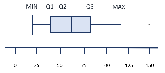
Modified Boxplots
Sometimes, the horizontal lines at the right and left of the central boxes do not have a vertical line at the far edge. If the data includes a value which is considered to be an outlier, it is represented on the boxplot as a single dot. If there are more than one outliers, then a dot will be included for each possible outlier. The sample boxplot below depicts a graphic of a boxplot with one outlier.
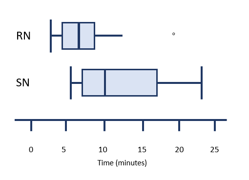
Comparing Boxplots
Boxplots can be used within a report to compare the distribution of individual variables in a study. One measurement scale is placed beside two or more boxplots. Each boxplot is labelled with the variable it is related to.
Suppose a study was undertaken to compare the length of time, in minutes, that registered nurses versus second year nursing students took to prepare a particular IV medication. Assume that additional variables which could affect the outcome were similar between both groups. After data is collected, a boxplot could be made for each group to compare the distributions. The image below represents a comparison of this imaginary data. When you look at this image, you should be able to quickly tell which group was slower and which group had a more consistent length of preparation time.
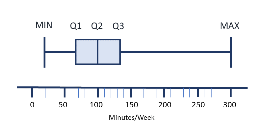
Sample Exercise 19.6
Create a boxplot of the following sample data set:
Average minutes per week nursing instructors engage in moderate physical activity in a sample from a small rural college: 20, 35, 50, 60, 75, 75, 75, 80, 90, 110, 120, 120, 120, 120, 150, 175, 180, 300
Answer:
First, determine the 5 number summary. Min, Q1, Median (or Q2), Q3, Max.
Minimum = 20, Maximum = 300
To find Q1:
[latex]\begin{equation}\begin{split} \text{location of Q1} &= \dfrac{1}{4}\times{(n+1)} \\ \\ &= \dfrac{18+1}{4} \\ \\ &=4.75\end{split}\end{equation}[/latex][latex]\begin{equation}\begin{split} \text{value of Q1} &= \dfrac{{a}+{b}}{2} \\ \\ &= \dfrac{60+75}{2} \\ \\ &=67.5\end{split}\end{equation}[/latex]
To find the median:
[latex]\begin{equation}\begin{split} \text{location of median} &= \dfrac{n+1}{2} \\ \\ &= \dfrac{18+1}{2} \\ \\ &=9.5\end{split}\end{equation}[/latex][latex]\begin{equation}\begin{split} \text{value of median} &= \dfrac{{a}+{b}}{2} \\ \\ &= \dfrac{90+110}{2} \\ \\ &=100\end{split}\end{equation}[/latex]
To find Q3:
[latex]\begin{equation}\begin{split} \text{location of Q3} &= \dfrac{3}{4}\times{(n+1)} \\ \\ &= \dfrac{3}{4}\times{(18+1)} \\ \\ &= \dfrac{3}{4}\times{19} \\ \\ &= \dfrac{57}{4} \\ \\ &=14.25\end{split}\end{equation}[/latex][latex]\begin{equation}\begin{split} \text{value of Q3} &= \dfrac{{a}+{b}}{2} \\ \\ &= \dfrac{120+150}{2} \\ \\ &=135\end{split}\end{equation}[/latex]
Key Takeaways
- Not all statistical measures are appropriate for all categories of data.
- The mode, median, and mean are examples of measurements related to the center of data sets.
- The range, standard deviation and 5 number summary are examples of ways to describe the variation in data within a set.
- There are a variety of was images and graphs can be used to display data.
Practice Set 19.1: Identifying Types of Data
Practice Set 19.1: Identifying types of data
Identify the following types of data as either discrete, continuous, nominal or ordinal:
- The number of discharges per day from the surgical ward of a particular hospital.
- The types of dressing products used for chronic would care in a particular home health center.
- The average number of minutes it takes nursing students to walk up the stairs of an outpatient treatment center with 5 stories.
- The letter grade received by nursing students in an introduction to statistics course.
- The amount of waste sent to the incinerator each day from a particular hospital, measured in kilograms.
- The number of devices with screen owned by nursing students.
- The satisfaction of new graduates with hospital orientation, measured on a Likert scale using descriptors of very satisfied, satisfied, neither satisfied or dissatisfied, dissatisfied, very dissatisfied.
- The colours of scrub tops owned by a nursing student.
- The weight of laptops owned by nursing students in a first year class at a particular college, measured in kilograms.
- The number of IV pumps available on the surgical ward of a particular hospital.
Answers:
- Discrete. Discharges per day are counted in whole numbers.
- Nominal. The types of dressings are described in words (hydrocolloid, semi-occlusive, etc.)
- Continuous. The number of minutes can include a partial measure of a minute. (eg. 3.5 minutes)
- Ordinal. Letter grades are a system of ranking.
- Continuous. The number of kilograms can include a partial measure (eg. 127.9 kg)
- Discrete. The number of devices are counted in whole numbers.
- Ordinal. The Likert scale measurements area a system of ranking.
- Nominal. The colours of scrub tops are described in words.
- Continuous. The number of kilograms can include a partial measure (eg. 0.94 kg)
- Discrete. Pumps are counted in whole numbers.
Practice Set 19.2: Identifying Types of Data
Practice Set 19.2: Identifying Types of Data
Identify the following types of data as either interval, discrete, continuous, nominal or ordinal:
- Eye colour
- Stages of cancer (Stage I, II, II, IV)
- Height of 12 year old children in a particular town
- Survey question with answer choices of: not at all, a little, neutral, some, a lot
- Types of walking aids used by people in a long term care home
- The level of education held by nursing instructors
- The Faces pain scale
- The number of textbooks owned by each nursing student in a class.
- The price of various brands of glucose test strips at pharmacies in a particular city
- the number of minutes college students wait on hold when making telephone inquiries about bursaries
Answers:
- Nominal. Eye colour is described in words with distinct meanings from one another.
- Ordinal. There is a ranking system but no specific numerical value between ranks.
- Continuous. The measurement of height can include a decimal number.
- Ordinal. There is a rank, but not a specific numerical value attached.
- Nominal. Walking aids are described with words with distinct meanings from one another.
- Ordinal. Types of degrees (bachelor's, master's, doctorate) belong to a ranking system.
- Ordinal and interval-there are faces, words and a number with each pain rating.
- Discrete. The number of textbooks is counted in whole numbers.
- Continuous. Cost can be counted in portions of dollars.
- Continuous. Zero has an absolute value and the number of minutes can have a partial value.
Practice Set 19.3: Calculating Mode
Practice Set 19.3: Calculating Mode
Calculate the mode for the following sample data sets, which have been conveniently sorted into numerical order:
- 12, 16, 18, 18, 18, 20, 22, 25, 27, 27, 29, 30
- 0, 0, 2, 5, 8, 9, 15, 17, 17, 32
- 1, 1, 1, 1, 2, 2, 2, 3, 4, 4, 4, 5, 5, 5, 5, 5, 6, 6, 7, 7, 7
- 4, 6, 8, 12, 13, 16, 17, 19, 20
- 30, 32, 35, 37, 37, 40, 60, 77, 88, 99, 137, 150
Answers:
- 18 (this value occurs 3 times, no other value occurs this many times).
- 0 and 17 (both of these values occur twice).
- 5 (this value is repeated the most).
- There is no mode, no value is repeated.
- 37 (this value occurs twice, no other value is repeated).
Practice Set 19.4: Calculating Median
Practice Set 19.4: Calculating Median
Calculate the median of the following data sets:
- 12, 16, 18, 18, 18, 20, 22, 25, 27, 27, 29, 30
- 0, 0, 2, 5, 8, 9, 15, 17, 17, 32
- 1, 1, 1, 1, 2, 2, 2, 3, 4, 4, 4, 5, 5, 5, 5, 5, 6, 6, 7, 7, 7
- 4, 6, 8, 12, 13, 16, 17, 19, 20
- 30, 32, 35, 37, 37, 40, 60, 77, 88, 99, 137, 150
Answers:
- 21
- 8.5
- 4
- 13
- 50
Recall the median is the value in the physical middle of the data set. The following formula can be used to calculate the location of the median. You might not have used a formula to find the location in these very small data sets.
[latex]\dfrac{n+1}{2}=\text{location of median}[/latex]
In a data set with an odd number of values the median will equal the number at this location.
In a data set with an even number of values, the median is equivalent to the mean of the values to the right and left of this location.
Use the following formula to find the mean in a data set with an even number of values:
[latex]\text{value of median}= \dfrac{{a}+{b}}{2}[/latex]
- [latex]\begin{aligned}[t] \text{location of median} &= \dfrac{12+1}{2} \\ \\ &= \dfrac{13}{2} \\ \\ &=6.5\end{aligned}[/latex][latex]\begin{aligned}[t] \text{value of median} &= \dfrac{{a}+{b}}{2} \\ \\ &= \dfrac{20+22}{2} \\ \\ &=21\end{aligned}[/latex]
- [latex]\begin{aligned}[t] \text{location of median} &= \dfrac{10+1}{2} \\ \\ &= \dfrac{11}{2} \\ \\ &=6.5\end{aligned}[/latex][latex]\begin{aligned}[t] \text{value of median} &= \dfrac{{a}+{b}}{2} \\ \\ &= \dfrac{8+9}{2} \\ \\ &=8.5\end{aligned}[/latex]
- [latex]\begin{aligned}[t] \text{location of median} &= \dfrac{21+1}{2} \\ \\ &= \dfrac{22}{2} \\ \\ &=11\end{aligned}[/latex]
[latex]\text{Count to the 11th value.}[/latex] - [latex]\begin{aligned}[t] \text{location of median} &= \dfrac{9+1}{2} \\ \\ &= \dfrac{10}{2} \\ \\ &=5\end{aligned}[/latex]
[latex]\text{Count to the 5th value.}[/latex] - [latex]\begin{aligned}[t] \text{location of median} &= \dfrac{12+1}{2} \\ \\ &= \dfrac{13}{2} \\ \\ &=6.5\end{aligned}[/latex][latex]\begin{aligned}[t] \text{value of median} &= \dfrac{{a}+{b}}{2} \\ \\ &= \dfrac{40+60}{2} \\ \\ &=50\end{aligned}[/latex]
Practice Set 19.5: Calculating Mean
Practice Set 19.5: Calculating Mean
Calculate the mean of the following data sets, up to two decimal places.
- 12, 16, 18, 18, 18, 20, 22, 25, 27, 27, 29, 30
- 0, 0, 2, 5, 8, 9, 15, 17, 17, 32
- 1, 1, 1, 1, 2, 2, 2, 3, 4, 4, 4, 5, 5, 5, 5, 5, 6, 6, 7, 7, 7
- 4, 6, 8, 12, 13, 16, 17, 19, 20
- 30, 32, 35, 37, 37, 40, 60, 77, 88, 99, 137, 150
Answers:
[latex]\text{Use the following formula to calculate the mean:}[/latex]
[latex]\text{mean}=\dfrac{\sum({{x_1}+{x_2}+...+{x_x}})}{n}[/latex]
- 21.83
[latex]\begin{equation}\begin{split} \text{mean} &= \dfrac{12+16+18+18+18+20+22+25+27+27+29+30}{12} \\ \\ \text{mean} &= \dfrac{262}{12} \\ \\ &=21.83\end{split}\end{equation}[/latex] - 10.5
[latex]\begin{equation}\begin{split} \text{mean} &= \dfrac{0+0+2+5+8+9+15+17+17+32}{10} \\ \\ \text{mean} &= \dfrac{105}{10} \\ \\ &=10.5\end{split}\end{equation}[/latex] - 3.95
[latex]\begin{equation}\begin{split} \text{mean} &= \dfrac{1+1+1+1+2+2+2+3+4+4+4+5+5+5+5+5+6+6+7+7+7}{21} \\ \\ \text{mean} &= \dfrac{83}{21} \\ \\ &=3.95\end{split}\end{equation}[/latex] - 12.78
[latex]\begin{equation}\begin{split} \text{mean} &= \dfrac{4+6+8+12+13+16+17+19+20}{9} \\ \\ \text{mean} &= \dfrac{115}{9} \\ \\ &=12.78\end{split}\end{equation}[/latex] - 68.5
[latex]\begin{equation}\begin{split} \text{mean} &= \dfrac{30, 32, 35, 37, 37, 40, 60, 77, 88, 99, 137, 150}{12} \\ \\ \text{mean} &= \dfrac{822}{12} \\ \\ &=68.5\end{split}\end{equation}[/latex]
Practice Set 19.6: Calculating Range
Practice Set 19.6: Calculating Range
Calculate the range for the following data sets.
- 12, 16, 18, 18, 18, 20, 22, 25, 27, 27, 29, 30
- 0, 0, 2, 5, 8, 9, 15, 17, 17, 32
- 1, 1, 1, 1, 2, 2, 2, 3, 4, 4, 4, 5, 5, 5, 5, 5, 6, 6, 7, 7, 7
- 4, 6, 8, 12, 13, 16, 17, 19, 20
- 30, 32, 35, 37, 37, 40, 60, 77, 88, 99, 137, 150
Answers:
- [latex]\begin{aligned}[t] \text{range}=30-12 \\ \\ &=18\end{aligned}[/latex]
- [latex]\begin{aligned}[t] \text{range}=32-0 \\ \\ &=32\end{aligned}[/latex]
- [latex]\begin{aligned}[t] \text{range}=7-1 \\ \\ &=6\end{aligned}[/latex]
- [latex]\begin{aligned}[t] \text{range}=20-4 \\ \\ &=16\end{aligned}[/latex]
- [latex]\begin{aligned}[t] \text{range}=150-30 \\ \\ &=120\end{aligned}[/latex]
Practice Set 19.7: Interpreting Standard Deviation
Practice Set 19.7: Interpreting Standard Deviation
- Suppose you were looking at the results of a study in which the intervention affects weight (in kilograms) of a person. If the standard deviation is very small, are the measured values of weight very similar or very different from each other in each people being studied?
- You are reading the results of a study comparing how different ways of cooking white basmati rice affects the blood glucose level of people with diabetes one hour after eating one half cup of cooked white rice. You can assume that the characteristics of participants in each intervention group are similar. Refer to the table below for a summary of mean increase in blood sugar based on the method of cooking and the calculated standard deviation.
a. Which of the following methods results in the most consistent rise in blood glucose?
b. Which method results in the highest possible blood glucose reading at exactly one standard deviation away from the calculated mean?
| Intervention | Mean Increase in Blood Sugar | Standard Deviation |
|---|---|---|
| Method A | 6 mmol/L | 1.07 mmol/L |
| Method B | 5.2 mmol/L | 0.8 mmol/L |
| Method C | 4.9 mmol/L | 1.21 mmol/L |
Answers:
- If the standard deviation is small, it means the numbers in the data set are closer together, so the weights will have a small amount of variation.
- a. Method B has the most consistent rise in blood glucose, as the standard deviation is the smallest. The smallest standard deviation has the least amount of variability in values.
b. Method A would have the highest blood glucose reading at exactly one standard deviation above the mean.
[latex]6+1.07=7.07[/latex]
[latex]5.2+0.8=6.0[/latex]
[latex]4.9+1.21=6.11[/latex]
Practice Set 19.8: 5 Number Summary and Boxplots
Practice Set 19.8: 5 Number Summary and Boxplots
- List the types of numbers included in a 5 number summary.
- What type of graphic is used to present the numbers in a 5 number summary?
- What are the "whiskers" of a boxplot?
- How is an outlier noted on a boxplot?
- Determine the 5 number summary for the following fictional data set. The average number of minutes spent by first year nursing students on social media per day.
10, 10, 13, 14, 15, 15, 15, 18, 20, 20, 20, 22, 30, 31, 31, 35, 36 38, 44, 50, 60, 78 - Create a boxplot to display the 5 number summary from question 5.
- Determine the 5 number summary for the following fictional data set. The number of times a nursing student hand washes in one shift on an inpatient medical floor.
27, 35, 48, 54, 58, 59, 62, 63, 63, 66, 67, 71, 72, 73, 76, 77, 78, 83, 87, 92, 102 - Determine the 5 number summary for the following fictional data set.
The number of migraines per month using a particular treatment for prevention.
0, 0, 1, 1, 1, 1, 1, 1, 1, 2, 2, 2, 2, 2, 3, 4, 4, 8, 12 - Determine the 5 number summary for the following fictional data set.
The number of migraines per month using a placebo for prevention.
1, 1, 1, 1, 2, 2, 2, 2, 2, 3, 3, 3, 4, 4, 5, 7, 9, 12, 13 - Create two boxplots comparing the 5 number summaries from questions 8 and 9.
Answers:
- The minimum, the first quartile, the median, the third quartile, and the maximum.
- A boxplot.
- The whiskers of a boxplot extend from Q3 to the maximum number and from Q1 to the minimum number.
- Each outlier is noted as a single dot outside of the whiskers.
- 10, 15, 21, 37, 78
The minimum and maximum are the smallest and largest numbers in the data set.
To find Q1:
[latex]\begin{equation}\begin{split} \text{location of Q1} &= \dfrac{1}{4}\times{(n+1)} \\ \\ &= \dfrac{22+1}{4} \\ \\ &=5.75\end{split}\end{equation}[/latex][latex]\begin{equation}\begin{split} \text{value of Q1} &= \dfrac{{a}+{b}}{2} \\ \\ &= \dfrac{15+15}{2} \\ \\ &=15\end{split}\end{equation}[/latex]
To find the median:
[latex]\begin{equation}\begin{split} \text{location of median} &= \dfrac{n+1}{2} \\ \\ &= \dfrac{22+1}{2} \\ \\ &=11.5\end{split}\end{equation}[/latex][latex]\begin{equation}\begin{split} \text{value of median} &= \dfrac{{a}+{b}}{2} \\ \\ &= \dfrac{20+22}{2} \\ \\ &=21\end{split}\end{equation}[/latex]
To find Q3:
[latex]\begin{equation}\begin{split} \text{location of Q3} &= \dfrac{3}{4}\times{(n+1)} \\ \\ &= \dfrac{3}{4}\times{(22+1)} \\ \\ &= \dfrac{3}{4}\times{23} \\ \\ &= \dfrac{69}{4} \\ \\ &=17.25\end{split}\end{equation}[/latex][latex]\begin{equation}\begin{split} \text{value of Q3} &= \dfrac{{a}+{b}}{2} \\ \\ &= \dfrac{36+38}{2} \\ \\ &=37\end{split}\end{equation}[/latex] 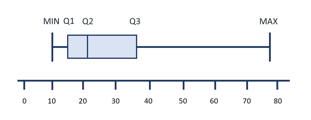
- 27, 58.5, 67, 77.5, 102
The minimum and maximum are the smallest and largest numbers in the data set.
To find Q1:
[latex]\begin{equation}\begin{split} \text{location of Q1} &= \dfrac{1}{4}\times{(n+1)} \\ \\ &= \dfrac{21+1}{4} \\ \\ &=5.5\end{split}\end{equation}[/latex][latex]\begin{equation}\begin{split} \text{value of Q1} &= \dfrac{{a}+{b}}{2} \\ \\ &= \dfrac{58+59}{2} \\ \\ &=58.5\end{split}\end{equation}[/latex]
To find the median:
[latex]\begin{equation}\begin{split} \text{location of median} &= \dfrac{n+1}{2} \\ \\ &= \dfrac{21+1}{2} \\ \\ &=11\end{split}\end{equation}[/latex]
To find Q3:
[latex]\begin{equation}\begin{split} \text{location of Q3} &= \dfrac{3}{4}\times{(n+1)} \\ \\ &= \dfrac{3}{4}\times{(21+1)} \\ \\ &= \dfrac{3}{4}\times{22} \\ \\ &= \dfrac{66}{4} \\ \\ &=16.5\end{split}\end{equation}[/latex][latex]\begin{equation}\begin{split} \text{value of Q3} &= \dfrac{{a}+{b}}{2} \\ \\ &= \dfrac{77+78}{2} \\ \\ &=77.5\end{split}\end{equation}[/latex] - 0, 1, 2, 3, 12
The minimum and maximum are the smallest and largest numbers in the data set.
To find Q1:
[latex]\begin{equation}\begin{split} \text{location of Q1} &= \dfrac{1}{4}\times{(n+1)} \\ \\ &= \dfrac{19+1}{4} \\ \\ &=5\end{split}\end{equation}[/latex]
To find the median:
[latex]\begin{equation}\begin{split} \text{location of median} &= \dfrac{n+1}{2} \\ \\ &= \dfrac{19+1}{2} \\ \\ &=10\end{split}\end{equation}[/latex]
To find Q3:
[latex]\begin{equation}\begin{split} \text{location of Q3} &= \dfrac{3}{4}\times{(n+1)} \\ \\ &= \dfrac{3}{4}\times{(19+1)} \\ \\ &= \dfrac{3}{4}\times{20} \\ \\ &= \dfrac{60}{4} \\ \\ &=15\end{split}\end{equation}[/latex] - 1, 2, 3, 5, 13
The minimum and maximum are the smallest and largest numbers in the data set.
To find Q1:
[latex]\begin{equation}\begin{split} \text{location of Q1} &= \dfrac{1}{4}\times{(n+1)} \\ \\ &= \dfrac{19+1}{4} \\ \\ &=5\end{split}\end{equation}[/latex]
To find the median:
[latex]\begin{equation}\begin{split} \text{location of median} &= \dfrac{n+1}{2} \\ \\ &= \dfrac{19+1}{2} \\ \\ &=10\end{split}\end{equation}[/latex]
To find Q3:
[latex]\begin{equation}\begin{split} \text{location of Q3} &= \dfrac{3}{4}\times{(n+1)} \\ \\ &= \dfrac{3}{4}\times{(19+1)} \\ \\ &= \dfrac{3}{4}\times{20} \\ \\ &= \dfrac{60}{4} \\ \\ &=15\end{split}\end{equation}[/latex] 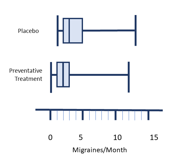
Practice Set 19.9: Using Stemplots, Histograms and Density Curves
Practice Set 19.9: Using Stemplots, Histograms and Density Curves
- Explain how an individual value in a data set can be split into a stem and a leaf.
- What kind of data is displayed in a histogram?
- Create a stemplot for the following data set which includes fictional values of the number of times per day the medication cabinet on the acute medical floor is accessed by a sample of nursing students.
3, 5, 6, 6, 6, 7, 7, 8, 9, 9, 10, 11, 13, 14, 14, 15, 17, 18, 22, 27 - Create a stemplot for the following data set which includes fictional values of visits per day to an emergency room.
187, 190, 195, 196, 199, 204, 206, 208, 211, 215, 215, 218, 219, 222, 225, 227, 230, 233, 242, 260 - What type of graph would you create to display the values of the following data set? This data set includes fictional values of the age in months in which the first tooth appeared for a sample of two year old children.
5.2, 5.7, 5.9, 6.1, 6.1, 6.3, 6.4, 6.4, 6.5, 6.5, 6.5, 6.7, 6.8, 6.8, 6.8, 6.9, 6.9, 7.2, 7.3, 7.5, 7.7, 7.8, 8.0, 8.1, 8.4, 8.5, 9.2, 10.7, 10.8, 11.3, 13.5, 14.1 - Convert the stem and leaves into actual values from the stemplot below.
- How does the shape of a density curve compare to a histogram using the same data set?
Answers:
- The last digit in the value is always represented as a leaf. The stem includes the numbers to the left of the last digit. Stems can have more than one digit while a leaf is always a single digit. A vertical line can divide the stem from the leaves. The stem is written on the left of the vertical line and the leaf is written to the right.
- Continuous data, or data with decimals.

- A histogram would be an appropriate type of graph as this data set includes data which is continuous.
- 1.0, 1.4, 1.5, 1.7, 1.8, 2.1, 2.2, 2.2, 2.4, 2.6, 2.7, 2.9, 3.2, 3.5, 3.6, 3.9, 4.4, 4.7
- The density curve will have a shape that looks like a line has been drawn through the tops of the columns of the histogram. If the histogram bin sizes (the width of columns on x axis) are very small, the density curve will follow the tops quite closely.
Image Descriptions
Data types branching flow chart:
- Numerical (Quantitative)
- Interval (arbitrary zero)
- Ratio (true zero)
- Discrete (whole numbers)
- Continuous (decimals scale)
- Categorical (Qualitative)
- Nominal (no order)
- Ordinal (order)
[Return to Chart 19.1 Data Types]
A statistic describing the value occurring most often in a data set.
A statistic describing the middle of a data set.
The statistic describing the average of all values in a data set.
A statistic describing the difference between the maximum and minimum values of a data set.
A statistic which provides a measure of the overall variation in a data set relative to the mean.
A summary of five statistics describing the distribution of values in a data set (minimum value, first quartile, median value, third quartile and maximum value).
A bar graph used to visually display continuous data.
A graph which visually represents the estimation of distribution of values in a sample.
A visual summary of the distribution of numbers in a data set.
A graph using the details of a 5 number summary to show how data is centered around the mean. An alternate name is a box and whisker diagram.
In statistics, individual refers to the subject being studied.
A particular characteristic of the subject being studied.
A value widely outside of the range of values in a data set.
A measured quantity describing a particular characteristic of a population.
A calculated number describing a particular characteristic of a sample of a population.
Ratio measurements refer to data measurements which are counted on a scale with a true zero.
Data which are represented by whole numbers.
Data which are represented by values on a scale and may use numbers with decimals.
Interval measurements refer to data which is measured on scales without an absolute zero.
Nominal data refers to categories of data which are distinct from one another, described using words.
Ordinal data refers to categories of data which are related to one another, described using words.
