7. Data Analysis I
7.2 Graphs and Tables
)")
Learning Objectives
By the end of this section it is expected that you will be able to:
- Extract information from a table, a bar graph, a line graph or a pie graph
- Create a stem and leaf graph from a set of data
- Create a frequency distribution table from a set of data
- Create a line graph, a bar graph and a pie graph (with or without technology)
- Compare a bar graph to a histogram
We have seen how data can be represented numerically with measures such as the mean, median and mode. Data can be organized and displayed in visual formats that allow the user to more easily extract information. When we represent data graphically we can determine data clusters, make comparisons, or determine trends.
Displaying Data with Tables or Graphs
We will consider some graphical alternatives for displaying the information presented in the following paragraph:
Tables
Transferring the data to a table, as in Table 1, provides greater clarity. The reader can quickly determine the names of the employers and their corresponding number of employees. It is easier to determine the employer with the greatest and least number of employees.
Table 1
| Employer | Number of Employees |
|---|---|
| Interior Health Authority | 3398 |
| School District #73 | 1924 |
| Thompson Rivers University | 1092 |
| Highland Valley Copper Mine | 1351 |
| City of Kamloops | 761 |
| BC Lottery Corporation | 440 |
Graphs
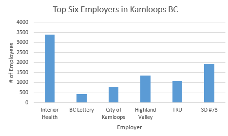
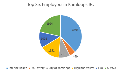
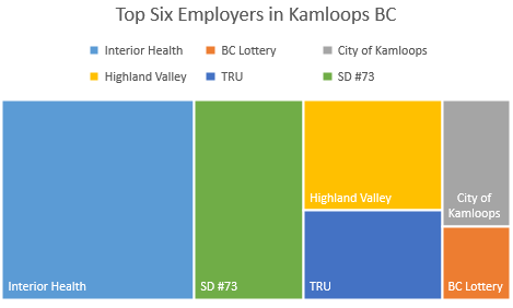
When the data is represented visually the reader can quickly retrieve information and make comparisons. Technology can be used to easily create a wide variety of graphs. The data from the table was entered into a spreadsheet and three graphs were generated. The results are displayed below as a bar graph (Fig. 1a), a pie graph (Fig. 1b), and a waterfall graph (Fig. 1c).
Bar Graph
Circle or Pie Graph
Waterfall
Consider each of the three graphs in Figures 1a, 1b and 1c (bar, pie and waterfall) to answer the following questions. Beside each answer indicate which of the three graph(s) provides the answer.
- Which of the six employers has the most number of employees?
- How many employees work for the largest employer?
- Which of the six employers has the least number of employees?
- How many employees work for the smallest employer?
- Where does TRU place in the ranking of number of employees?
- Which graph is the easiest to extract data from?
The answers to the six questions would be:
- Interior Health has the most number of employees. This information is found in all three graphs.
- Interior Health employs 3398 people. This information can only be determined using the pie graph
- BC Lottery has the least number of employees. This information is found in all three graphs.
- BC Lottery employs 440 people. This information can only be determined using the pie graph
- TRU ranks fourth in the number of employees. This can be stated with certainty by using the bar graph or pie graph. The reader may not be so certain with the waterfall graph.
- This depend on which information is required.
Note that there is not necessarily one form of graph that is better than the others. It is important to recognize that the way in which the information is presented will impact its use. By making one change, such as including the numerical values for the bar or waterfall graphs, the user would be able to obtain more exact information.
When choosing and creating a table or graph it is important to know what kind of information is required. A decision can then be made as to how best to depict this. Since technology provides easily accessible tools for creating tables and charts, this section will focus on the features of different tables and graphs rather than on the manual construction of the graphs.
We will now take a closer look at line graphs, bar graphs, and circle graphs as well as stem-and-leaf plots and frequency tables.
Stem-and-Leaf Graph
One simple graph, the stem-and-leaf graph or stemplot, is a good choice when the data sets are small. This graph indicates data clusters and can be used to determine the measures of central tendency.
A stem-and-leaf graph divides each observation of data into a stem and a leaf. The leaf consists of one final significant digit. For example, 23 has a stem of 2 and a leaf 3. The number 432 has a stem of 43 and a leaf of 2. Likewise, the number 5,432 has a stem 543 and a leaf of two. The decimal 9.3 has a stem of nine and a leaf of three.
To create the plot, write the stems in a vertical line from smallest to largest. Draw a vertical line to the right of the stems. Then write the leaves in increasing order next to their corresponding stem.
EXAMPLE 1
For Susan’s spring pre-calculus class, scores for the first exam were as follows (ranked from lowest to highest):
33; 42; 49; 49; 53; 55; 55; 61; 63; 67; 68; 68; 69; 69; 72; 73; 74; 78; 80; 83; 88; 88; 88; 90; 92; 94; 94; 94; 94; 96; 100
a) Create a stem-and-leaf graph for the data.
b) Describe where the data clusters.
c) What percentage of the students obtained a score of 90 or better?
d) What is the mean, median and mode?
Solution
a) To create the graph, rank the data from lowest to highest.
Create the column for the stems. This will be the first digit in a two digit number and the first two digits in a three digit number. The stems will start at 3 and end at 10.
For each data value, add each leaf to its corresponding stem. For the value 33. the stem is 3 and the leaf is 3. For the value 68 the stem is 6 and the leaf is 8. Since 68 occurs twice in the data set, for the stem of 6 there will be two leaves of 8.
| Stem | Leaf |
|---|---|
| 3 | 3 |
| 4 | 2 9 9 |
| 5 | 3 5 5 |
| 6 | 1 3 7 8 8 9 9 |
| 7 | 2 3 4 8 |
| 8 | 0 3 8 8 8 |
| 9 | 0 2 4 4 4 4 6 |
| 10 | 0 |
b) There appears to be two clusters of data. The stemplot shows that most scores fell in either the 60s or the 90’s.
c) Eight out of the 31 scores or approximately 26% were in the 90s or 100.
d) The mean is 73.5. Since there are 31 students, the median is the 16th score, which is 73. The mode is 94 as it occurs 4 times.
TRY IT 1
For the Park City basketball team, scores for the last 30 games were as follows (from lowest to highest):
32; 32; 33; 34; 38; 40; 42; 42; 43; 44; 46; 47; 47; 48; 48; 48; 49; 50; 50; 51; 52; 52; 52; 53; 54; 56; 57; 57; 60; 61
a) Construct a stem-and-leaf graph for the data.
b) In what percent of the games did the team score less than 40 points?
c) Use the graph to determine the mean, median and mode.
Show answer
a)
| Stem | Leaf |
| 3 | 2 2 3 4 8 |
| 4 | 0 2 2 3 4 6 7 7 8 8 8 9 |
| 5 | 0 0 1 2 2 2 3 4 6 7 7 |
| 6 | 0 1 |
b) 16.7%
c) Mean is 47.3; Median is 48; Bimodal 48 and 52
The stem-and-leaf graph presents a quick way to graph data and it gives an exact picture of the data. It also provides an opportunity to recognize outliers. An outlier is an observation of data that does not fit the rest of the data. It is sometimes called an extreme value. When you graph an outlier, it will appear not to fit the pattern of the graph. Some outliers are due to mistakes (for example, writing down 50 instead of 500) while others may indicate that something unusual is happening.
EXAMPLE 2
A restaurant was scouting for a new location. It wants to be within walking distance to theatres or performing arts facilities. It gathered data for the distances (in kilometres) between a potential new location and several theatres or arts facilities:
1.1; 1.5; 2.3; 2.5; 2.7; 3.2; 3.3; 3.3; 3.5; 3.8; 4.0; 4.2; 4.5; 4.5; 4.7; 4.8; 5.5; 5.6; 6.5; 6.7; 12.3
a) Create a stemp-and-leaf graph for the data. Note: The leaves are the digits to the right of the decimal.
b) Do the data seem to have any concentration of values? What does this indicate to the restaurant about this potential location?
c) Do there appear to be any outliers?
d) Determine the median and the mean.
e) Eliminate the outlier and recalculate the mean. What impact does the outlier have on the mean?
Solution
a)
| Stem | Leaf |
|---|---|
| 1 | 1 5 |
| 2 | 3 5 7 |
| 3 | 2 3 3 5 8 |
| 4 | 0 2 5 5 7 8 |
| 5 | 5 6 |
| 6 | 5 7 |
| 7 | |
| 8 | |
| 9 | |
| 10 | |
| 11 | |
| 12 | 3 |
b) Values appear to concentrate between three and five kilometres. This potential location might not be best as many of the theatres and arts facilities are not within walking distance.
c) The value 12.3 km appears to be an outlier.
d) The median is the 11th data value or 4.0 km The mean is 4.3 km.
e) The mean will be 3.91 km. The outlier results in a much larger mean (4.3 km rather than 3.91 km).
TRY IT 2
The following data show the distances (in kilometres) to a college from the homes of the members of the counselling department:
0.5; 0.7; 1.1; 1.2; 1.2; 1.3; 1.3; 1.5; 1.5; 1.7; 1.7; 1.8; 1.9; 2.0; 2.2; 2.5; 2.6; 2.8; 2.8; 2.8; 3.5; 3.8; 4.4; 4.8; 4.9; 5.2; 5.5; 5.7; 5.8; 8.0
a) Create a stem-and-leaf graph using the data.
b) Determine the mean, median, mode and any outliers.
Show answer
a)
| Stem | Leaf |
|---|---|
| 0 | 5 7 |
| 1 | 1 2 2 3 3 5 5 7 7 8 9 |
| 2 | 0 2 5 6 8 8 8 |
| 3 | 5 8 |
| 4 | 4 8 9 |
| 5 | 2 5 7 8 |
| 6 | |
| 7 | |
| 8 | 0 |
b) Mean is 2.89 km; Median  Mode 2.8 km Outlier 8.0 km
Frequency Distributions
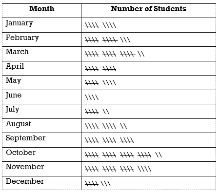
Frequency is the number of occurrences of an event over a period of time. The frequency of a full moon is generally once a month. The frequency of one’s birthday is once a year. A frequency distribution table illustrates the frequency or number of times that a specific outcome or data value occurs. Tally marks can be used to keep track of the number of occurences. Once the tally is complete the frequency distribution table can be created.
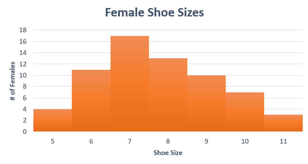
Consider a marketing survey where sixty-five females were asked their shoe size. The responses ranged from size 5 to size 11. A tally of the results is illustrated:
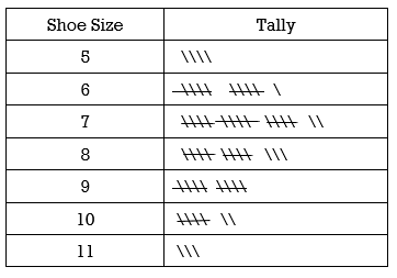
The tally is then easily converted to a frequency distribution table .
| Shoe Size | Number of Females |
|---|---|
| 5 | 4 |
| 6 | 11 |
| 7 | 17 |
| 8 | 13 |
| 9 | 10 |
| 10 | 7 |
| 11 | 3 |
Frequency Distribution
A frequency distribution can show the absolute frequency and the relative frequency. The absolute frequency is the number of occurences of a data value. The relative frequency is the ratio of the number of occurrences of a data value to the total number of data values.
EXAMPLE 3.1
a) Create a frequency distribution table to show the absolute frequency and the relative frequency for the shoe size tally of 65 females:
b) Which shoe size was the most common? What percentage of the females wear this size?
c) Which shoe size was the least common? What percentage of the females wear this size?
Solution
a) The frequency table will require 3 columns and 8 rows:
| Shoe Size | Absolute Frequency | Relative Frequency |
|---|---|---|
| 5 | 4 | 6% |
| 6 | 11 | 17% |
| 7 | 17 | 26% |
| 8 | 13 | 20% |
| 9 | 10 | 15% |
| 10 | 7 | 11% |
| 11 | 3 | 5% |
The absolute frequency is the number of females with a specific shoe size.
The relative frequency is the ratio of the number of females with a specific shoe size to the total number of females. Since there are 65 females in the survey, the relative frequency for shoe size 5 is 4/65 = 0.0615 = 6% Note: the relative frequencies have been converted from decimals to percentages and rounded to the nearest whole number.
b) Size 7 is the most common with 26%
c) Size 11 is the least common with 5%
TRY IT 3
The tally of the birth months for a class of 145 students is shown in the following table.
a) Create a frequency distribution table that shows both the absolute and the relative frequencies. The absolute frequency is the number of birthdays. The relative frequency is the ratio of the number of birthdays to the total number of students. Note: Round the relative frequencies to the nearest whole number.
b) Which month is the most common? What percentage of the students had a birthday during this month?
c) Which month is the least common? What percentage of the students had a birthday during this month?
Show answer
a)
| Month | Number of Birthdays | Relative Frequency |
|---|---|---|
| January | 9 | 6% |
| February | 13 | 9% |
| March | 17 | 12% |
| April | 10 | 7% |
| May | 9 | 6% |
| June | 4 | 3% |
| July | 7 | 5% |
| August | 12 | 8% |
| September | 15 | 10% |
| October | 22 | 15% |
| November | 19 | 13% |
| December | 8 | 6% |
b) October is the most common birthday month with 15%.
c) June is the least common month with 3%.
Choosing an Appropriate Graph
Although a frequency distribution table provides quantitative information it does not allow the user to easily make comparisons or determine trends. The bar graph, line graph and pie (circle) graph provide quick visual representations of the data and allow the user to make comparisons and extract information. As stated earlier in this section, technology assists us with creating the graphs but it is the creater’s responsibility to determine the specifics. When creating a graph, consider the following:
- What information must be conveyed? Ranking, high and low values, trends?
- What type of graph will best suit this? Bar, pie, line, waterfall…
- Select an appropriate title and labels for the axis. Without a title and labels the graph is virtually meaningless.
- What should the scale for each axis be? Should there be increments of 1, 10, 100, 1000….?
- How much detail or colour is useful or required? Consider whether to include numerical values (or not). Don’t go overboard with colour variations and information at the expense of neatness and conciseness.
Consider the bar graphs in Figures 2 and 3:
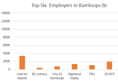
Although the data values are identical for both bar graphs, it might not appear from figure 3 that Interior Health dominates as the top employer in Kamloops. This illustrates that the choice of scale is critical. In Figure 3 the graph is also missing the labels on the vertical and horizontal axes.
Consider the pie graphs in Figure 4 and Figure 5. Which is more informative?
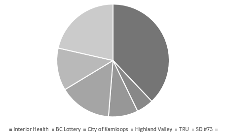
When creating a graph be sure to include the title and any relevant information. The circle graph in Figure 5 is lacking a title which makes the graph meaningless. The addition of a title “Top Six Employers in Kamloops” would enable the user to determine rankings but not the actual number of employees. The addition of employee numbers as in Figure 4 would add further clarity to Figure 5. Note that although the colour in Figure 4 may make it more visually appealing, it is the title, labels and numerical values that are most informative.
Bar Graphs
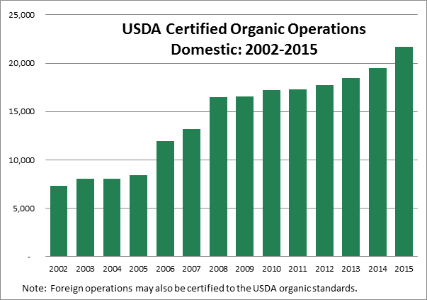
A bar graph presents data using vertical or horizontal rectangular bars. Bar graphs are useful for making comparisons or for showing trends over time. One axis shows the categories and the other axis shows the values. The bar graph in Figure 6 indicates that there was a rising trend in the number of USDA (United States Department of Agriculture) certified domestic organic operations from 2005 to 2015. The reader can also make comparisons. In Figure 6 we can see that the number of certified domestic organic operations more than doubled between the years 2005 and 2015.
EXAMPLE 4
A retailer tracked the sale of a particular shoe style. The information in the bar graph illustrates the colour preference for one week of sales.
a) What was the most preferred colour? How many females preferred this colour?
b) What was the least preferred colour? How many females preferred this colour?
c) How many more females preferred grey over blue?
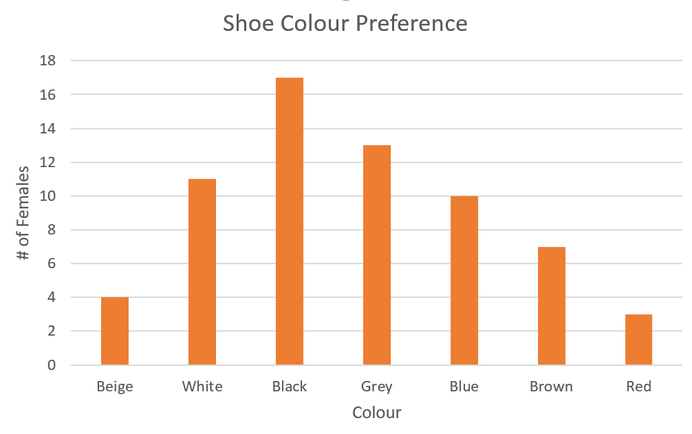
Solution
a) Black was the most preferred colour. 17 females preferred black.
b) Red was the least preferred colour. 3 females preferred red.
c) Three more preferred grey over blue.
TRY IT 4
a) Refer to the tally in TRY IT 3. Create a vertical bar graph for the distribution of birth months. Be sure to include a title, axis labels and select a reasonable scale for the values.
b) In which three months were there the most number of birthdays?
c) In which three months were there the least number of birthdays?
d) How many more birthdays were there in September as compared to April?
e) What is the trend in the number of birthdays over the course of the year?
Show answer
a)
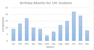
b) October, November and March
c) June, July and December
d) 5 more in Sept. than in April
e) the no. increases in the spring and fall and decreases in the summer and winter months.
Some data sets are better represented as occuring in natural pairs. With shoe sizes or colours perhaps we might want to compare male and female responses. Bar graphs can be created to illustrate more than one category.
EXAMPLE 5
The Hornets hockey team entered the league in 2010. Each season consists of 80 games. Their win/loss record is provided in the table below.
| Year | # of Wins | # of Losses |
|---|---|---|
| 2010 | 33 | 47 |
| 2011 | 31 | 49 |
| 2012 | 36 | 44 |
| 2013 | 41 | 39 |
| 2014 | 44 | 36 |
| 2015 | 52 | 28 |
| 2016 | 57 | 23 |
| 2017 | 56 | 24 |
| 2018 | 59 | 21 |
| 2019 | 61 | 19 |
A bar graph provides a visual comparison of wins and losses each year.
a) In which year were there the most losses? the most wins?
b) In which year were the number of wins and losses almost identical?
c) In which year did the number of wins exceed the number of losses (for the first time)?
d) Use the graph to estimate how many more wins than losses there were in 2016.
e) What was the trend in wins and losses from 2010 to 2019?
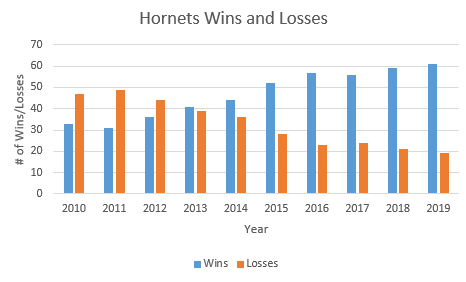
Solution
a) The team had its highest number of losses in its second year of operations 2011 and its highest number of wins in 2019.
b) 2013
c) 2013
d) 57 – 22 = 35 (note that the table indicates that it is actually 34)
e) Over the ten years, the number of wins has been increasing and the number of losses has been decreasing. The number of wins surpassed the number of loses for the first time in 2013.
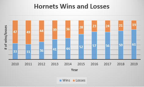
Bar graphs can also be arranged in a stacked format. Refer to Figure 7. This type of bar graph illustrates the relationship between the parts and the whole. Although beyond the scope of this text it is worth illustrating.
TRY IT 5
The average high temperature (to the nearest degree Celsius) and the average monthly rainfall (in mm) for Phoenix Arizona are provided in the table below (Source: https://www.usclimatedata.com/climate/arizona/united-states/3172#) .
| Month | Temperature (Celsius) | Rainfall (mm) |
|---|---|---|
| January | 20 | 8 |
| February | 22 | 19 |
| March | 25 | 12 |
| April | 30 | 16 |
| May | 35 | 21 |
| June | 40 | 25 |
| July | 41 | 29 |
| August | 40 | 28 |
| September | 38 | 25 |
| October | 31 | 18 |
| November | 24 | 12 |
| December | 19 | 7 |
a) Create one bar graph illustrating both the average daily temperature and average rainfall for Phoenix.
b) In which month was there the most rainfall? The least rainfall?
c) In which month was the average temperature the highest? the lowest?
d) What pattern is there as you compare the temperature trend with the rainfall trend?
e) Which is the better month to be in Phoenix? October or April? Why?
Show answer
a)
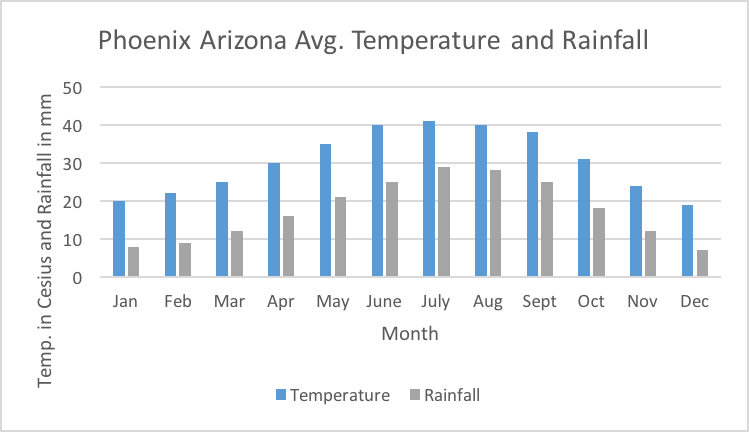
b) Most rainfall in July; least rainfall in December
c) Highest avg. temperature in July; lowest avg. temperature in December
d) As avg. temperature increases/decreases so does the rainfall
e) Both are very similar. In April it is not quite as warm and a little less rain so perhaps that might be preferred.
Line Graphs
Line graphs can be used to show data changes over time. The horizontal or x-axis represents time and the vertical or y-axis represents the data points which are plotted and joined by line segments. Trends and rates of change can be determined by considering the slope of the line. It is also possible to have more than one line on a graph.
Line graphs are useful for illustrating trends over time but accuracy can be lost. In Figure 8 the escalating increase in housing prices is evident but it is difficult to determine average house prices in a specific year.
Fig. 8 Average Price of Detached Homes in Vancouver BC (in $1000’s)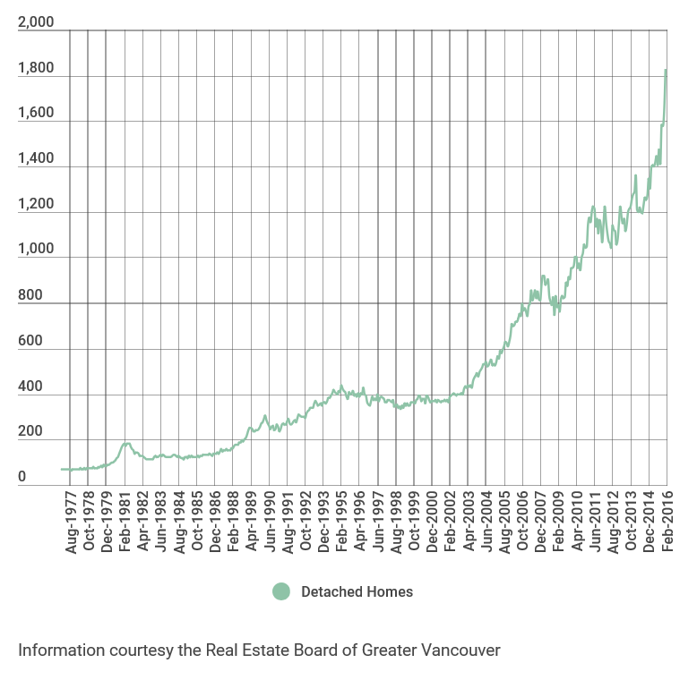
EXAMPLE 6
Consider the Hornets hockey team from Example 5. To construct a line graph, draw a horizontal axis to represent the years 2010 through 2019. The vertical axis will represent both the number of wins and the number of losses.
Solution
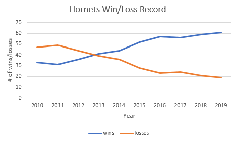
Several observations can be made from the line graph in Example 6. The number of wins increased every year except for 2010 to 2011 and 2016 to 2017. The number of wins first surpassed the number of losses in 2013 and continued to do so every year after that. The gap between the number of wins versus the number of losses was the highest in 2019. The lowest number of wins was in 2011 and the highest was in 2019. One might also make a prediction that based on the upward trend in wins that in 2020 the Hornets could have their best year ever. This is known as extrapolating from the data.
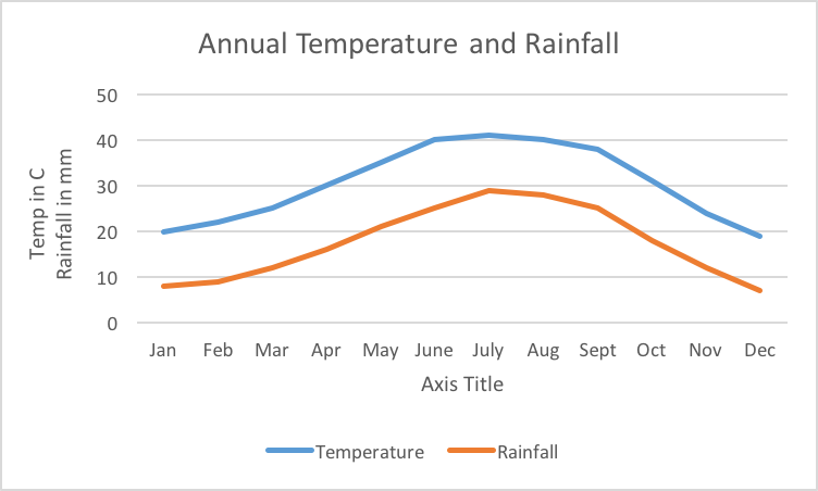
TRY IT 6
Use the data from Try It 5 to create a line graph representing the temperature and rainfall from January to December. Be sure to title and label the axes of your graph.
Show answer
Histograms
A different type of graph that also uses bars is the histogram. Histograms are used to illustrate the distribution of one specific data item such as height or temperature. In a histogram the data will be quantitative, as with income or heights. With a histogram the numerical data values are divided into “bins” or intervals. A bin could represent one data value or a range of data values. In the next example each bin represents one shoe size.
Reconsider example 3 with shoe sizes (qualitative) and example 4 with shoe colours (qualitative). Bar charts were created for both of these. A histogram could be created for the shoe sizes but not shoe colour. Refer to Figure 9. This histogram illustrates the frequency or occurrence of shoe sizes ranging from size 5 to size 11 where every bar (bin) represents one shoe size. The most frequent size is 7 and the other sizes are dispersed outward from size 7.
Note that with a histogram there are no spaces between the bars and the bars range from low to high (or high to low). With a histogram the data values appear on the horizontal axis and the frequency (number of occurrences) appears on the vertical axis. In a histogram the data can be distinct quantities (as with shoe sizes) or it may be grouped into intervals. As an example consider a histogram representing hourly wages. The hourly wage could be distinct values: $15, $16, $17 or it could be intervals: $15-$16, $17-$18, $19-20.
Consider Figure 10 below. Every bar represents an interval that is half a unit: 0-0.5, 0.5-1, 1-1.5 and so on. From the histogram we can easily determine which interval occurs the most often and which occurs least often. We can also determine how the data values are clustered. In Figure 10 we see that the data clusters around the values -0.5 to 0.5.

Histograms are useful for representing the distribution or dispersion of data and as such will be revisited elsewhere in this book.
Glossary
frequency distribution
A table or graph that illustrates the number of times that a specific outcome or data value occurs within an interval.
histograms
Used to illustrate the distribution of one specific data item such as height or temperature.
stem and leaf graph
Divides each data observation into a stem and a leaf. The stem is the first digit or digits and the leaf is the last digit.
7.2 Exercise Set
- The two graphs below depict the median age of the population for the province of British Columbia (Source: https://www2.gov.bc.ca/gov/content/data/statistics/people-population-community/population/vital-statistics) Refer to both graphs to answer the following questions.
- What has been the trend from the year 2000 to 2018 for the median age in B.C.?
- In which year was the median age the lowest? What was the lowest median age?
- In which year was the median age the highest? What was the highest median age?
- What was the change in median age from 2000 to 2004?e) What was the change in median age from 2007 to 2011?
- What was the change in median age from 2014 to 2018?
- Which of the two graphs was more helpful in answering these questions?
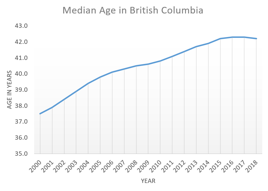
Line Graph
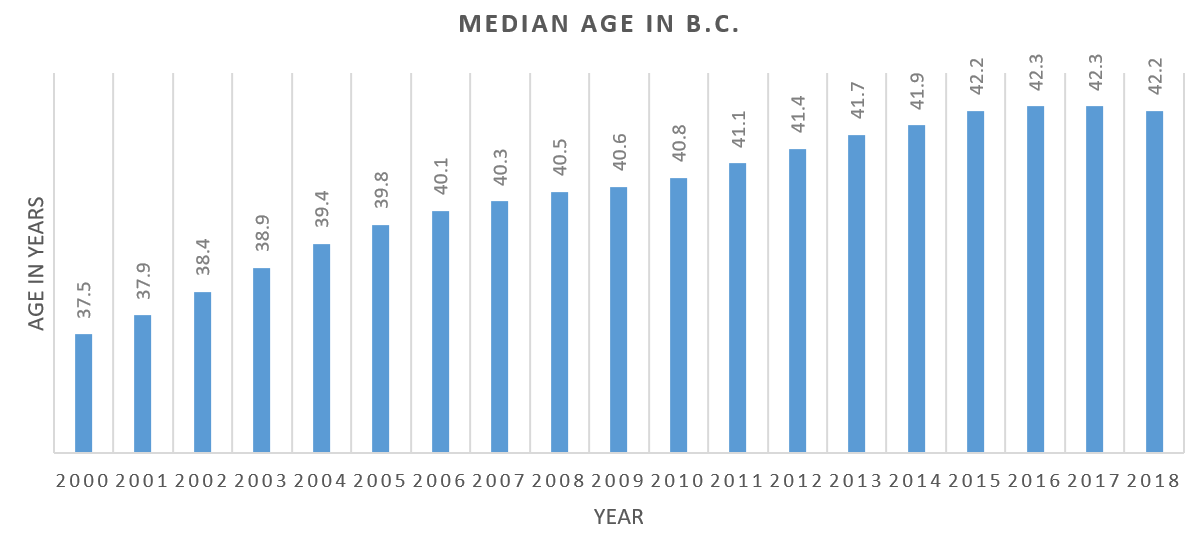
- Bar Graph
The bar graph indicates the average commuting time for Canadians in 2016. (Source: Statistics Canada Census Program)
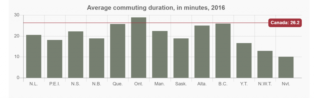
- According to the graph, what was the average commuting time for all Canadians?
- Which province had the highest commuting time? Estimate the time.
- Which province had the lowest commuting time? Estimate the time.
- Which province or territory’s commuting time was closest to the average?
- Name all provinces or territories with a commuting time greater than the Canadian average.
- Name all provinces or territories with a commuting time less than 20 minutes.
- Which province or territory best represents the median commuting time?
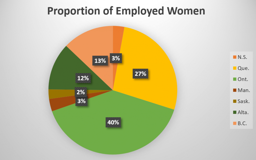
- The pie graph illustrates the proportion of women who are employed as physicians for the top seven Canadian provinces in 2016. (Source: Statistics Canada). The total number of female physicians in these 7 provinces is 25,700. Note: If you have difficulty reading the graph start at Novia Scotia (orange) and move clockwise in the pie graph. This corresponds to reading the list of provinces from top to bottom.
-
- Which of the seven provinces has the highest proportion of female physicians? What is the proportion? How many female physicians are there in this province?
- Which of the seven province has the lowest proportion of female physicians? What is the proportion? How many female physicians are there in this province?
- What proportion of women physicians are located in the top two provinces? What might account for this?
- Which two provinces have identical proportions of female physicians?
- The average age of the residents at at a local seniors residence are as follows: 85, 55, 86, 57, 88, 77, 69, 79, 71, 63, 61, 92, 72, 85, 76, 65, 87, 69, 61, 74, 81, 73, 74, 66, 75, 81, 90, 56, 74, 69, 82, 64, 55, 58, 69, 90, 72, 73, 95
-
- Construct a stem plot for the data.
- Use the stem plot to determine the median and mode.
-
- A recreational basketball league gathered information on its players. The tally for the players’ heights (in feet and inches) is provided below.
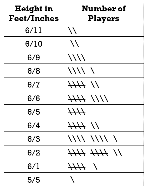
- Create a frequency distribution table that shows both the absolute and the relative frequencies.
- Determine the mode and median.
- Create a bar graph to illustrate this data.
- Are there any outliers? Why does the bar graph not depict this?
- A biker documented the daily kilometres she covered as she travelled across the Canadian prairies. Her first ten days are listed in the table below.
Day 1 2 3 4 5 6 7 8 9 10 Km 82 87 100 71 93 88 42 53 88 98 - What was her average daily distance?
- Create both a bar graph and a line graph.
- What was the median daily distance?
- On which day did she bike the furthest? the least?
- Between which two days was there the greatest increase in distance travelled?
- Between which two days was there the greatest decrease in distance travelled?
- If the table were not provided, from which of the two graphs is it easier to obtain the above answers?
- State one advantage and one disadvantage of using a bar graph, a pie graph, and a line graph.
Answers
-
- The median age increased most rapidly from 2000 to 2006. It continued to increase at a slower rate through to 2016, levelled off and decreased for the first time in 2018.
- In 2000 the median age was 37.5
- In 2016 and 2017 the median age was 42.3
- From 2000 to 2004 the median age increased by 1.9 years.
- From 2007 to 2011 the median age increased by 0.8 years.
- From 2014 to 2018 the median age increased by 0.3 years.
- Answers may vary. The bar graph provided the necessary detail but the line graph depicted the trend.
-
- 26.2 min.
- Ontario 28-29 min.
- Nunavut 10 min.
- B.C.
- Ontario
- P.E.I. , N.B. , Sask. , Y.T. , N.W.T. , Nvt.
- Nl.
-
- Ontario 40% 10, 280
- Saskatchewan 2% 514
- 67%; These two provinces have the largest populations in Canada.
- Nova Scotia and Manitoba
-
- Stem plot for the data:
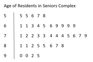
- Median is 73 and mode is 69
- Stem plot for the data:
-
- Frequency distribution table:
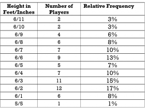
- mode is 6’2″ and median is 6’4″
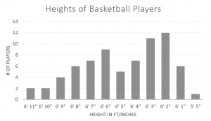
- 5’5″ is an outlier. This is not obvious from the bar graph since the measures from 5’5″ to 6’1″ have been omitted from the graph so the gap betwen 5’5″ and 6’1″ is not apparent.
- Frequency distribution table:
-
- 80.2 km
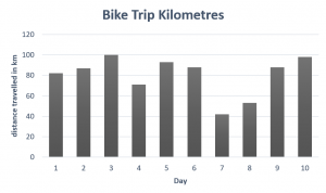
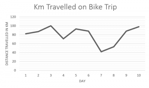
- 87.5 km
- Day 3; Day 7
- From Day 8 to Day 9
- From Day 6 to Day 7
- Answers may vary
- Answers may vary. Bar graphs provide a visual comparison of different categories (e.g. comparing the total number of wins for several different hockey teams) but they can be difficult to read accurately. Line graphs are useful for depicting trends over time but are inappropriate for comparing distinct categories (e.g. comparing the total number of wins for hockey teams). Pie graphs are useful for representing portions of a whole (e.g. voter preferences in an election) but they can be difficult to read accurately.
