7. Data Analysis I
7.4 Survey Creation

Learning Objectives
By the end of this section it is expected that you will be able to:
- Design a statistical experiment, collect the data, and analyze and communicate the results
This section provides an overview of the steps involved in designing and conducting a survey.
Survey Steps
- Determine the objective of the survey and the population to be surveyed.
- Determine the survey questions.
- Determine the sampling technique: simple random sampling, systematic sampling, cluster or convenience. Select the sample to be surveyed.
- Collect the data using an appropriate instrument (interview, paper questionnaire, internet,…). Record the responses in a frequency table.
- Analyze the data and communicate the results using descriptive statistics such as measures of central tendency and/or graphs. The graphs can be created using technology.
Math Support Survey
- Determine the objective of the survey and the population to be surveyed.
- The goal of the survey is to determine the types of math support and frequency of use by the students enrolled in upgrading math at College ABC
-
Determine three survey questions.
- Three questions will be used:i. Which of the following support(s) do you access while you are enrolled in upgrading math at College ABC? Check all that apply: math learning lab, my math instructor, private tutor, internet, otherii. Which method of support do you most prefer? math learning lab, my math instructor, private tutor, internet, otheriii. How many hours a day (on average) do you work on math outside of classtime? 0; more than 0 but less than 1; 1-2; more than 2
-
Determine the sampling technique: simple random sampling, systematic sampling, cluster or convenience. Select the sample to be surveyed.
- Cluster sampling will be used. There are 12 sections of upgrading math during the winter semester at College ABC. Each of these represents a cluster. The clusters will be numbered 3-14 and three clusters will be selected by rolling three die. The total of the three die will be matched with the corresponding cluster.Upon completion of this step the three selected clusters are cluster numbers 5, 9 and 14.
-
Collect the data using an appropriate instrument (interview, paper questionnaire, internet,…). Record the responses in a frequency table.
- Permission to visit these three classes will be obtained by contacting the instructors via email. Each cluster will be visited on a test day when attendance tends to be most reliable. All students in each cluster will be asked to complete a three question paper survey. Three frequency tables will be created to organize the results. In total 86 students will be surveyed.a) Which of the following support(s) do you access while you are enrolled in upgrading math at College ABC? Check all that apply: math learning lab, my math instructor, private tutor, internet, other
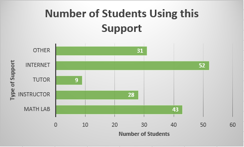
Type of Support Tally Frequency Math Learning Lab ///////////////////////////////////43 My Math Instructor ///////////////////////28 Tutor ////////9 Internet //////////////////////////////////////////52 Other //////////////////// /////31 b) Which support do you prefer most?
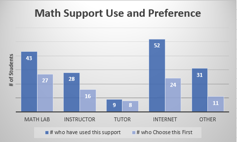
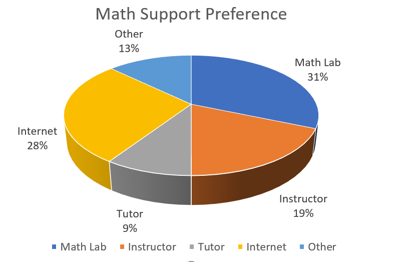
Type of Support Tally Frequency Math Learning Lab //////////////////////27 My math instructor /////////////16 Tutor ///////8 Internet ////////////////////24 Other /////////11 c) How many hours per day, on average, do you work on math?
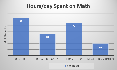
# of Hours Frequency 0 31 between 0 and 1 18 1 to 2 27 More than 2 10
- Permission to visit these three classes will be obtained by contacting the instructors via email. Each cluster will be visited on a test day when attendance tends to be most reliable. All students in each cluster will be asked to complete a three question paper survey. Three frequency tables will be created to organize the results. In total 86 students will be surveyed.a) Which of the following support(s) do you access while you are enrolled in upgrading math at College ABC? Check all that apply: math learning lab, my math instructor, private tutor, internet, other
-
Analyze the data and communicate the results. Graphs can be created using technology.
- Pie and bar graphs will be used to organize and summarize the results of the survey.
Bar Graphs
The following three graphs were created using the Chart feature in Excel.
Bar Graph#1 depicts the number of students on the horizontal axis and the type of support on the vertical axis. It is clear from the graph that the support that has been used by the most number of students is the internet and by the least number of students is a tutor.
Bar Graph#1 Bar Graph#2 depicts the total number of students using the support as compared against the number of students preferring the support. Forty-three students in total have used the math lab whereas twenty-seven of these would choose the math lab first for support. Although fifty-two students have accessed the internet for support, only twenty-four would choose this type of support first. The support that is most preferred is the math lab; least preferred is the tutor.
Bar Graph#2 Bar Graph#3 depicts the amount of hours per day, on average, that students spend studying math.
Bar Graph#3 Pie Graphs
Graph#4 depicts which type of math support is most preferred by the students. The math lab is the largest sector followed closely by the Internet.
Pie Graph #4 Graph#5 depicts the number of hours per day, on average, spent working on math.
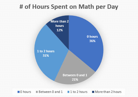
Pie Graph #5
- Pie and bar graphs will be used to organize and summarize the results of the survey.
